Question Types
Tip
Get feature highlights and practical tips delivered to your inbox. Subscribe.ODK Collect supports forms with a wide variety of question types.
The exact functionality and display style of each question
are specified in your XLSForm definition using the
type and appearance columns.
Tip
You can find an XLSForm with all available question types here.
Helpful terminology
Text widgets
All of the text widgets share the text type,
and the inputs from them are saved as literal strings.
Warning
If you are using Aggregate and expect answers to be more than 255 characters, you should increase the database field length to over 255 characters.
Default text widget
- type
text- appearance
none
A simple text input.
The text entry field expands as the user types, and line breaks can be included. The keyboard displayed depends on the Android device and user settings.
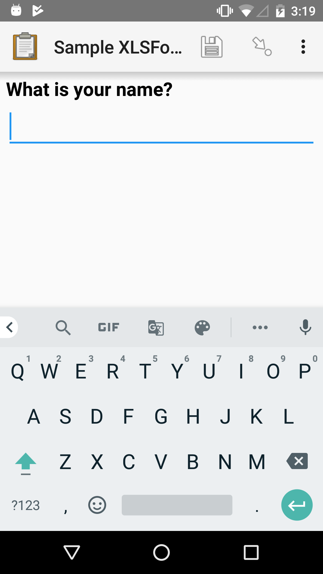
XLSForm
type |
name |
label |
|---|---|---|
text |
name |
What is your name? |
Text area
- type
text- appearance
multiline
A text area shown as 4 rows. The area can be scrolled as more text is added.
XLSForm
type |
name |
label |
appearance |
|---|---|---|---|
text |
comments |
Comments |
multiline |
Text area with custom rows
- type
text- appearance
none
To define the minimum number of rows that a text field should display, use the parameters column.
XLSForm
type |
name |
label |
parameters |
|---|---|---|---|
text |
essay |
Your essay |
rows=15 |
Number text widget
- type
text- appearance
numbers
A numerical input that treats the input as a string, rather than a number.
The number input accepts numerals (0123456789), hyphens (-), and decimal separators (. and ,). These are the only characters available on the number keypad displayed with this widget.
This is useful for phone numbers, ID numbers, IP addresses, and similar data. It can also be used in place of the Integer widget or Decimal widget if large numbers are needed (the integer widget has a limit of nine digits, and the decimal widget has a limit of 15 characters).
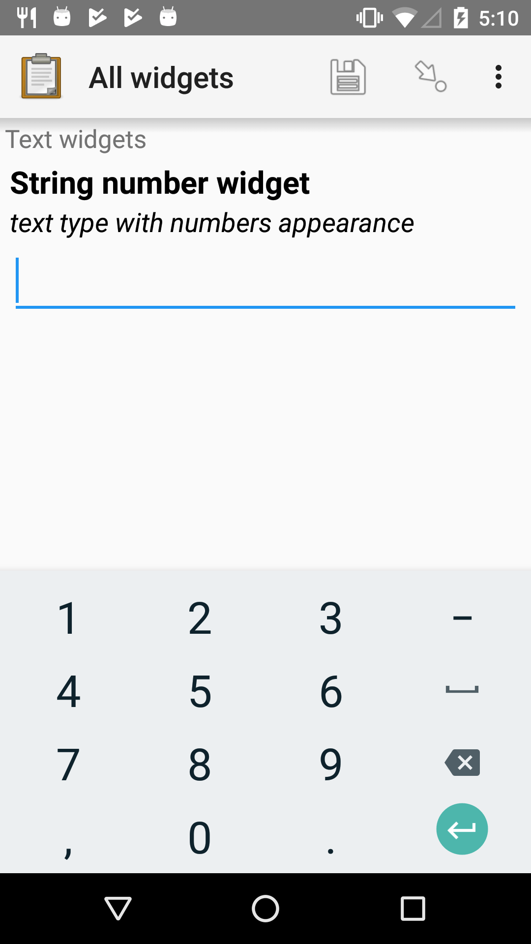
XLSForm
type |
name |
label |
appearance |
hint |
|---|---|---|---|---|
text |
string_number_widget |
String number widget |
numbers |
text type with numbers appearance |
Warning
It's not guaranteed that the result will be a well-formed number. For example, it might be .0,1-2 5. If you know the expected format of the value, you can add constraints to ensure it meets your requirements. For instance, if you only want numbers greater than or equal to zero (without decimal separators), you can use a regular expression like regex(.,'^[0-9]*$') for validation.
Note
This appearance can be combined with the thousands-sep appearance.
External app string widget
- type
text- appearance
ex.*
Launches an external app and receives a string input back from the external app. If the specified external app is not available, a manual input is prompted.
The external app widget is displayed when the appearance attribute begins with ex:. The rest of the appearance string specifies the application to launch.
See also
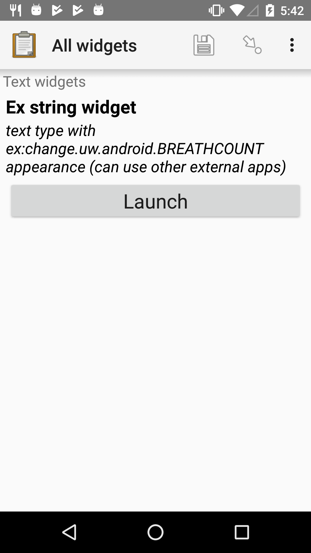
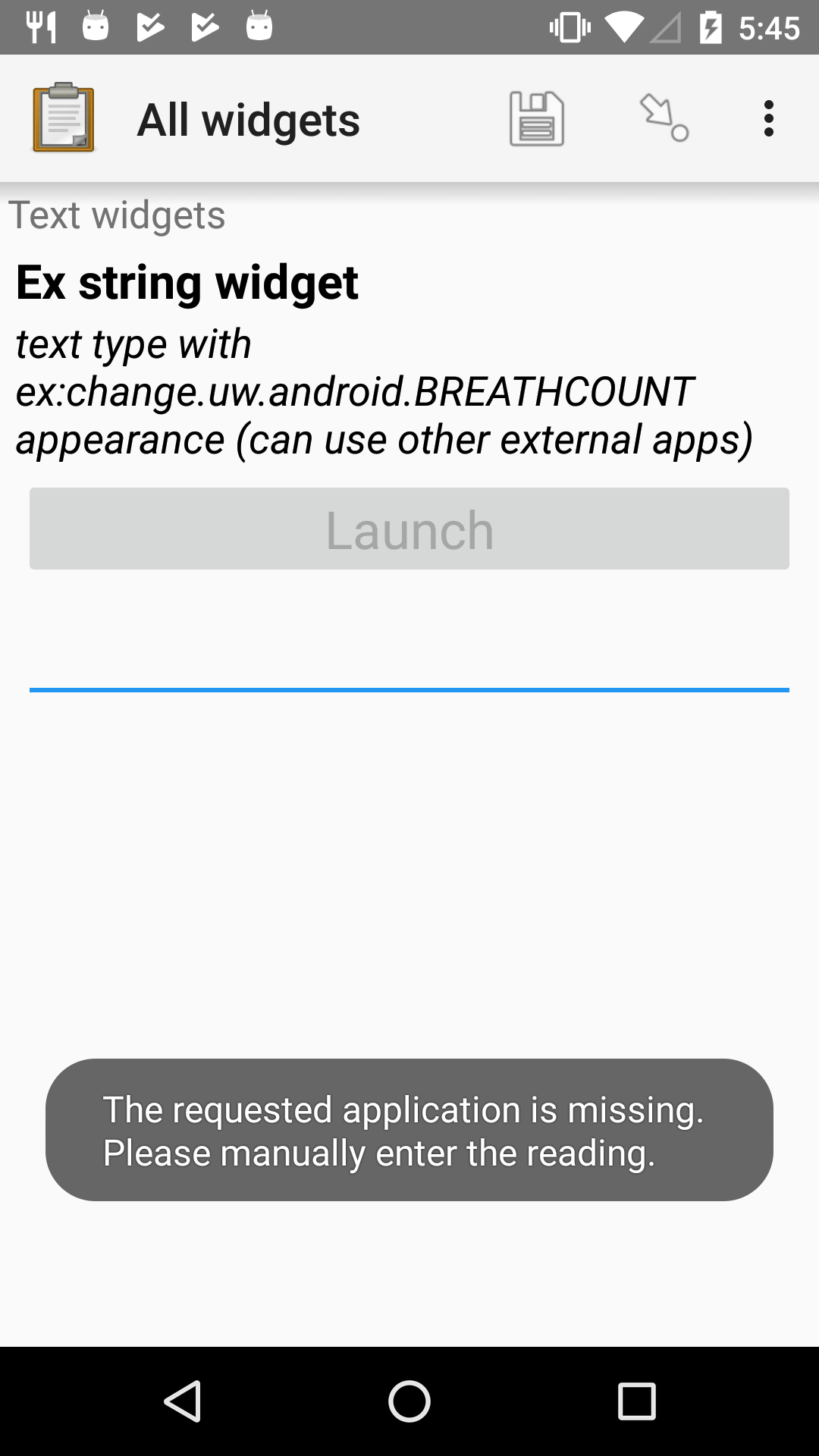
XLSForm
type |
name |
label |
appearance |
hint |
|---|---|---|---|---|
text |
ex_string_widget |
Ex string widget |
ex:change.uw.android.BREATHCOUNT |
text type with ex:change.uw.android.BREATHCOUNT appearance (can use other external apps) |
Hiding the received value
By default, the received value is shown below the widget button. In some cases, the raw received value is not helpful to display. For example, it may be very long or may represent a list of values. In that case, you can use the hidden-answer appearance. We generally recommend putting this question in a field-list to provide some useful feedback about the received value.
XLSForm
type |
name |
label |
appearance |
hint |
|---|---|---|---|---|
text |
ex_string_widget |
Ex string widget |
ex:change.uw.android.BREATHCOUNT hidden-answer |
text type with ex:change.uw.android.BREATHCOUNT hidden-answer appearance (can use other external apps) |
Masking the entered value
- type
text- appearance
masked
If masked is added to appearance, the answers will be obscured with dots similar to password-protected fields. This can be used to hide input as it is being entered but it does not provide any security measures beyond that.
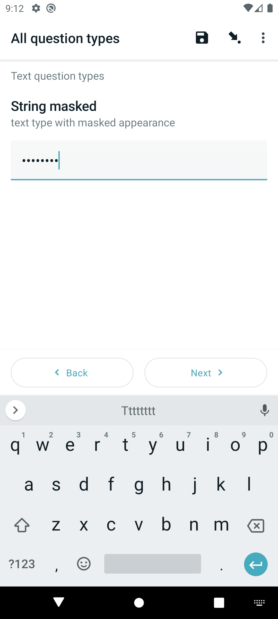
XLSForm
type |
name |
label |
hint |
appearance |
|---|---|---|---|---|
text |
string_masked |
String masked |
text type with masked appearance |
masked |
Warning
Answers will remain masked within questions utilizing this appearance, as well as in the summary screen. However, if referenced in labels or calculations, they will be accessible and displayed like any other values, without any protective measures.
Warning
It's only possible to mask answers in Default text widget. It will not work with Number text widget or Number widgets.
Number widgets
Number widgets collect and store number inputs — either integers or floating-point decimals.
Number values can also be captured by the Range widgets.
Integer widget
- type
integer- appearance
none
A whole number entry input.
Integer widgets will not accept decimal points, and the entry field has a limit of nine digits. If you need numbers larger than nine digits, see the Number text widget.
The integer widget supports:
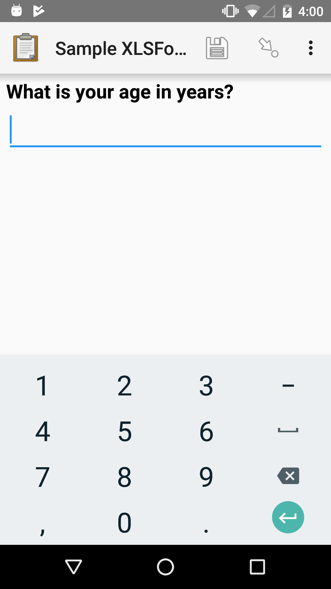
XLSForm
type |
name |
label |
|---|---|---|
integer |
age |
What is your age in years? |
Decimal widget
- type
decimal- appearance
none
A numeric input that will accept decimal points.
Decimal number entry is capped at 15 characters (14 digits and a decimal point). If you need numbers larger than 15 digits, see the Number text widget.
The decimal widget supports:
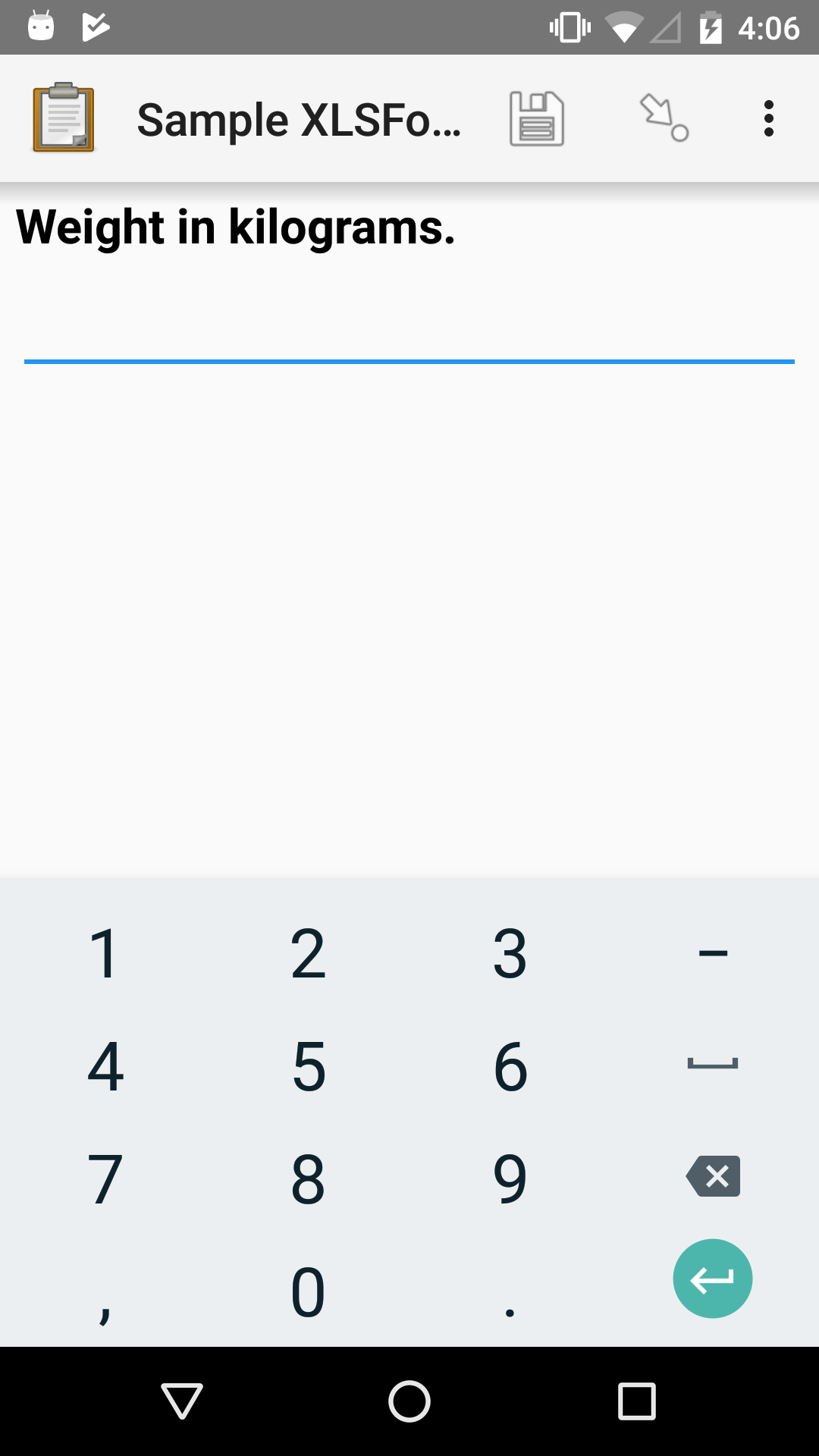
XLSForm
type |
name |
label |
|---|---|---|
decimal |
weight |
Weight in kilograms. |
Number widget appearance options
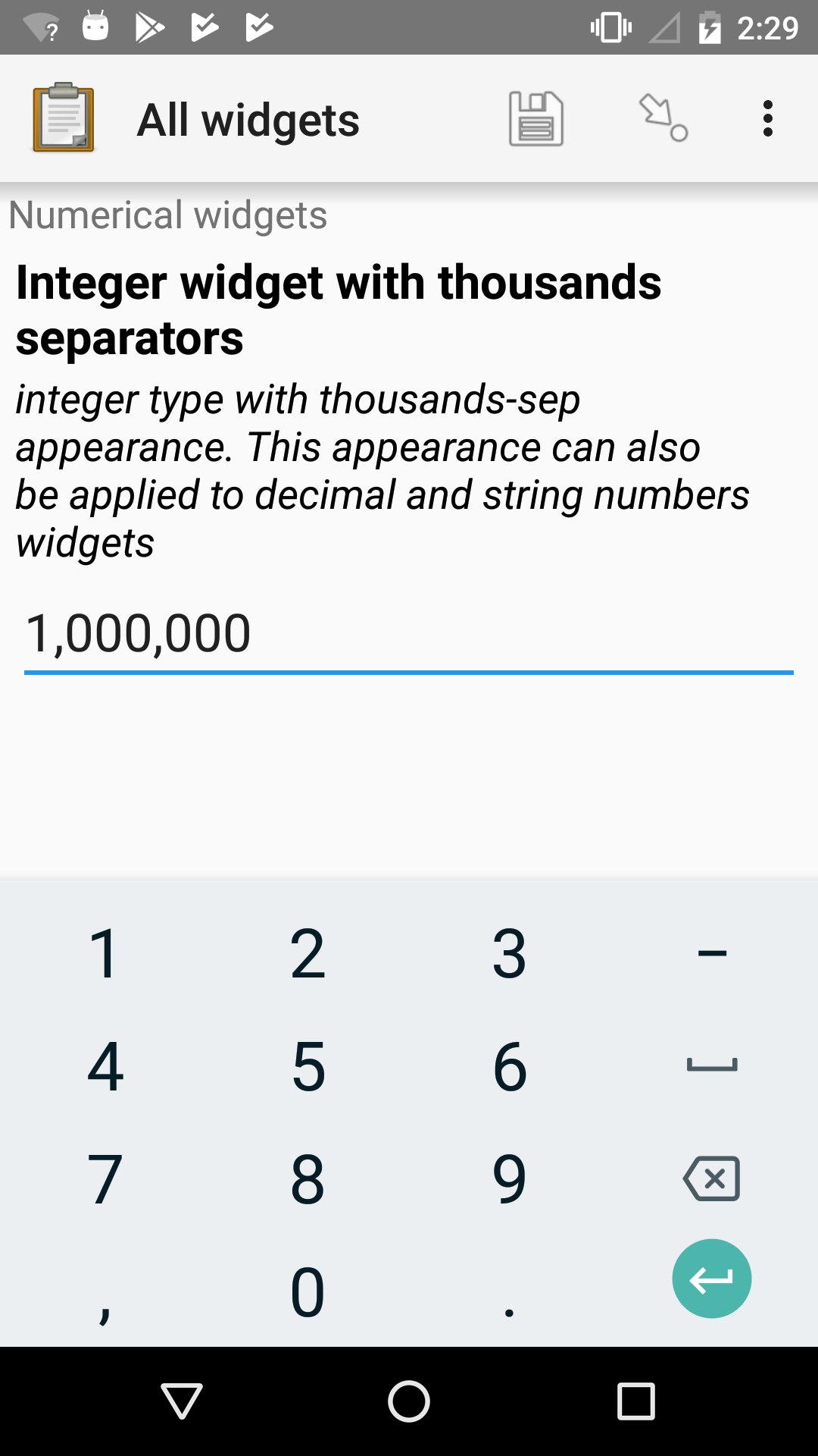
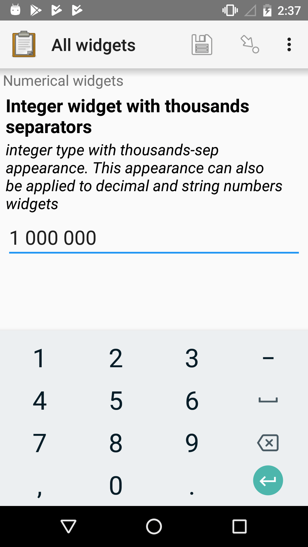
Thousands separator
- type
integer,decimal, (text)- appearance
thousands-sep, (numbers)
If thousands-sep is added to appearance,
integer,
decimal,
and number text widgets
will display their values using locale-specific thousands separators.
Note
For locales that use the point separator (.),
a space is used instead.
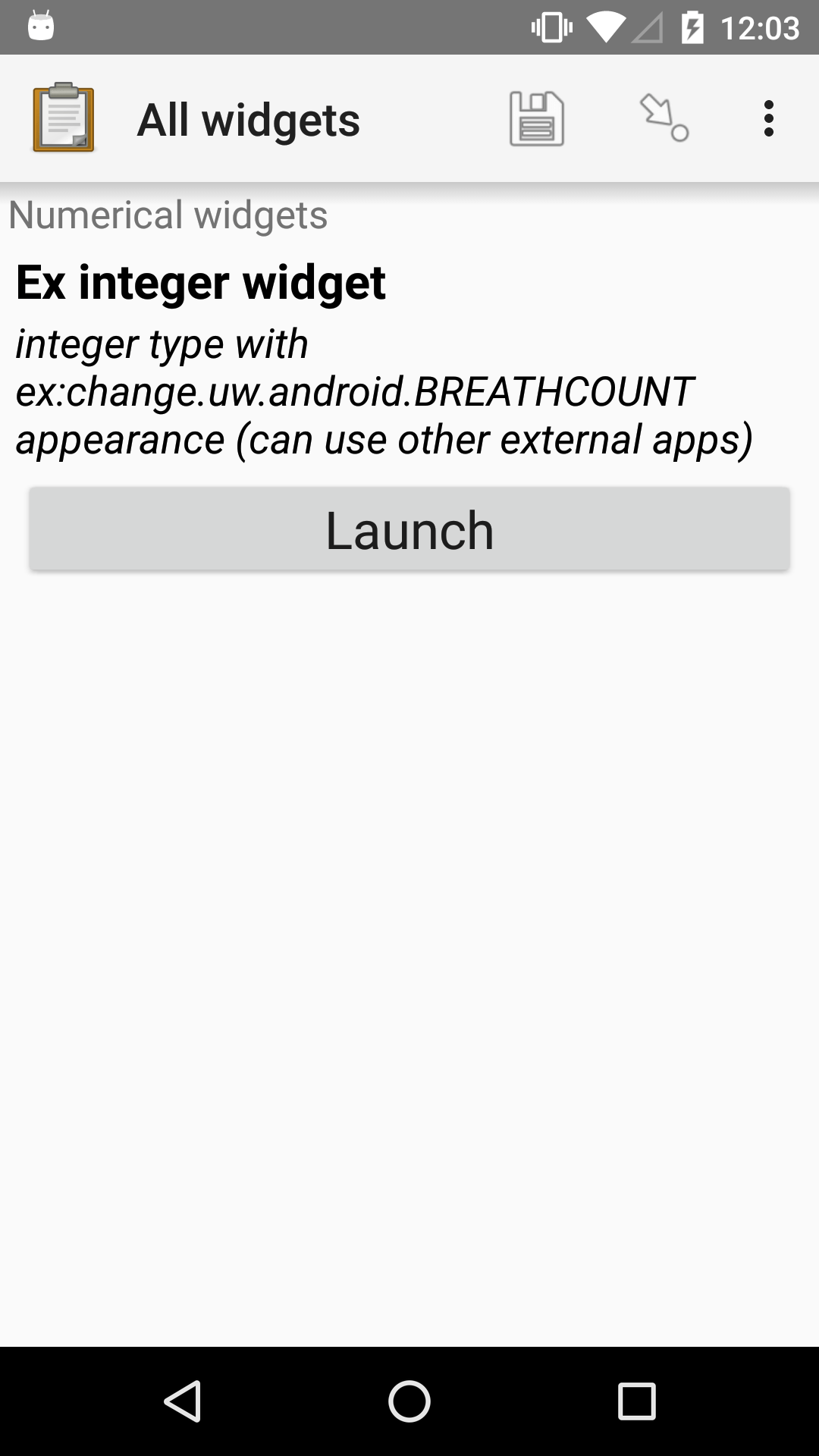
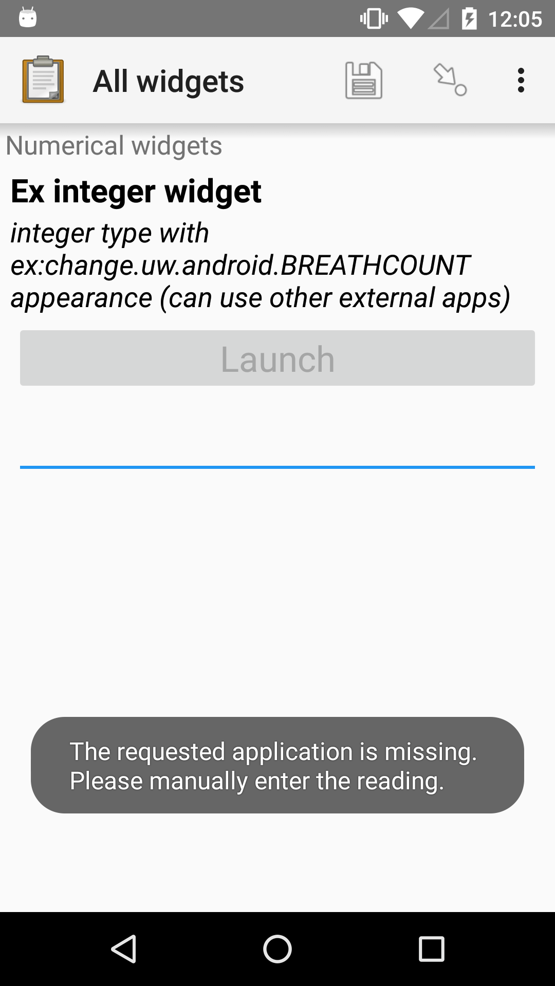
Number from an external app
- type
integer,decimal- appearance
ex:*
By specifying an external app in the appearance,
your form can launches an external app and receive a number
(integer or decimal)
from the external app as input.
If the specified external app is not available,
a manual input is prompted.
See also
XLSForm
type |
name |
label |
appearance |
hint |
|---|---|---|---|---|
integer |
ex_integer_widget |
Ex integer widget |
ex:change.uw.android.BREATHCOUNT |
integer type with ex:change.uw.android.BREATHCOUNT appearance (can use other external apps) |
Counter
- type
integer- appearance
counter
The counter appearance allows users to increase a count by one with each click, making it ideal for tracking occurrences, items, or any sequential tallies. Negative numbers are not supported, so the count starts at zero and only increments upwards. It works exclusively with integers, and decimal values are not supported.
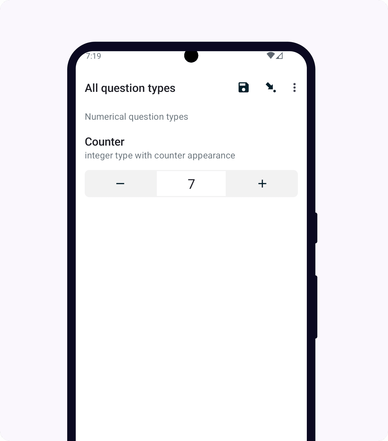
XLSForm
type |
name |
label |
hint |
appearance |
|---|---|---|---|---|
integer |
counter |
Counter |
integer type with counter appearance |
counter |
Date and time widgets
Default date widget
- type
date- appearance
none
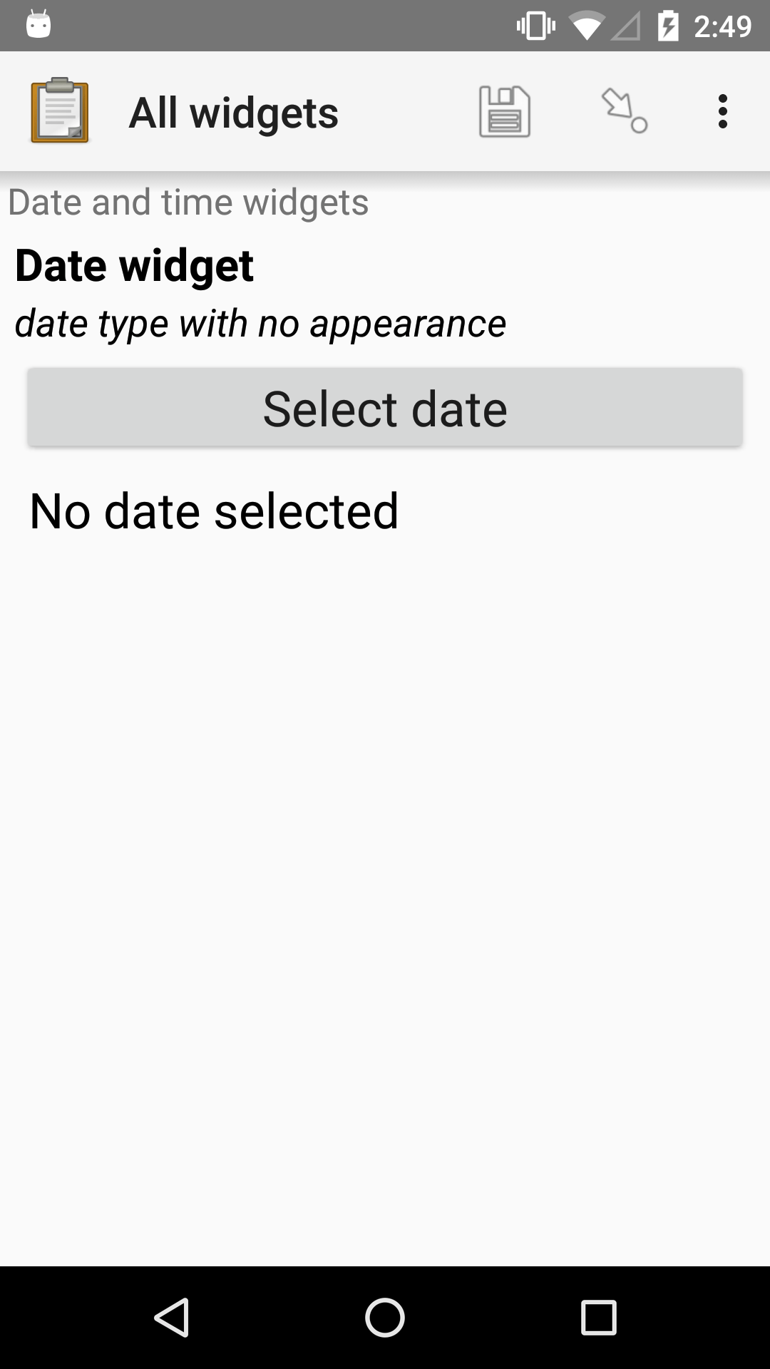
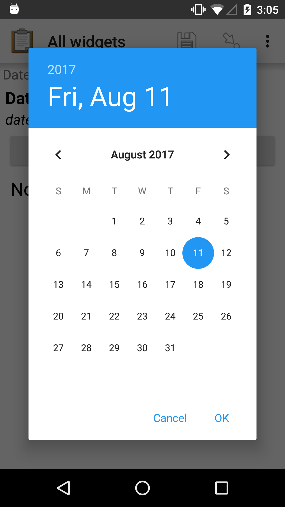
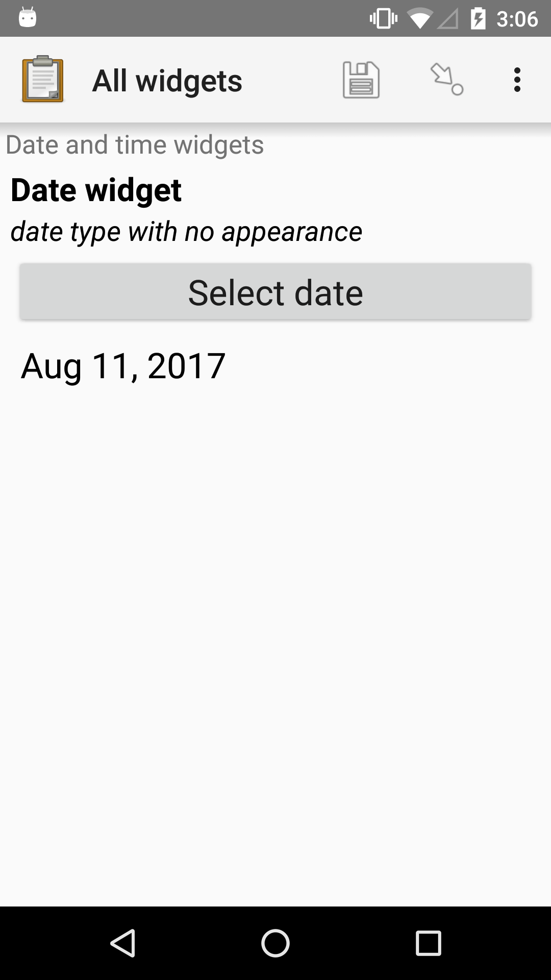
XLSForm
type |
name |
label |
hint |
|---|---|---|---|
date |
date_widget |
Date widget |
date type with no appearance |
Date widget with spinner input
- type
date- appearance
no-calendar
The no-calendar appearance displays a spinner-style date selection. This is especially appropriate for selecting dates more than one year in the past or future.
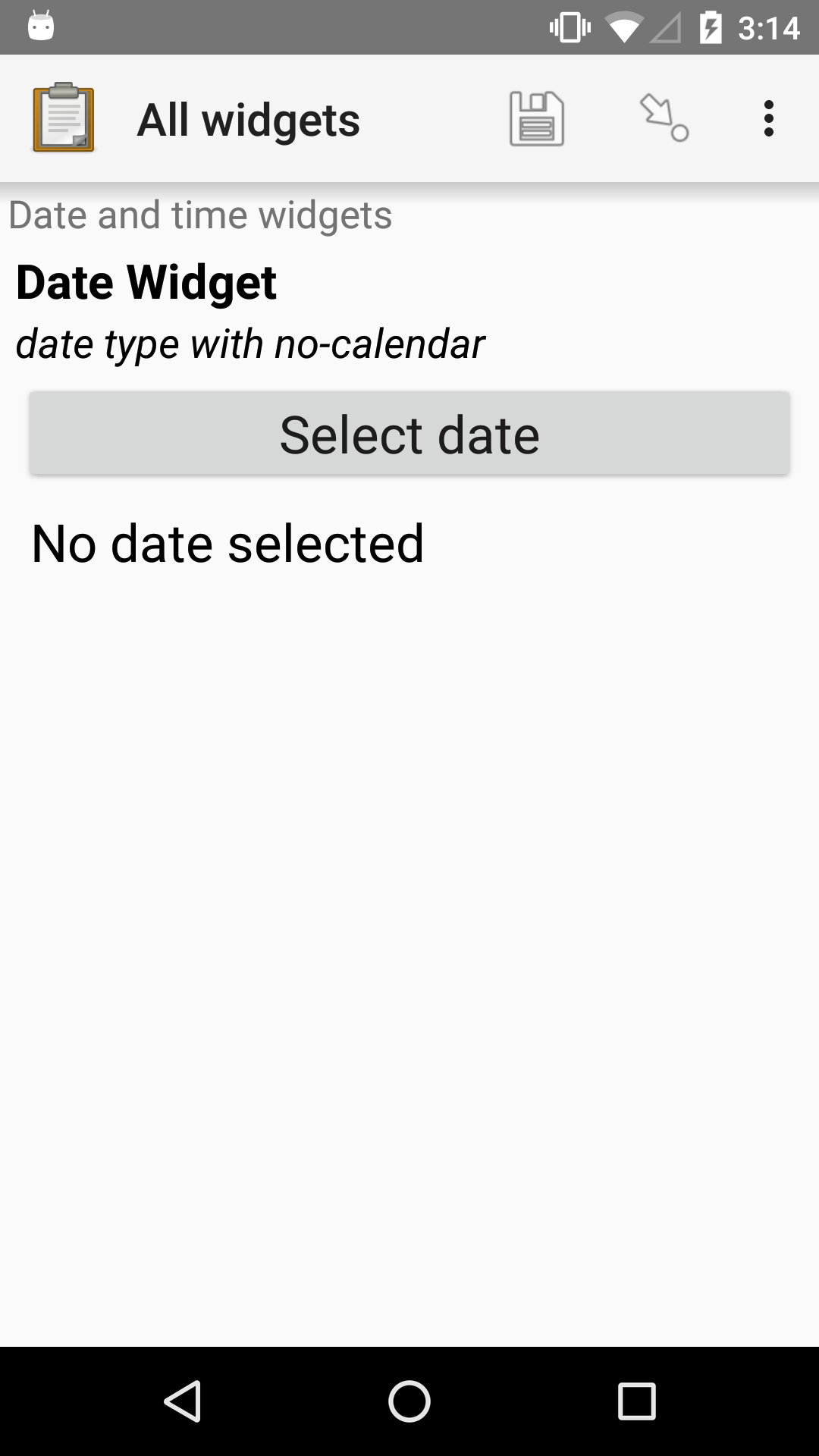
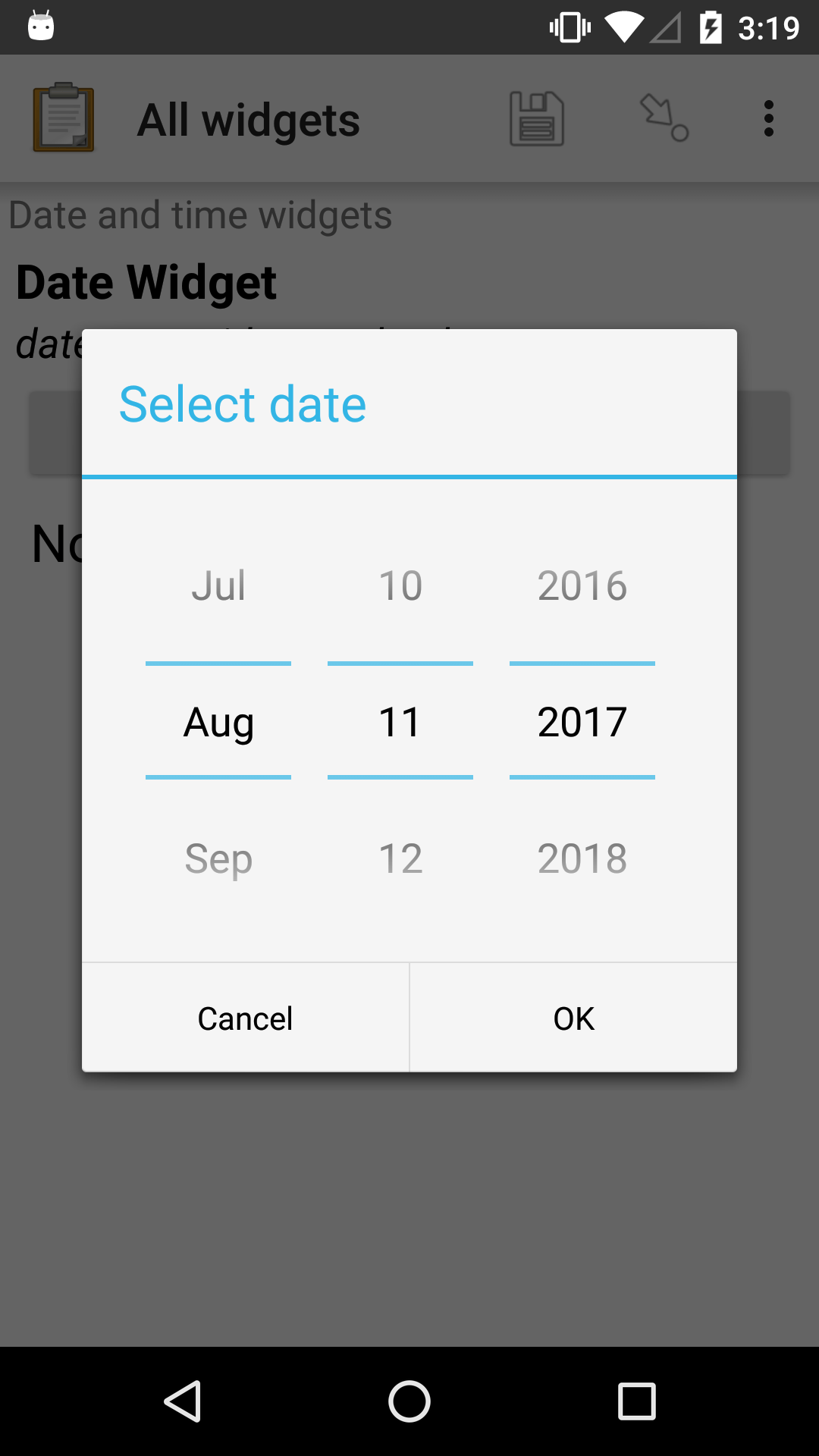
XLSForm
type |
name |
label |
appearance |
hint |
|---|---|---|---|---|
date |
date_widget_nocalendar |
Date Widget |
no-calendar |
date type with no-calendar appearance |
Month and year only
- type
date- appearance
month-year
Collects only a month and year.
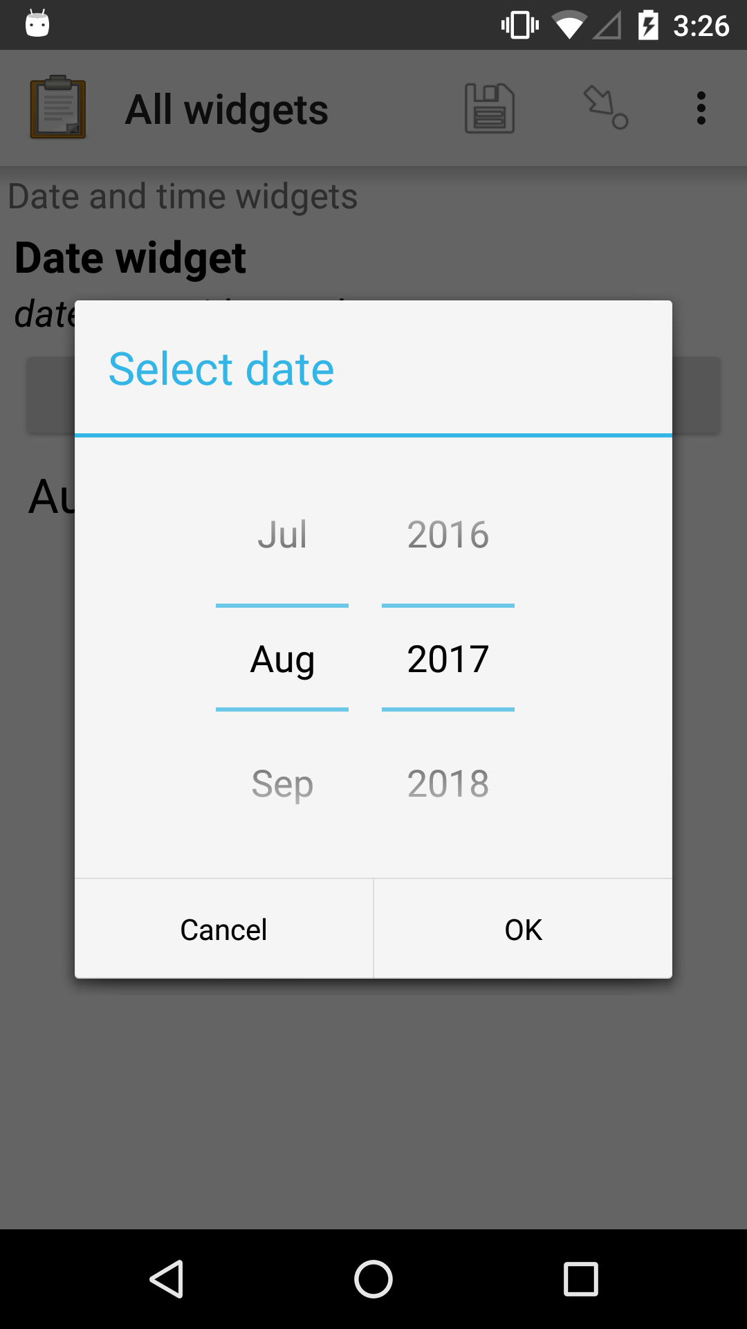
XLSForm
type |
name |
label |
appearance |
hint |
|---|---|---|---|---|
date |
date_widget_month_year |
Date widget |
month-year |
date type with month-year appearance |
Year only
- type
date- appearance
year
Collects only a year.
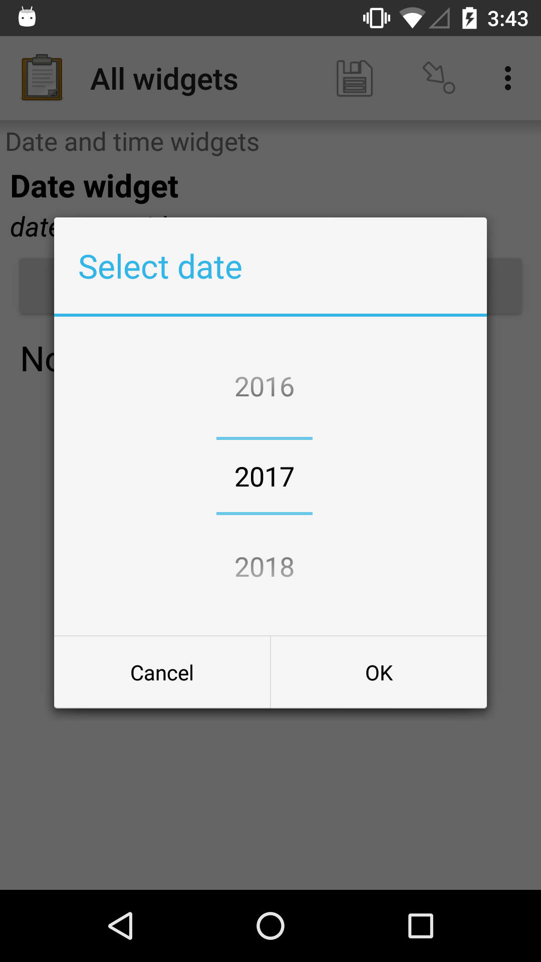
XLSForm
type |
name |
label |
appearance |
hint |
|---|---|---|---|---|
date |
date_widget_year |
Date widget |
year |
date type with year appearance |
Date widgets with non-Gregorian calendars
Collect supports several non-Gregorian calendars.
Note
The non-Gregorian calendar is used only on input. The dates are converted and stored as standard Gregorian dates
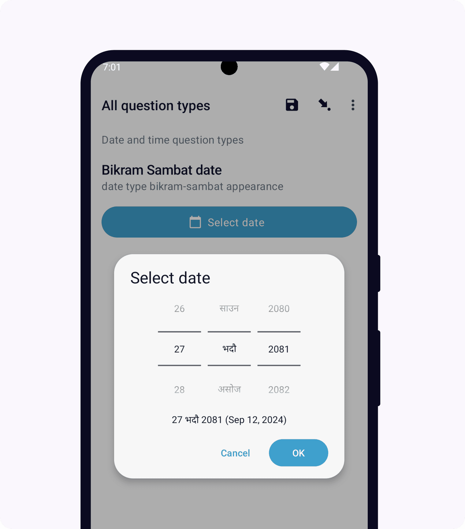
Bikram Sambat calendar
- type
date- appearance
bikram-sambat
Buddhist calendar
- type
date- appearance
buddhist

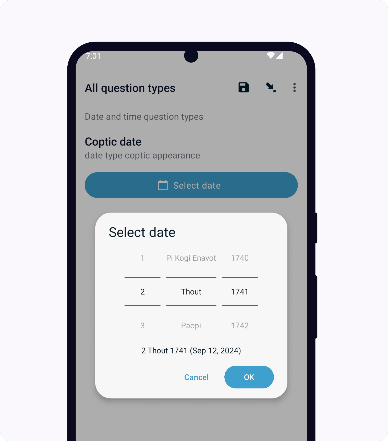
Coptic calendar
- type
date- appearance
coptic
Ethiopian calendar
- type
date- appearance
ethiopian

Islamic calendar
- type
date- appearance
islamic

Myanmar calendar
- type
date- appearance
myanmar

Persian calendar
- type
date- appearance
persian

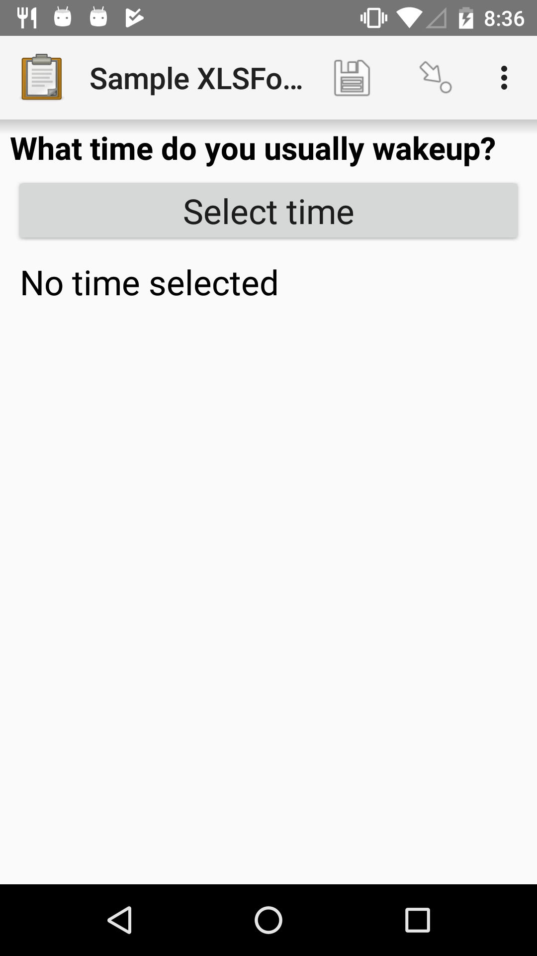
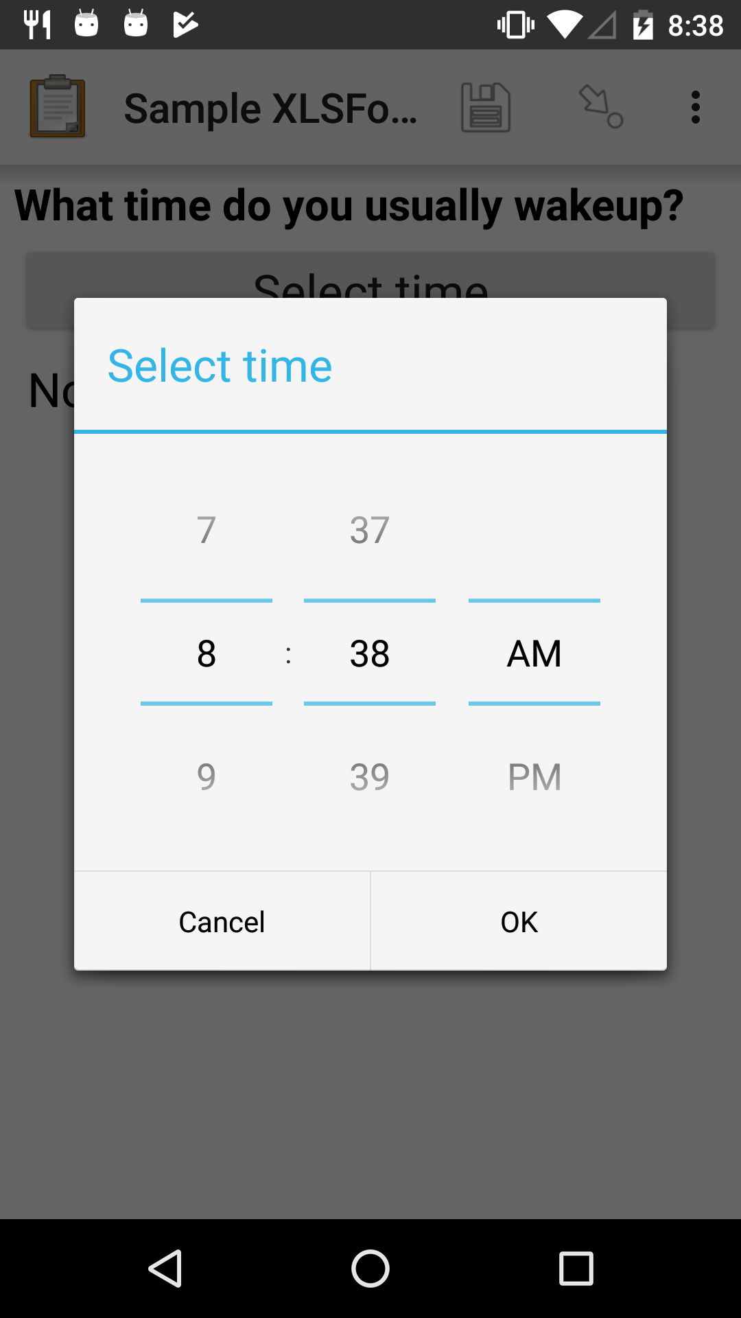
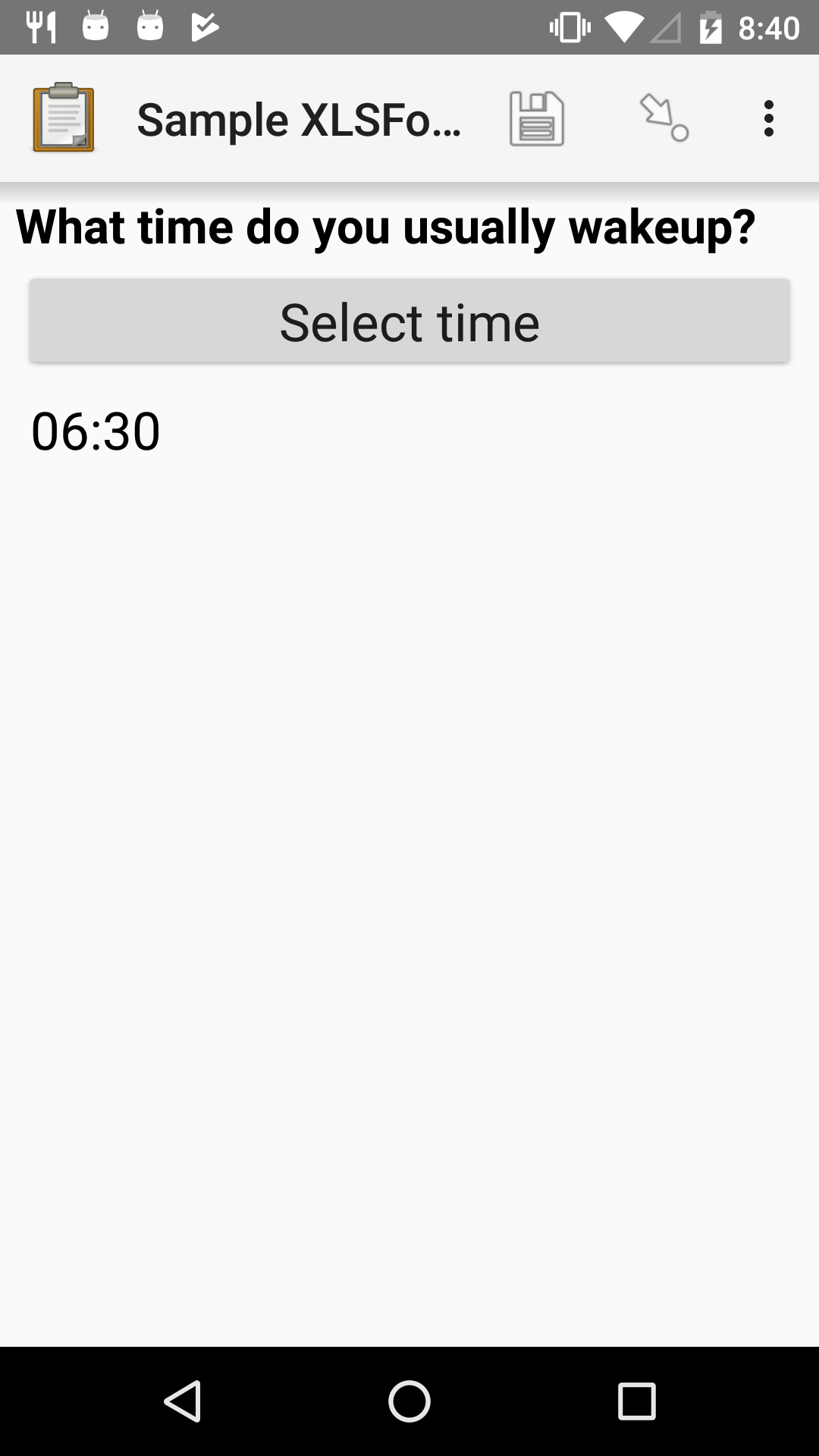
Time widget
- type
time- appearance
none
A time selector. Captures only a specific time-of-day, not a date and time. For date and time, see the Datetime widget.
The time widget does not accept any appearance attributes.
Note
The time widget stores the time along with a time zone. This can cause unexpected behavior around Daylight saving time.
For example, if you record a time before the clock change, and then view the time after the clock change, it will appear to be an hour off. This happens because the recorded time data is understood as a specific moment in time that is being "translated" into your current, local time zone.
A similar problem occurs when moving between geographic time zones.
This makes the time widget unsuitable for abstract time-of-day questions such as What time do you usually wake up? For questions like this, you may want to use a Minimal select widget. You can set the options at whatever level of accuracy you need — for example, 15 or 30 minute increments. Alternatively, you could use the select widget for hours, and an Integer widget for minutes.
XLSForm
type |
name |
label |
|---|---|---|
time |
wakeup |
What time do you usually wakeup? |
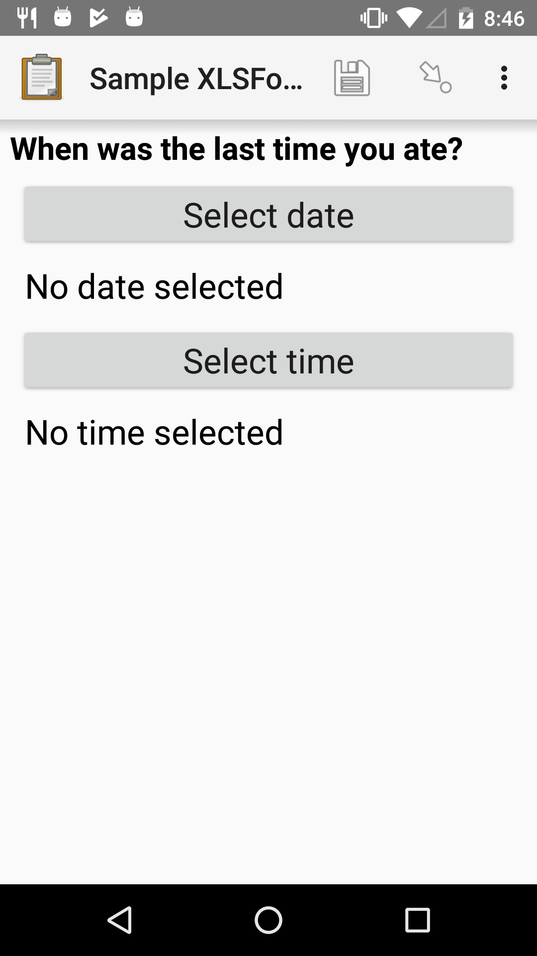
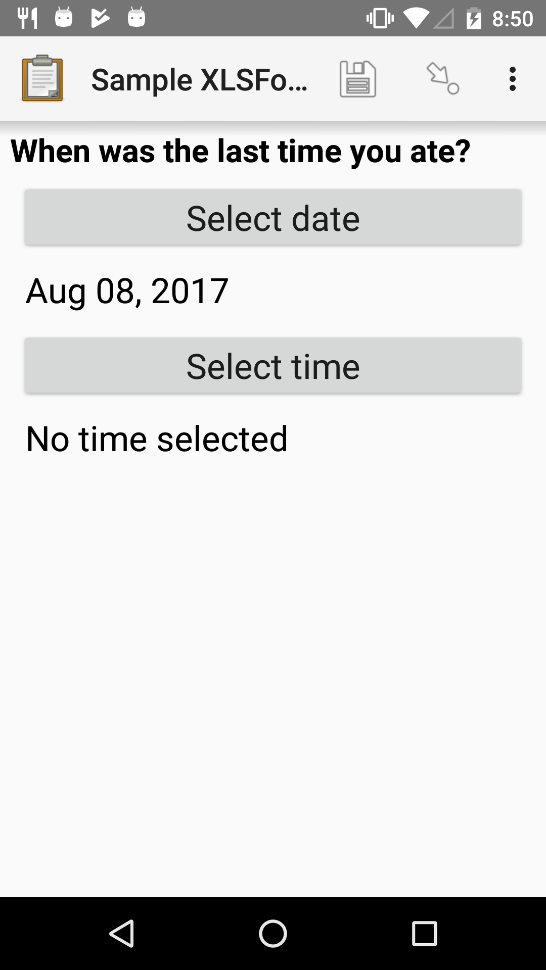
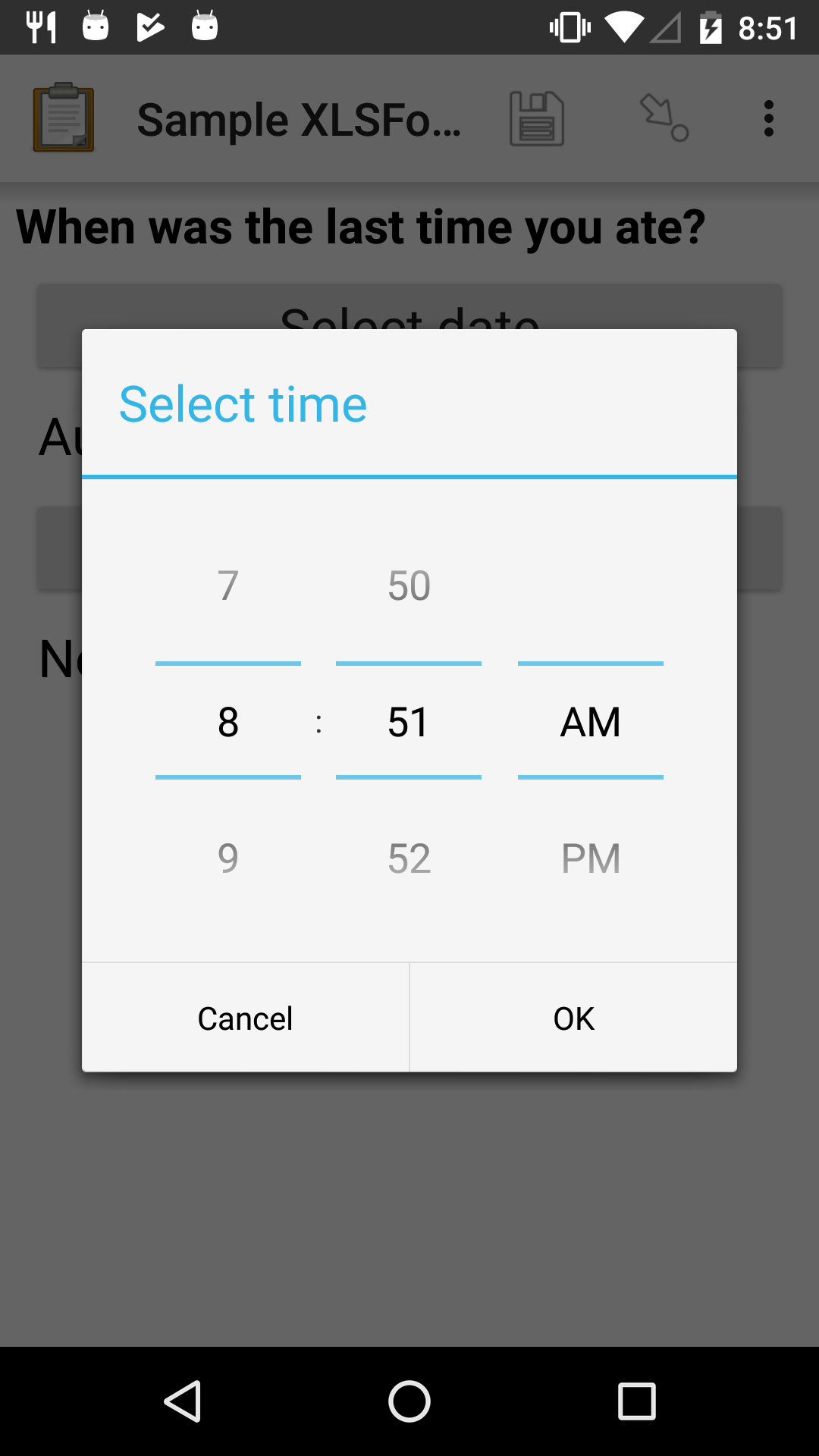
Datetime widget
A date and time selector.
For date only, see Default date widget. For time only, see Time widget.
XLSForm
type |
name |
label |
|---|---|---|
dateTime |
previous_meal |
When was the last time you ate? |
Note
The Datetime widget supports the no-calendar spinner-style appearance.
Select widgets
Select widgets display choices to pick from. Single selects allow selecting a single choice, and multi selects allow selecting multiple choices.
The choices for a select question can be included on a sheet named choices directly in an XLSForm or attached as an external dataset.
The order of the choices can be randomized for any of the select types described below. The list of choices available can also be filtered based on answers to previous questions. Selects from internal datasets can include images as choices.
Selects can be displayed in different ways using appearances.
The choices sheet for defining internal datasets has at least three columns:
list_nameA set of choices for a single question share a common
list_name. The value oflist_nameis included in thetypecolumn on the survey sheet.nameThe identifier for a specific choice. This value is what is stored on the completed form. If you refer to a select response using a variable, the
namestring is returned.As in the survey sheet, the
namefor a choice must not include spaces.labelThe user-facing text displayed for the choice.
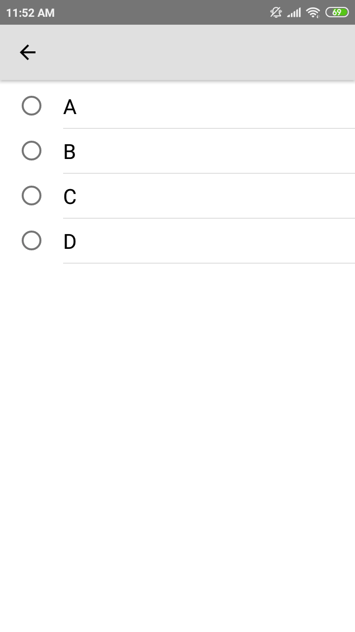
Single select widget
- type
select_one {list_name}
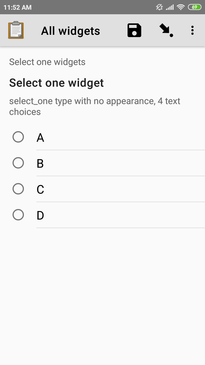
XLSForm
type |
name |
label |
hint |
|---|---|---|---|
select_one opt_abcd |
select_one_widget |
Select one widget |
select_one type with no appearance, 4 text choices |
list_name |
name |
label |
|---|---|---|
opt_abcd |
a |
A |
opt_abcd |
b |
B |
opt_abcd |
c |
C |
opt_abcd |
d |
D |
Multi select widget
- type
select_multiple {list_name}- appearance
none
Multi select questions allow selecting multiple answers. The response for the question will be the space-separated choices made by the user, in the order that they were selected.
Note
The multi select widget supports
all of the same appearance attributes
as the Single select widget excluding the quick appearance.
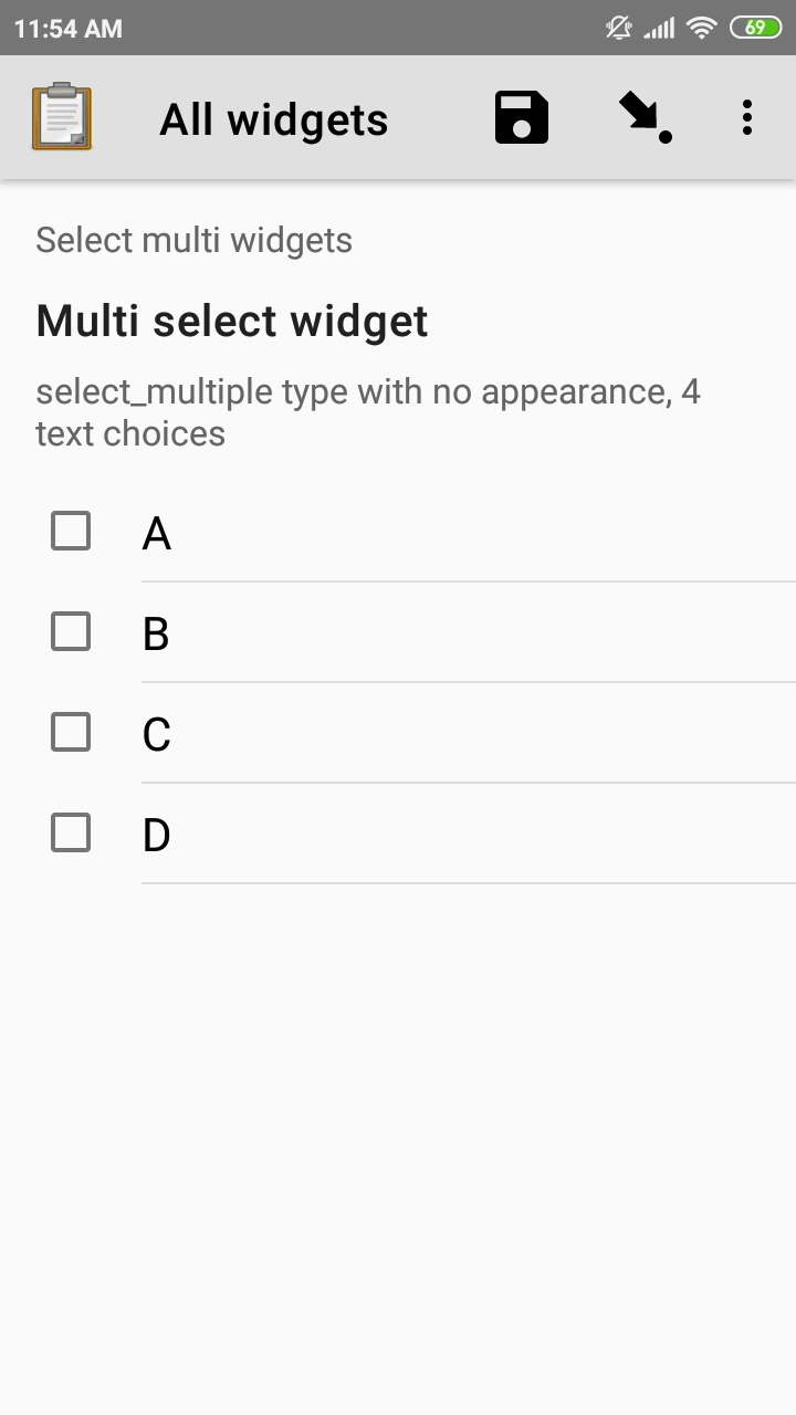
XLSForm
type |
name |
label |
hint |
|---|---|---|---|
select_multiple opt_abcd |
select_multi_widget |
Multi select widget |
select_multiple type with no appearance, 4 text choices |
list_name |
name |
label |
image |
|---|---|---|---|
opt_abcd |
a |
A |
|
opt_abcd |
b |
B |
|
opt_abcd |
c |
C |
|
opt_abcd |
d |
D |
Select from external dataset
Data files in CSV, GeoJSON or XML format can be attached to form definitions. These external datasets can be used as data sources for selects. The question type for single selection is select_one_from_file and for multiple selection, it is select_multiple_from_file. The full filename of the dataset including the extension goes after the type.
Selects from external datasets can be used in all the same ways as internal selects. For example, they can be displayed differently using appearances or filtered using choice filters.
- type
select_one_from_file {file.extension}
XLSForm
type |
name |
label |
|---|---|---|
select_one_from_file hospitals.csv |
hospital |
Select hospital |
name |
label |
|---|---|
hospital_a |
Hospital A |
hospital_b |
Hospital B |
hospital_c |
Hospital C |
hospital_d |
Hospital D |
Customizing the label and value
When using an external dataset as a data source for a select, the underlying value for each choice comes from:
CSV file: the
namecolumnGeoJSON file: the
idtop-level element if it exists or theidproperty as a fallbackXML file: the
namechild element
The label for each choice comes from:
CSV file: the
labelcolumnGeoJSON file: the
titleproperty (follows the GeoJSON simplestyle specification)XML file: the
labelchild element
In some cases, it may not be convenient to rename your columns to match these defaults. If you have a dataset from another source and different column names, you can use the parameters column in your XLSForm to specify which columns to use.
For example, to use feature_id for the underlying value and human_name for the label:
XLSForm
type |
name |
label |
parameters |
|---|---|---|---|
select_one_from_file hospitals.csv |
hospital |
Select hospital |
value=feature_id,label=human_name |
feature_id |
human_name |
|---|---|
hospital_a |
Hospital A |
hospital_b |
Hospital B |
Select appearances
Selects can be styled in various ways using the appearance column in an XLSForm. Unless otherwise indicated, the appearances described below can combine with single or multiple selects with either internal or external data sources.
Minimal select widget
- type
select_one {list_name}- appearance
minimal
Adding the minimal appearance shows the choices in a compact way. This is particularly helpful when the list of choices is long and the select question is displayed on the same screen as other questions. It is often combined with the search appearance.
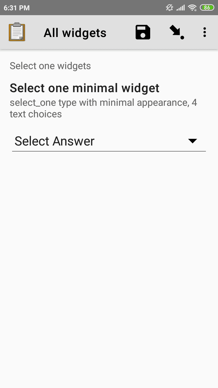
XLSForm
type |
name |
label |
appearance |
hint |
|---|---|---|---|---|
select_one opt_abcd |
select_widget |
Select widget |
minimal |
select_one type with minimal appearance, 4 text choices |
list_name |
name |
label |
|---|---|---|
opt_abcd |
a |
A |
opt_abcd |
b |
B |
opt_abcd |
c |
C |
opt_abcd |
d |
D |
Select widget with autoadvance
- type
select_one {list_name}- appearance
quick
When the quick appearance is added,
the form advances immediately to the next question
once a selection is made.
Note
The quick appearance can only be used with single selection.
XLSForm
type |
name |
label |
appearance |
hint |
|---|---|---|---|---|
select_one opt_abcd |
select_one_autoadvance_widget |
Select one autoadvance widget |
quick |
select_one type with quick appearance, 4 text choices |
list_name |
name |
label |
|---|---|---|
opt_abcd |
a |
A |
opt_abcd |
b |
B |
opt_abcd |
c |
C |
opt_abcd |
d |
D |
Select widget with search
- type
select_one {list_name}- appearance
search
The search appearance allows the enumerator to filter the list of available choices based on their label. The filtering is case-insensitive and matches any subset of the label text.
Note
autocomplete is an alias for search and can be used to serve the same purpose, but search is now the recommended option because it is more intuitive.
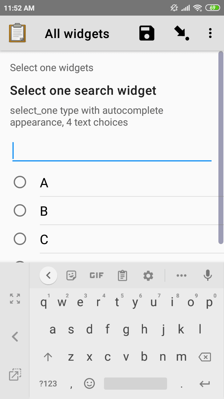
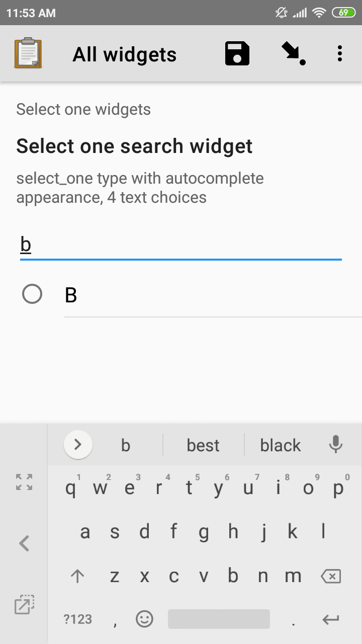
XLSForm
type |
name |
label |
appearance |
hint |
|---|---|---|---|---|
select_one opt_abcd |
select_one_search_widget |
Select one widget |
search |
select_one type with search appearance, 4 text choices |
list_name |
name |
label |
|---|---|---|
opt_abcd |
a |
A |
opt_abcd |
b |
B |
opt_abcd |
c |
C |
opt_abcd |
d |
D |
Select widget with columns-pack appearance
- type
select_one {list_name}- appearance
columns-pack
When the columns-pack appearance is added, the app tries to accommodate as many choices in a single line as possible. If the choice labels have different lengths, they will not be in even columns.
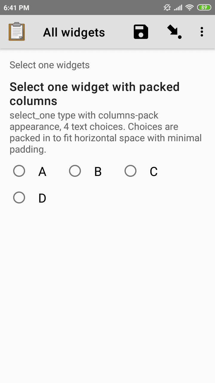
XLSForm
type |
name |
label |
appearance |
hint |
|---|---|---|---|---|
select_one opt_abcd |
select_widget |
Select one widget |
columns-pack |
select_one type with columns-pack appearance, 4 text choices |
list_name |
name |
label |
|---|---|---|
opt_abcd |
a |
A |
opt_abcd |
b |
B |
opt_abcd |
c |
C |
opt_abcd |
d |
D |
Select widget with columns appearance
- type
select_one {list_name}- appearance
columns
When the columns appearance is added, the app puts choices in 2, 3, 4 or 5 columns depending on the screen size.
Select widgets support image choices.
The images are referenced in the choices sheet,
and the image files
need to be included in the media folder.
See Including media files in choices to learn more about including images in surveys.
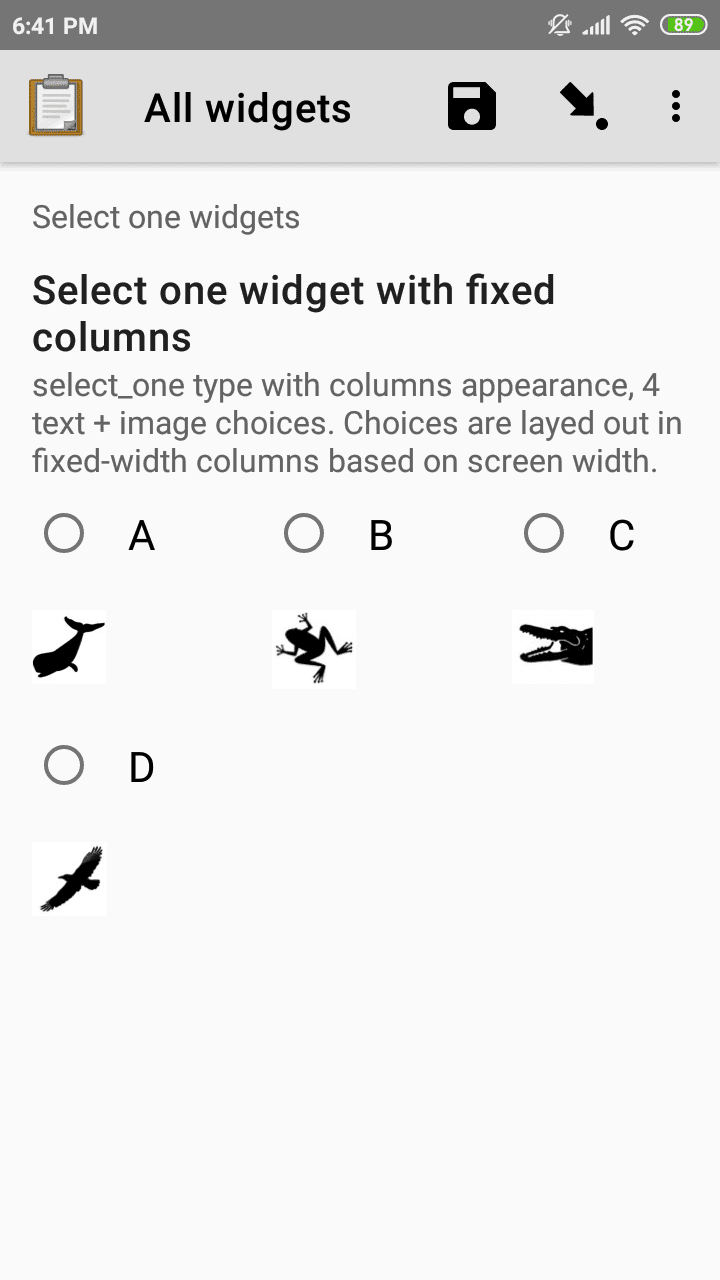
XLSForm
type |
name |
label |
appearance |
hint |
|---|---|---|---|---|
select_one abcd_icon |
select_widget |
Select one widget |
columns |
select_one type with columns appearance, 4 text + image choices |
list_name |
name |
label |
image |
|---|---|---|---|
abcd_icon |
a |
A |
a.jpg |
abcd_icon |
b |
B |
b.jpg |
abcd_icon |
c |
C |
c.jpg |
abcd_icon |
d |
D |
d.jpg |
Select widget with columns-n appearance
- type
select_one {list_name}- appearance
columns-n
When the columns-n appearance is added, the app puts choices in n columns.
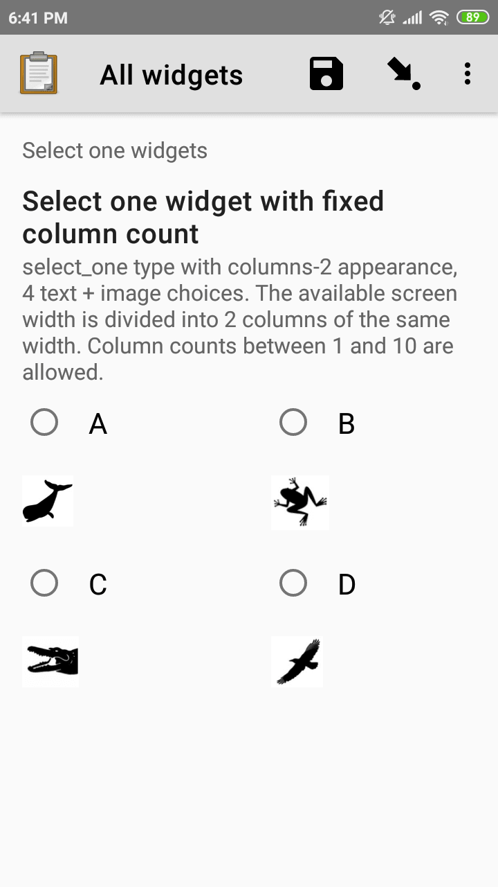
XLSForm
type |
name |
label |
appearance |
hint |
|---|---|---|---|---|
select_one abcd_icon |
select_widget |
Select one widget |
columns-2 |
select_one type with columns-2 appearance, 4 text + image choices |
list_name |
name |
label |
image |
|---|---|---|---|
abcd_icon |
a |
A |
a.jpg |
abcd_icon |
b |
B |
b.jpg |
abcd_icon |
c |
C |
c.jpg |
abcd_icon |
d |
D |
d.jpg |
Select widget with no-buttons appearance
- type
select_one {list_name}- appearance
no-buttons
When the no-buttons appearance is added, the app displays choices without the selection radio button. If images are specified for choices, only the images are displayed. This is particularly useful for building a grid of images.

XLSForm
type |
name |
label |
appearance |
hint |
|---|---|---|---|---|
select_one abcd_icon |
select_widget |
Select one widget |
columns-pack no-buttons |
select_one type with columns-pack no-buttons appearance, 4 image choices |
list_name |
name |
label |
image |
|---|---|---|---|
abcd_icon |
a |
A |
a.jpg |
abcd_icon |
b |
B |
b.jpg |
abcd_icon |
c |
C |
c.jpg |
abcd_icon |
d |
D |
d.jpg |
Likert widget
- type
select_one {list_name}- appearance
likert
A single-select question can be styled as a Likert scale. Options can include text, images or both. If both are provided, images appear above text.
If adding images, note that the images are referenced in the choices sheet, and the image files need to be included in the media folder. See Including media files in choices to learn more about including images in choices.
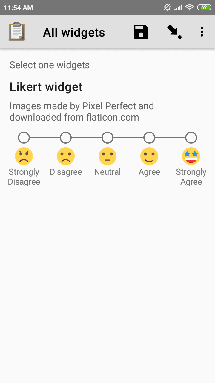
XLSForm
type |
name |
label |
appearance |
hint |
|---|---|---|---|---|
select_one likert |
likert_widget |
Likert Widget |
likert |
select_one type with Likert appearance, 5 image choices (strongly_disagree.jpg, disagree.jpg, neutral.jpg, agree.jpg, strongly_agree.jpg) |
list_name |
name |
label |
image |
|---|---|---|---|
likert_widget |
strongly_disagree |
Strongly Disagree |
strongly_disagree.jpg |
likert_widget |
disagree |
Disagree |
disagree.jpg |
likert_widget |
neutral |
Neutral |
neutral.jpg |
likert_widget |
agree |
Agree |
agree.jpg |
likert_widget |
strongly_agree |
Strongly Agree |
strongly_agree.jpg |
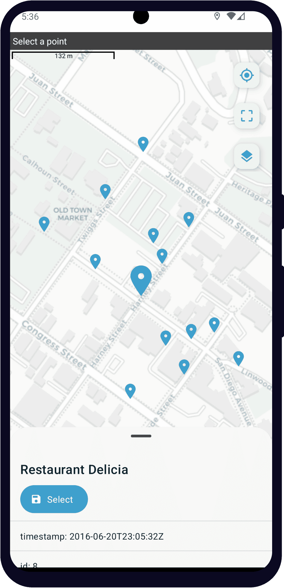
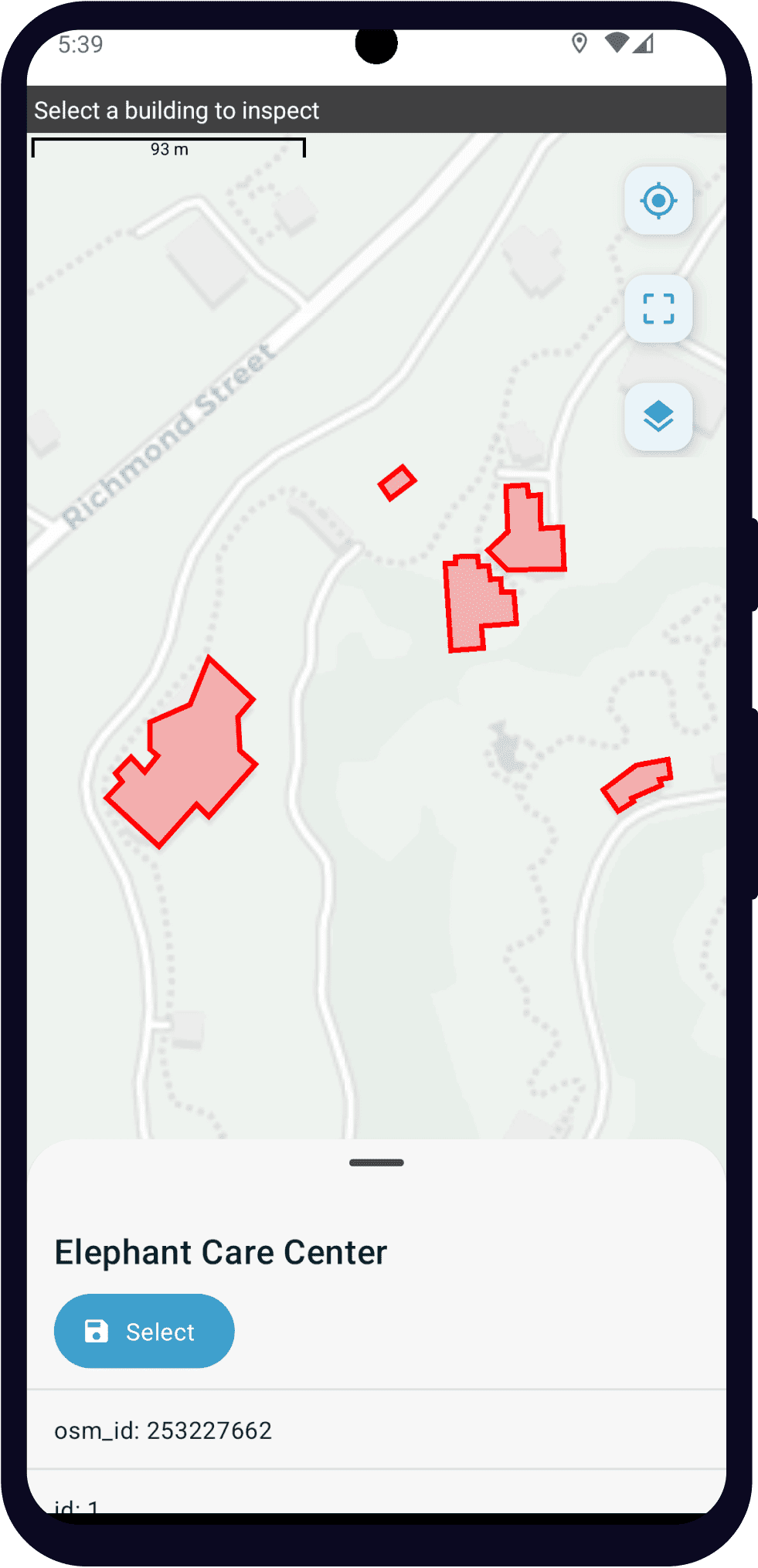
Select one from map widget
Added in version 2023.1.0: ODK Collect v2023.1.0
Added in version v2025.3: Web Forms in Central
- type
select_one {list_name}- appearance
map
Warning
The map appearance for selects is available in Web Forms (added in Central v2025.3) but not in Enketo. See more about the available features of select one from map in Web Forms and best practices here.
The different basemap sources currently have different performance. If Collect feels slow when creating the map or when selecting a choice, please describe what you are experiencing on the forum. If you have many choices to include on a map, try a provider other than Google or Mapbox. You can also use a choice filter to reduce the number of choices that get mapped.
Note
The only appearance that can combine with selection from map is quick.
If the choices that you want users to select from are locations, you can display them on a map. Each choice must have a geometry property that specifies the choice's geometry (see Specifying geometry for choices for details). A choice list can include a mix of points, lines and shapes.
Specifying geometry for choices
You can specify geometry for all choice sources:
If you specify choices in the form using the choices tab, add a
geometrycolumnIf you use an external CSV file and use
select_one_from_file, add ageometrycolumnUse a GeoJSON attachment and
select_one_from_file
For the first two options, geometry values must be specified in the ODK format. This makes it straightforward to use data previously collected by ODK as choices displayed on a map. You must make sure that the column containing the geometry to use for each choice has the name geometry.
Learn more about using GeoJSON attachments and see an example here.
Note
Choices with invalid geometries are silently ignored. There will be no message displayed to a user when it happens.
Select one from map behavior
When the map is first opened, it centers on the device's current location. There are buttons on the right to recenter on the current location and to show all available points.
Point choices are represented by map markers (). Tapping on a marker increases its size.
Line and polygon choices are represented by red lines. The inside of polygons is shaded red and can be tapped to select the polygon.
When a choice is selected, its properties are displayed at the bottom of the screen. Those properties are from:
additional columns when choices are specified the choices tab or an external CSV file
the
propertiesobject when choices are specified in a GeoJSON file
Under the choice label, there is a button to save the currently-selected feature to the form.
Choice properties
All of a choice's properties including geometry can be used in the rest of the form (see referencing values in datasets) including in choice filter expressions. Even if the choices are specified from a GeoJSON file, the geometry property is made available to the form in the ODK format, NOT as GeoJSON.
There are special properties that can be used to style different choices:
Points
marker-color: a valid long or short hex color representing the color of a marker (e.g.
#aacceeor#ace).marker-symbol: a single character displayed on a marker (e.g.
Aor7or🏥or🟢).
Lines
stroke: a valid long or short hex color representing the color of a line (e.g.
#aacceeor#ace).stroke-width: a floating-point number (greater than or equal to 0) representing the width of a line (e.g.
5or6.5).
Polygons
stroke: a valid long or short hex color representing the color of a polygon (e.g.
#aacceeor#ace).stroke-width: a floating-point number (greater than or equal to 0) representing the width of a polygon (e.g.
5or6.5).fill: a valid long or short hex color representing the interior color of a polygon (e.g.
#aacceeor#ace). It is displayed with transparency that can't be configured.
If your geospatial data comes from an external source, you can customize the label and underlying value.
If there is an offline layer specified, it will be displayed under the mapped choices.
Select from image widget
- type
select_one {list_name},select_multiple {list-name}- appearance
image-map
The image map widget displays an SVG image with selectable regions.
To make an image with selectable regions:
Create or edit an
.svgsource file. Includeidattributes on any elements you want to be selectable.In the choices tab of your XLSForm, put the value of the
idattributes in thenamecolumn. Add an appropriate human-friendlylabelto each choice.In the survey tab of your XLSForm, put the
.svgfile name in theimagecolumn.Include the
.svgfile in your form's media folder.
See also
- Inkscape
An open source vector graphics editor.
- SVG Documentation
From Mozilla Developer Network.
- Free SVG Files
From Wikimedia Commons.
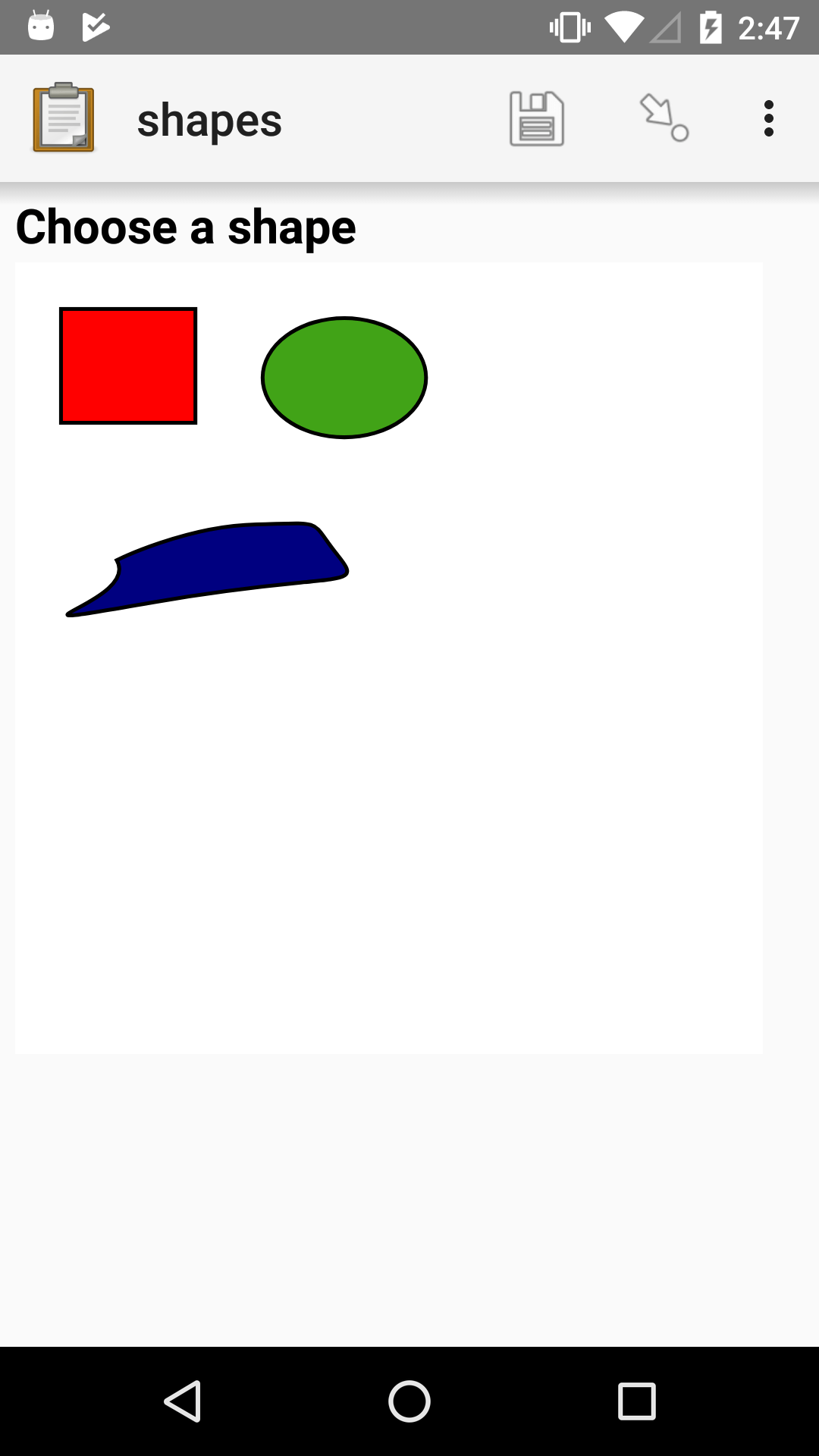
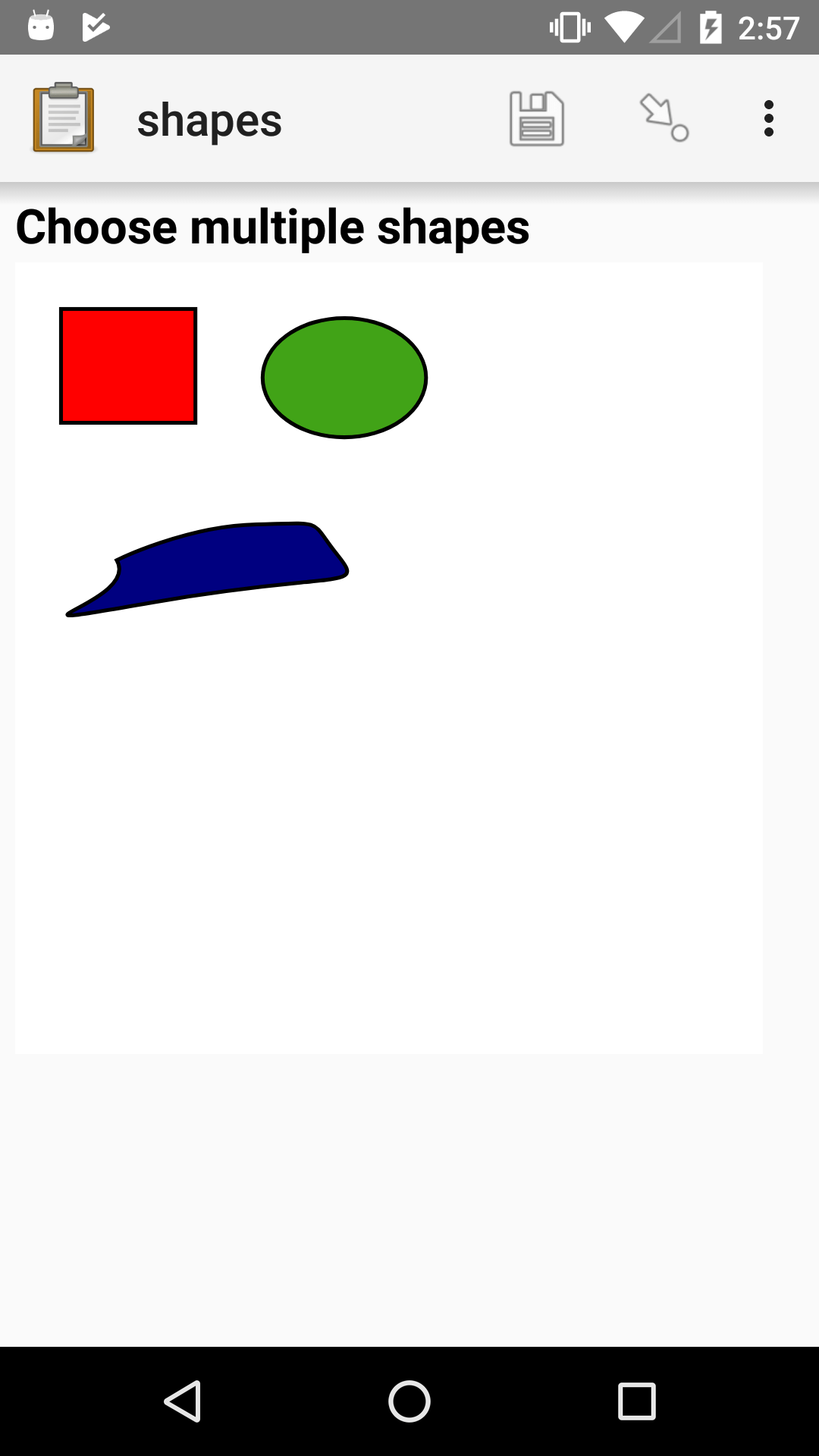
SVG
<svg width="640" height="480" xmlns="http://www.w3.org/2000/svg" xmlns:svg="http://www.w3.org/2000/svg">
  <title>shapes</title>
  <g>
    <title>Layer 1</title>
    <path id="path" fill="#000080" stroke="#000000" stroke-width="5" d="m125,382c33,56 -193,97 48,55c241,-42 279,-15 241,-62c-38,-47 -13,-42 -106,-40c-93,2 -183,47 -183,47z"/>
    <rect id="rect" fill="#FF0000" stroke="#000000" stroke-width="5" x="52" y="53" width="176" height="149"/>
    <ellipse id="ellipse" fill="#41A317" stroke="#000000" stroke-width="5" cx="423" cy="143" rx="107" ry="78"/>
  </g>
</svg>
XLSForm
type |
name |
label |
appearance |
image |
|---|---|---|---|---|
select_one shapes |
choose-shape |
Choose a shape |
image-map |
shapes.svg |
select_multiple shapes |
choose-shapes |
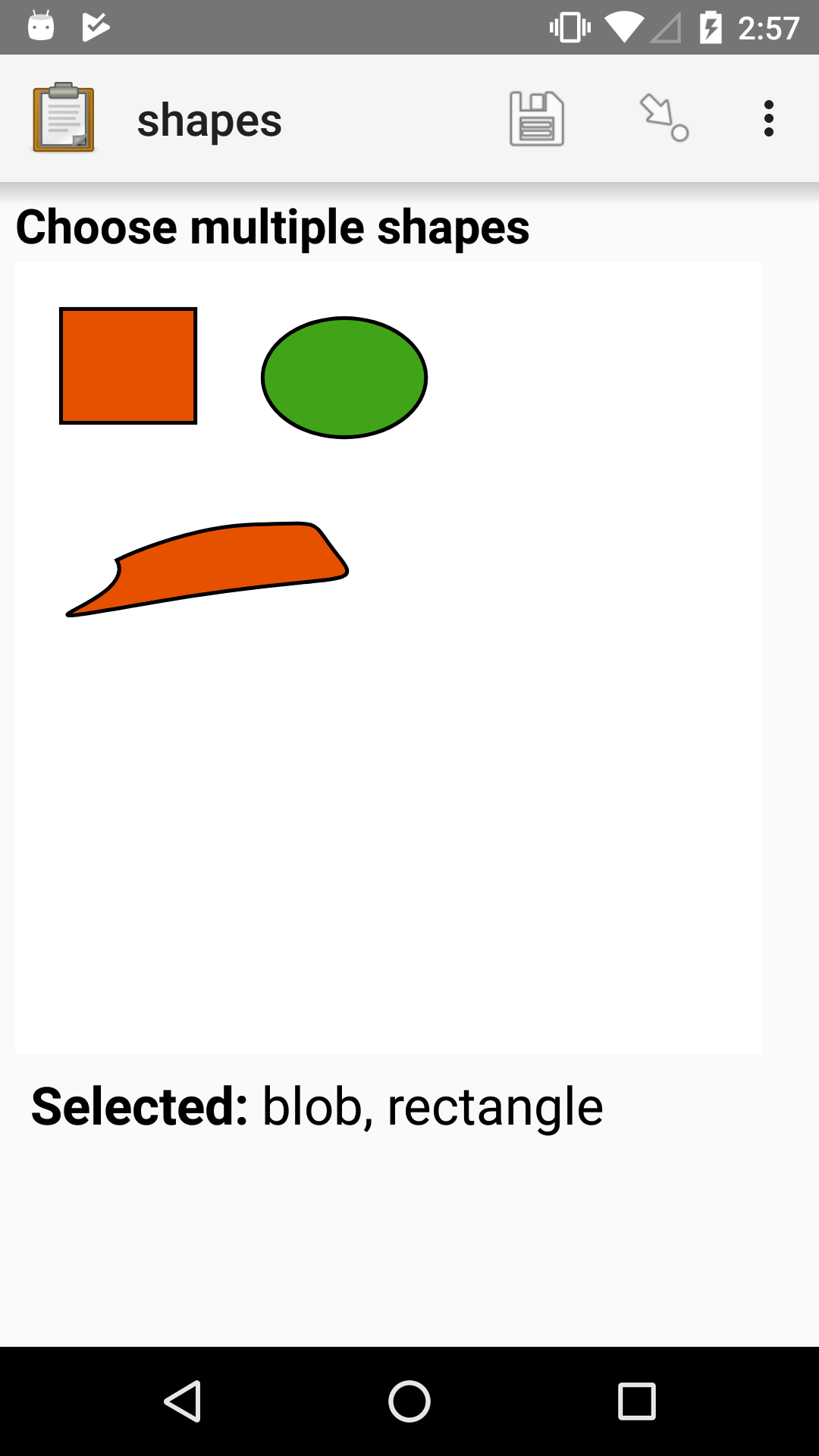
Choose multiple shapes |
image-map |
shapes.svg |
list_name |
name |
label |
|---|---|---|
shapes |
path |
blob |
shapes |
rect |
rectangle |
shapes |
ellipse |
ellipse |
Including media files in choices
Like question labels, choices can include media (image, video, or audio files):
list_name |
name |
label |
image |
video |
audio |
|---|---|---|---|---|---|
opt_media |
a |
A |
a.jpg |
||
opt_media |
b |
B |
b.mp4 |
||
opt_media |
c |
C |
c.mp3 |
Note
For images, you can specify a bigger image for panning and zooming using the big-image column. This is not compatible with the no-buttons appearance.
select_one and select_multiple questions using the no-buttons appearances will not
display media buttons next to choices. However, if a choice has audio, it will be played when
the choice is selected.
Randomizing choice order
To reduce bias, choice order can be randomized for any of the select question types described above. To display the choices in a different order each time the question is displayed, set randomize to true in the parameters column of the XLSForm survey sheet:
XLSForm
type |
parameters |
name |
label |
|---|---|---|---|
select_one opt_abcd |
randomize=true |
select_one_random_widget |
Select one with random choice order set on each display |
list_name |
name |
label |
|---|---|---|
opt_abcd |
a |
A |
opt_abcd |
b |
B |
opt_abcd |
c |
C |
opt_abcd |
d |
D |
In the example above, each time the question is displayed, the choices will be in a different order. This means a single data collector may see the same question with different choice orders if they open a draft or leave the question and then return to it.
Seeded randomization
It can be preferable to show a consistent order for choices for a given submission. This can be accomplished by setting an integer seed for the randomization. Using an explicit seed also allows you to recreate the order that choices were displayed in at analysis time to do things like identify biasing orders.
Good seed values are unique to a submission. Some examples are the unique ID of a participant or the last 4 digits of a phone number. Another good option is to use time.
In the example below, the current time is converted to a decimal number. The number before the decimal point is the number of days since January 1, 1970. The digits after the decimal point represent fractions of a day from midnight. This means that the digits after the decimal point will be different for each form session and are a good candidate for a random seed. To use only that part of the time representation, we can use the substr() function.
XLSForm
type |
parameters |
name |
label |
calculation |
|---|---|---|---|---|
calculate |
my_seed |
once(substr(decimal-date-time(now()), 8)) |
||
select_one opt_abcd |
randomize=true,seed=${my_seed} |
select_one_widget |
Select one with random choice order set once per filled form |
list_name |
name |
label |
|---|---|---|
opt_abcd |
a |
A |
opt_abcd |
b |
B |
opt_abcd |
c |
C |
opt_abcd |
d |
D |
To recreate the order that choices were displayed in from the seed, see the XForms spec for a description of the randomization algorithm used.
Note
If you use a changing value like time in your seed expression, once() is important because it makes sure the seed is not changed if the same filled form is opened more than once.
Including "other" as a choice
Warning
We do not recommend using or_other because it does not support multiple languages or choice_filter. Instead, add your own "other" question and use form logic to have it appear as needed.
On the survey sheet, in the type column,
after the type and the list_name,
you can add or_other.
This will add "Other" as an additional option to your choice list.
The name value of the choice when selected will be other.
Rank widget
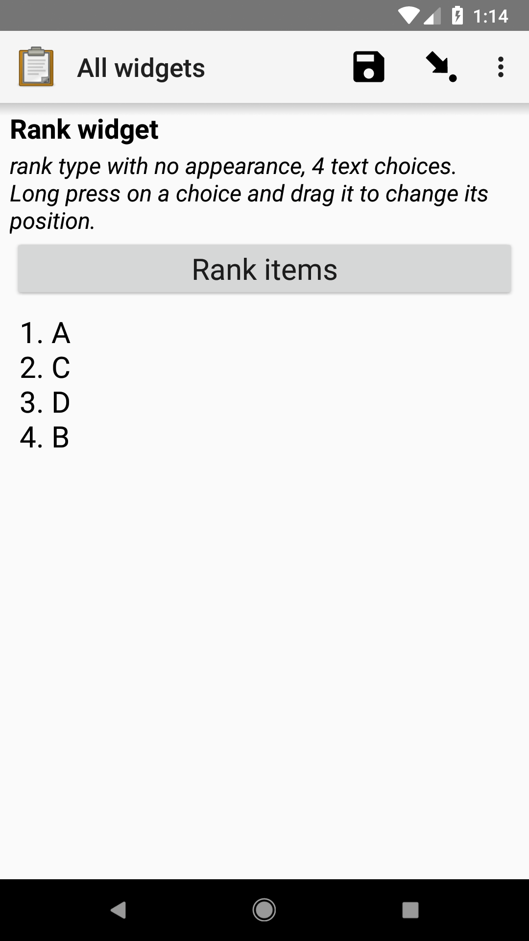
The rank widget allows the user to order options from a list. The value saved in the form and sent to the server is a space-separated ordered list of the options.
Like with Select widgets, the options are listed on a sheet named choices in an XLSForm.
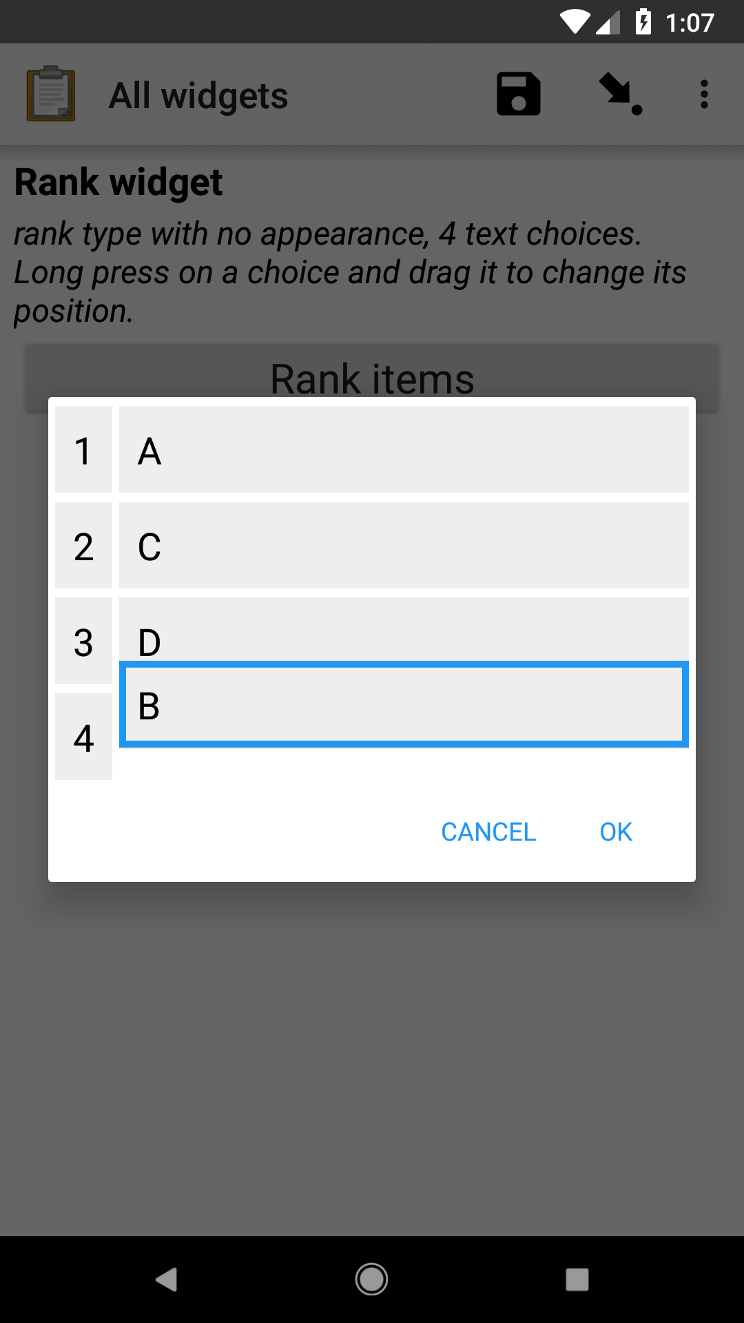
To change the order of the options in the list, tap the Rank items button. In the resulting dialog, long press on an item and once it gets a border around it, drag it up or down to change the order. If no default is provided, the value for the question is blank until the user taps OK in the ranking dialog.
To limit the options in the rank widget based on the answer to a previous question, specify an expression in the choice_filter column of the survey sheet.
- type
rank {list_name}
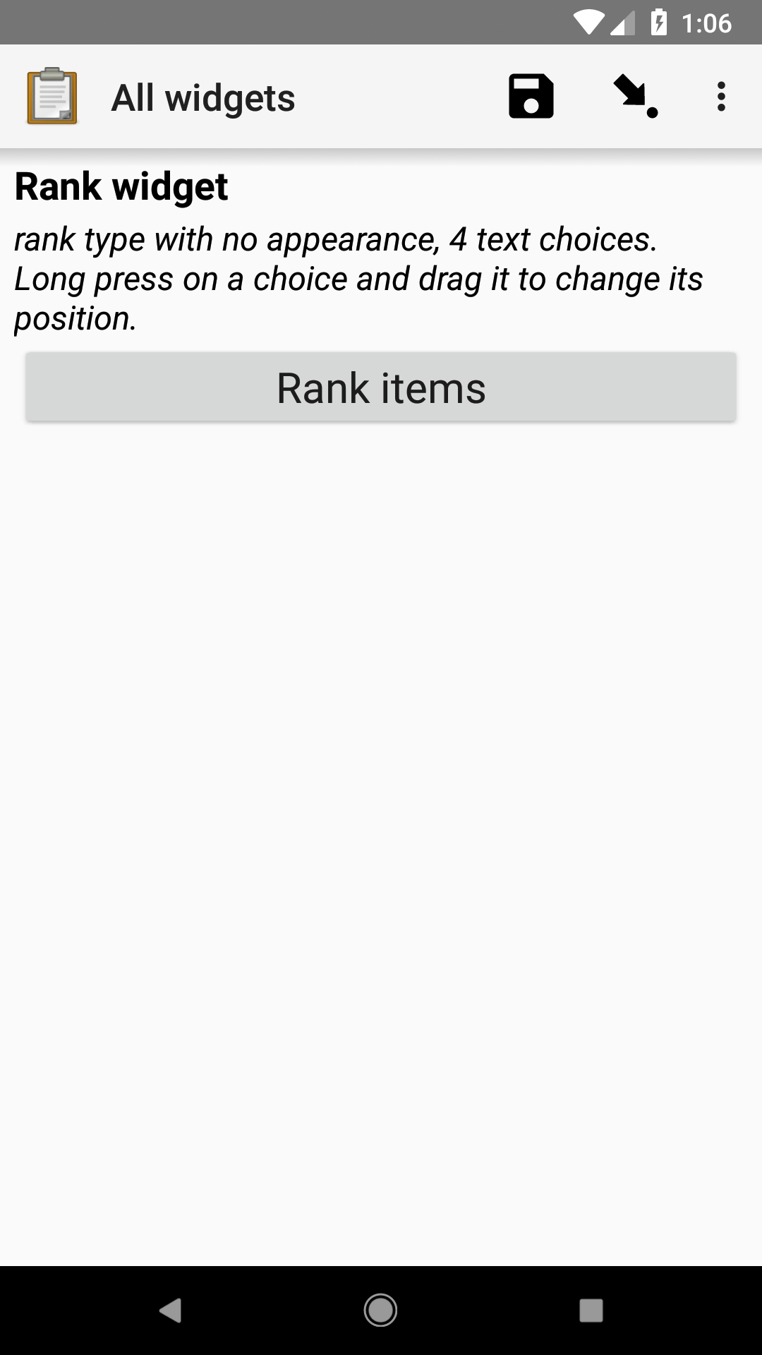
XLSForm
type |
name |
label |
hint |
|---|---|---|---|
rank opt_abcd |
rank_widget |
Rank widget |
rank type with no appearance, 4 text choices |
list_name |
name |
label |
|---|---|---|
opt_abcd |
a |
A |
opt_abcd |
b |
B |
opt_abcd |
c |
C |
opt_abcd |
d |
D |
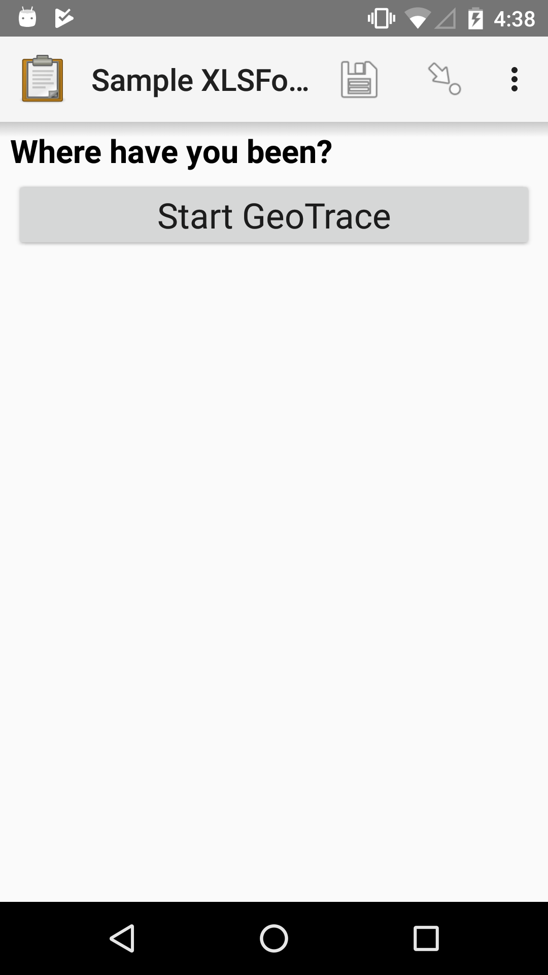
Capturing geospatial data
Geospatial question types make it possible to capture one or more points representing locations on Earth. Each point is represented as four numbers separated by spaces: latitude, longitude, altitude in meters, and accuracy radius in meters.
For example, if a Collect user captured a point while at the coordinates 12°22'17.0"N 1°31'10.9"W, with a reported accuracy radius of 17.4 meters, and at 305 meters above sea level, the ODK geopoint representation would be:
12.371400 -1.519700 305 17.4
Multiple points that form lines or shapes are separated by semicolons and called geotrace and geoshape.
See also
Note
The accuracy radius is an estimate of what Android calls the radius of 68% confidence: there is a 68% chance that the true location falls within this radius. This is an estimate reported by the Android system based on the available sensors (GPS, network, etc). The accuracy radius itself may be more or less reliable depending on the sensor(s) used and current conditions.
To get an accurate location quickly, ensure devices have a clear view of the sky. For even faster points, consider "warming" the GPS with a start-geopoint question. See improving location performance for more.
Mock location providers and external GPS devices
Android makes it possible to provide mock locations to applications like ODK Collect. This can be useful for testing with real geo data without needing to go to a specific location. You can use applications like Fake GPS for this.
GPS faker applications can also be used by enumerators, presenting a risk to data quality. ODK Collect makes this detectable by always setting the accuracy to 0 when a location comes from a mock location provider. If you see an accuracy of 0 in analysis, the corresponding point came either from manual point placement or from a mock provider.
External GPS devices also use mock location providers. When using an external GPS device, you should configure your form to capture accuracy even when it comes from a mock provider. To do this, set allow-mock-accuracy to true in the parameters column of your geospatial question in your XLSForm survey sheet. See the section on geopoint for an example.
If you rely on mock locations, keep in mind that only GPS can be spoofed. The system may still retrieve real location data from WI-FI or cellular networks, which can override the mock location and as a result, deliver a mix of real and fake location data. To avoid this, go to Android Settings > Location and turn off Improve location accuracy. This forces the device to use only GPS, ensuring your mock location is applied consistently.
Geopoint widget
- type
geopoint- appearance
none
Captures the current geolocation from the device. The location is displayed in degrees-minutes-seconds (DMS) notation and is stored in decimal degrees with altitude and accuracy. Learn more about the format of resulting data in the location widgets section.
This question type shows a dialog with the current accuracy and lets the data collector decide when to capture the point. For capturing location without data collector intervention, see start-geopoint. For a geopoint with a user-selected location, see placement-map.
Tip
You can use selected-at() to require geopoints meet a particular threshold. For example, if you need points with an accuracy better than 10 meters, use this constraint:
selected-at(${geopoint_widget}, 3) < 10.
The 3 in the above constraint references accuracy, the fourth space-separated value in the geopoint data type. The selected-at function uses 0-based indexing so you can use 0 to reference latitude, 1 for longitude, and 2 for altitude.
XLSForm with optional parameters
type |
name |
label |
hint |
parameters |
|---|---|---|---|---|
geopoint |
geopoint_widget |
Geopoint widget |
geopoint type |
capture-accuracy=10 warning-accuracy=10 allow-mock-accuracy=true |
There are three parameters that can be used to customize a geopoint question's behavior:
capture-accuracy: when the device accuracy reaches this value or better, the point will be automatically captured and the dialog will close. If you always want data collectors to make an explicit decision about accepting a point, set this value to 0. Defaults to 5 (meters), a target that can usually be reached by modern devices given enough time. We generally do not recommend setting this value to below 3 (meters) unless you are using an external GPS device. You can also set an accuracy constraint.
warning-accuracy: when the device accuracy is this value or worse, the dialog is red and displays a message stating that the accuracy is unacceptable. There is no enforcement of the threshold so if a data collector needs to capture a point with an unacceptable accuracy (e.g. because they can't wait any longer), they can do so. Set this value to the same value as capture-accuracy if you generally always want your data collectors to wait until the point is automatically captured. Defaults to 100 (meters), about the length of a city block. In extreme conditions such as under dense forest canopy, any reported accuracy may be considered acceptable. In that case, you can set this value to a very large number.
allow-mock-accuracy: set to true to use an external GPS device that uses the mock GPS provider. Otherwise, any location captured from a mock provider will have an accuracy of 0.
A dialog is used to give data collectors feedback on the location they are capturing:
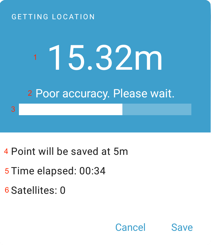
The dialog is designed to guide the data collector to capture a point with the best reported accuracy possible. The current accuracy is shown at the top of the dialog (1). A message below it (2) gives a qualitative assessment of the accuracy (e.g. unacceptable, poor) and suggested action (e.g. wait). The progress bar (3) gives a visual representation of progress towards an acceptable accuracy.
The bottom half of the dialog displays troubleshooting information. The first line (4) shows the accuracy at which the point will be automatically captured. This is configured by the capture-accuracy parameter. You can ask data collectors to watch time elapsed (5) and let you know if it is systematically taking them a long time to get high-accuracy points. This may indicate an issue with their device.
You can also train data collectors to use time elapsed to take some action. For example, you can let them know to capture any point available after waiting for 2 minutes. Number of satellites (6) can be useful when capturing points outdoors. A low number of satellites (under 4) may indicate that something is wrong with the device or its position. See Improving Location Performance.
Geopoint with map display
- type
geopoint- appearance
maps
The default Geopoint widget does not display a map to the user. When the appearance attribute is maps, the widget displays a map to help the user get oriented and confirm that the selected point is correct and sufficiently accurate.
When the device's geolocation is available, it is displayed on the map by a blue cross. A blue shaded circle around the cross represents the accuracy radius of the geolocation. The "add marker" button at the top right of the screen can be tapped to add a point at the location indicated by the middle of the blue cross. The selected point is represented by a small circle with a red outline.
When the map view is opened again with a selected point, the map is centered on that point. To change the selection, first tap the "trash" icon and then select a new point.
For a geopoint with a location that the user can manually select or adjust, see Geopoint with user-selected location.
XLSForm
type |
name |
label |
appearance |
hint |
|---|---|---|---|---|
geopoint |
geopoint_widget_maps |
Geopoint widget |
maps |
geopoint type with maps appearance |
Geopoint with user-selected location
- type
geopoint- appearance
placement-map
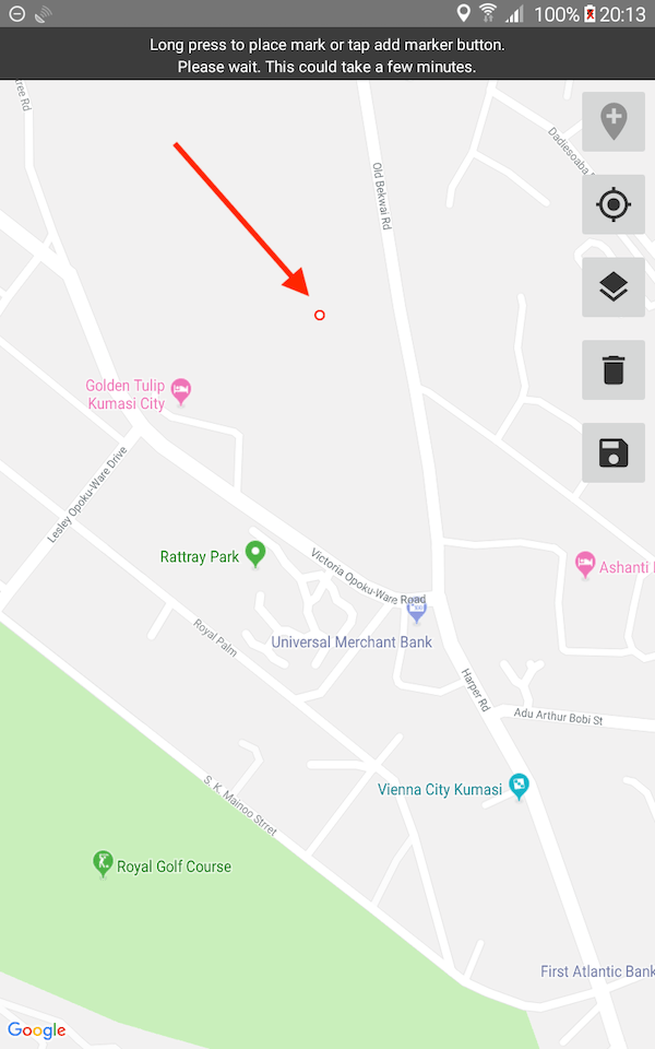
The default Geopoint widget does not allow the user to place the point anywhere other than the device's current geolocation.
A geopoint with the appearance attribute placement-map allows the user to select any point from a map. The user can either long press to place the point anywhere, or, if the device knows its geolocation, tap on the "add point" button at the top right of the screen. The selected point is represented by a small circle with a red outline (see arrow in screenshot).
The save button saves the selected point and returns to the question screen. If the point was selected by long pressing, the accuracy radius and altitude will both be 0. If the device's geolocation was selected, the accuracy radius will be greater than 0.
When the map view is opened again with an existing point, the map is centered on the selected point. To change the selection, first tap the "trash" icon and then select a new point.
XLSForm
type |
name |
label |
appearance |
hint |
|---|---|---|---|---|
geopoint |
geopoint_widget_placementmap |
Geopoint widget |
placement-map |
geopoint type with placement-map appearance |
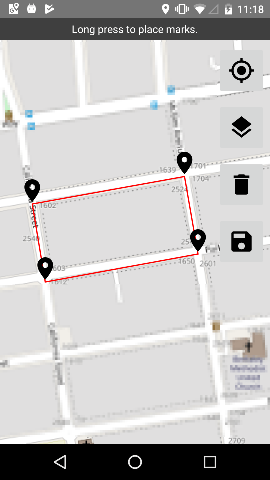
Geotrace
- type
geotrace- appearance
none
A series of points. Identical to geoshape except that the first and last point may be different and at least 2 points are required.
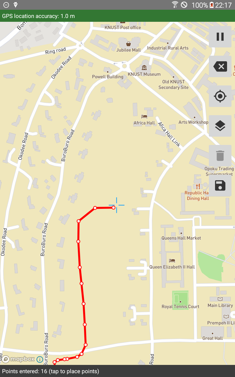
Points can be entered either by tapping the screen to place each point, or by taking readings of the device's geolocation over time. On a map, each coordinate is represented by small circles with outlines. These are connected by lines. The last point that was entered has a darker outline.
To collect a geotrace, first select the location-recording mode by tapping the "add point" button in the upper right side of the screen. The selected mode will be displayed in the gray bar at the bottom of the screen. While point collection is ongoing, the "add marker" button changes to a "pause" button. The "back arrow" button can be used to remove the last-entered point either when actively collecting points or when paused. Any point can be manually moved at any time by tapping on it and dragging it. The mode can only be changed if an existing line is first cleared by tapping the "trash" button. Recording must be paused to clear the existing line.
Tip
Points that were entered by tapping or adjusted by dragging will always have an accuracy radius of 0. Points that were read from the device location will never have an accuracy radius of 0 unless they come from a mock provider.
To prevent intersecting segments, use the intersects() function. By default, constraint violation messages are shown after leaving the question screen. Add incremental=true` in the parameters column to instead show the constraint message in a toast immediately when the constraint is violated.
Once the trace has been saved, the coordinates of its points will be displayed on the question screen. The trace can be opened for manual editing by tapping to add more points, moving existing points or deleting the last-added point. After a trace has been saved once, it cannot be added to in manual or automatic location recording modes.
The three location recording modes are:
- Placement by tapping
The user taps the device to place points.
- Manual location recording
The user chooses when to tap the "record a point" button at the top of the screen to capture the device geolocation at that moment.
- Automatic location recording
The user is prompted to select a recording interval and accuracy requirement. If the accuracy requirement is set to None, points are always collected at the recording interval. If the accuracy requirement is set to any other value, a point will only be captured if it meets the requirement. For example, given a recording interval of 20 seconds and an accuracy requirement of 10 meters, the app places a point at the device location every 20 seconds if the location is accurate to 10 meters or better.
XLSForm
type |
name |
label |
|---|---|---|
geotrace |
trace_example |
Where have you been? |
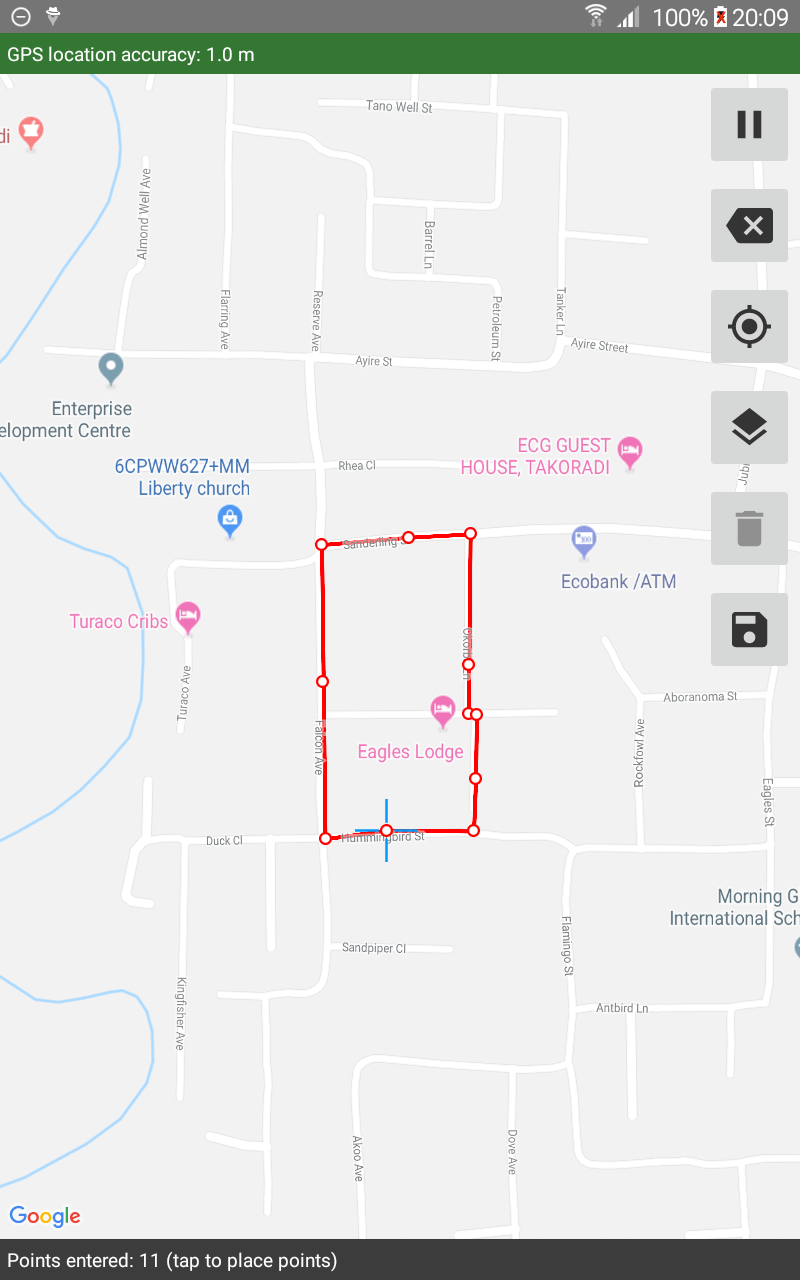
Geoshape
- type
geoshape- appearance
none
A series of points that form a closed polygon. Identical to geotrace except that the first and last point are always the same and at least 3 points are required.
Points can be entered either by tapping the screen to place each point, or by taking readings of the device's geolocation over time. On a map, each coordinate is represented by small circles with outlines. These are connected by lines. The last point that was entered has a darker outline.
To collect a geoshape, first select the location-recording mode by tapping the "add point" button in the upper right side of the screen. The selected mode will be displayed in the gray bar at the bottom of the screen. While point collection is ongoing, the "add marker" button changes to a "pause" button. The "back arrow" button can be used to remove the last-entered point either when actively collecting points or when paused. Any point can be manually moved at any time by tapping on it and dragging it. The mode can only be changed if an existing line is first cleared by tapping the "trash" button. Recording must be paused to clear the existing line.
Tip
Points that were entered by tapping or adjusted by dragging will always have an accuracy radius of 0. Points that were read from the device location will never have an accuracy radius of 0 unless they come from a mock provider.
To prevent intersecting segments, use the intersects() function. By default, constraint violation messages are shown after leaving the question screen. Add incremental=true` in the parameters column to instead show the constraint message in a toast immediately when the constraint is violated.
Once the shape has been saved, the coordinates of its points will be displayed on the question screen. The shape can be opened for manual editing by tapping to add more points, moving existing points or deleting the last-added point. After a shape has been saved once, it cannot be added to in manual or automatic location recording modes.
The three location recording modes are:
- Placement by tapping
The user taps the device to place points.
- Manual location recording
The user chooses when to tap the "record a point" button at the top of the screen to capture the device geolocation at that moment.
- Automatic location recording
The user is prompted to select a recording interval and accuracy requirement. If the accuracy requirement is set to None, points are always collected at the recording interval. If the accuracy requirement is set to any other value, a point will only be captured if it meets the requirement. For example, given a recording interval of 20 seconds and an accuracy requirement of 10 meters, the app places a point at the device location every 20 seconds if the location is accurate to 10 meters or better.
XLSForm
type |
name |
label |
|---|---|---|
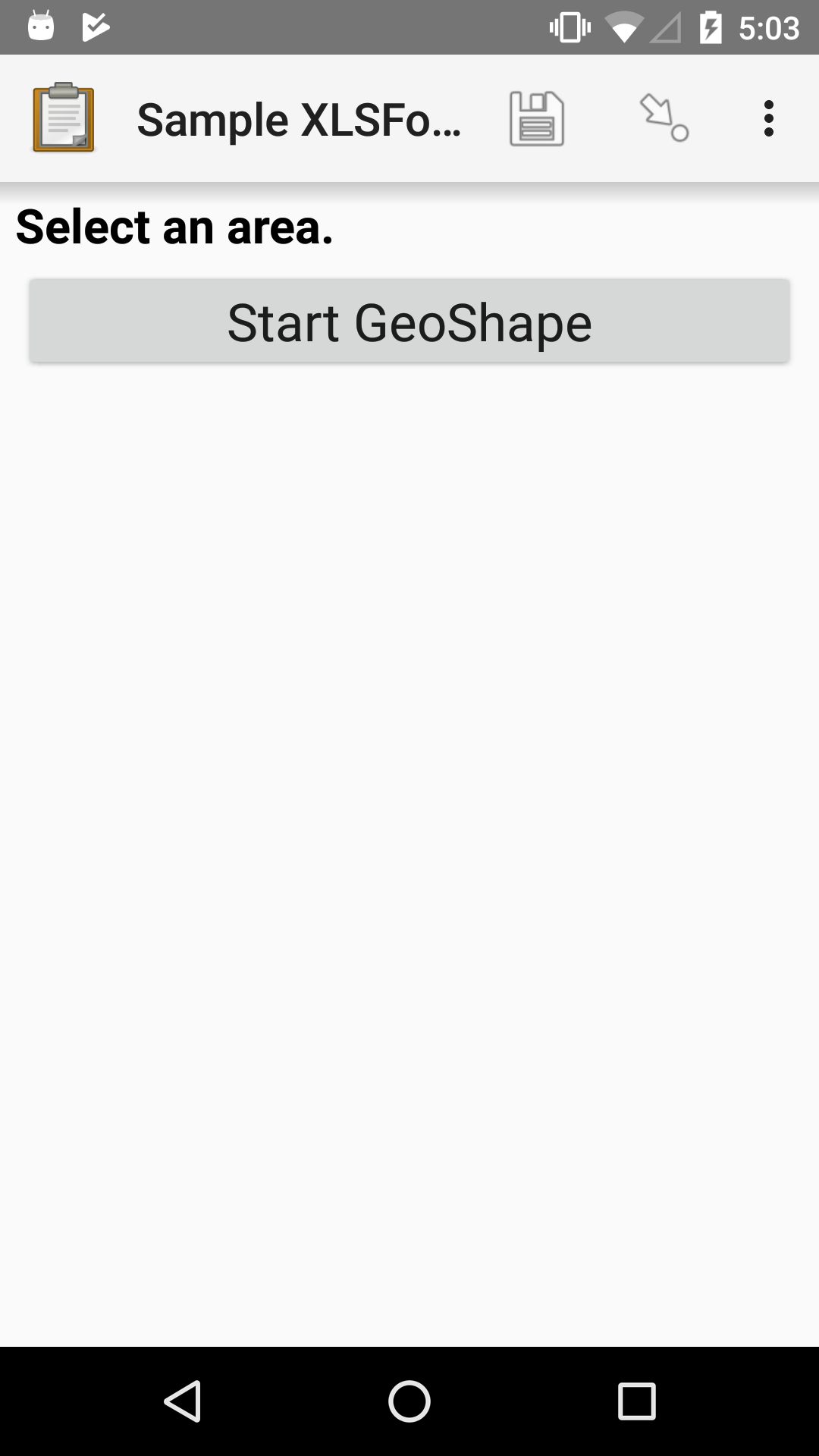
geoshape |
shape_example |
Select an area |
Calculating the area of a geoshape
- type
calculate- calculation
area(${geoshape})
The area() function calculates the land area,
in square meters,
of a polygon defined in a Geoshape.
The value will be included in your completed survey data,
and can also be used in later widgets in the form.
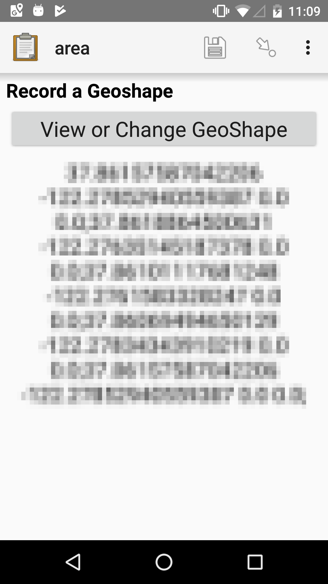
XLSForm
type |
name |
label |
calculation |
|---|---|---|---|
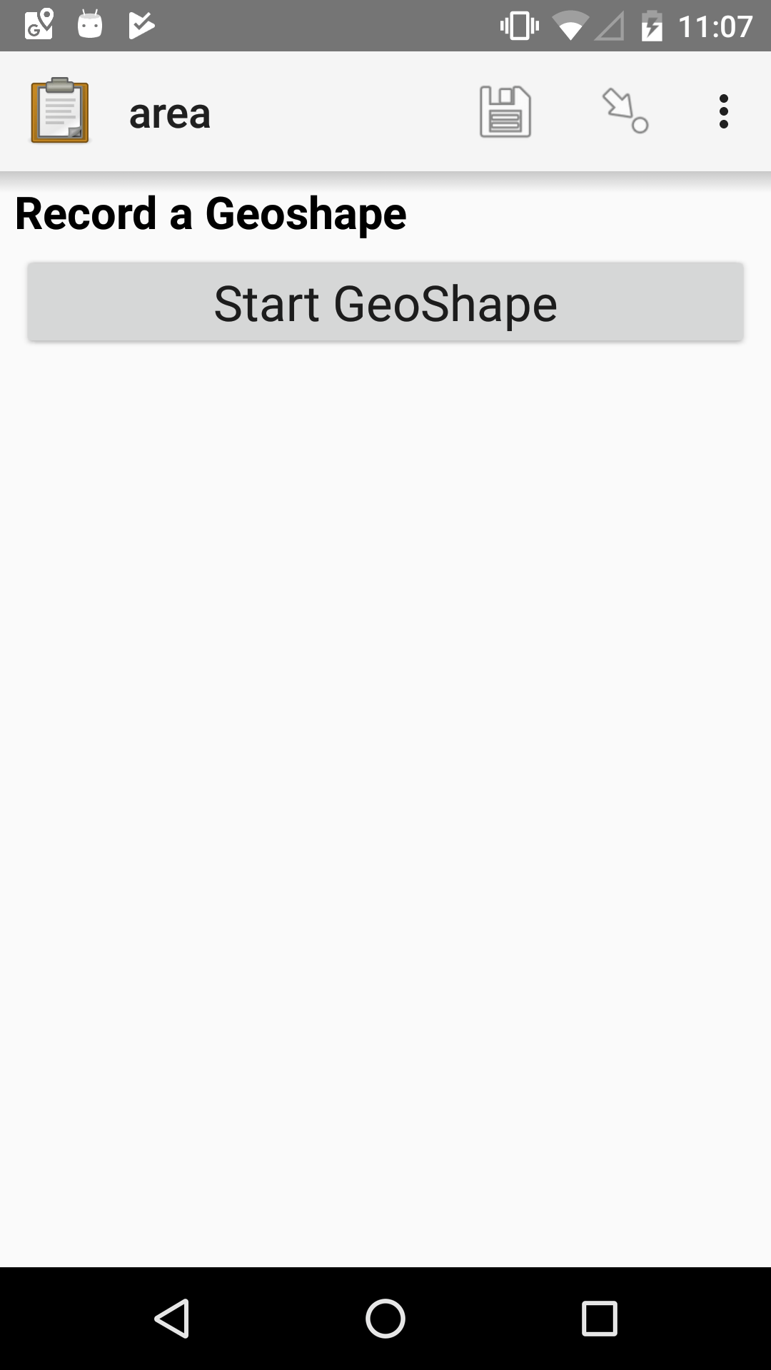
geoshape |
shape |
Record a Geoshape |
|
calculate |
shape_area |
area(${shape}) |
|
calculate |
rounded_shape_area |
round(${shape_area}, 2) |
|
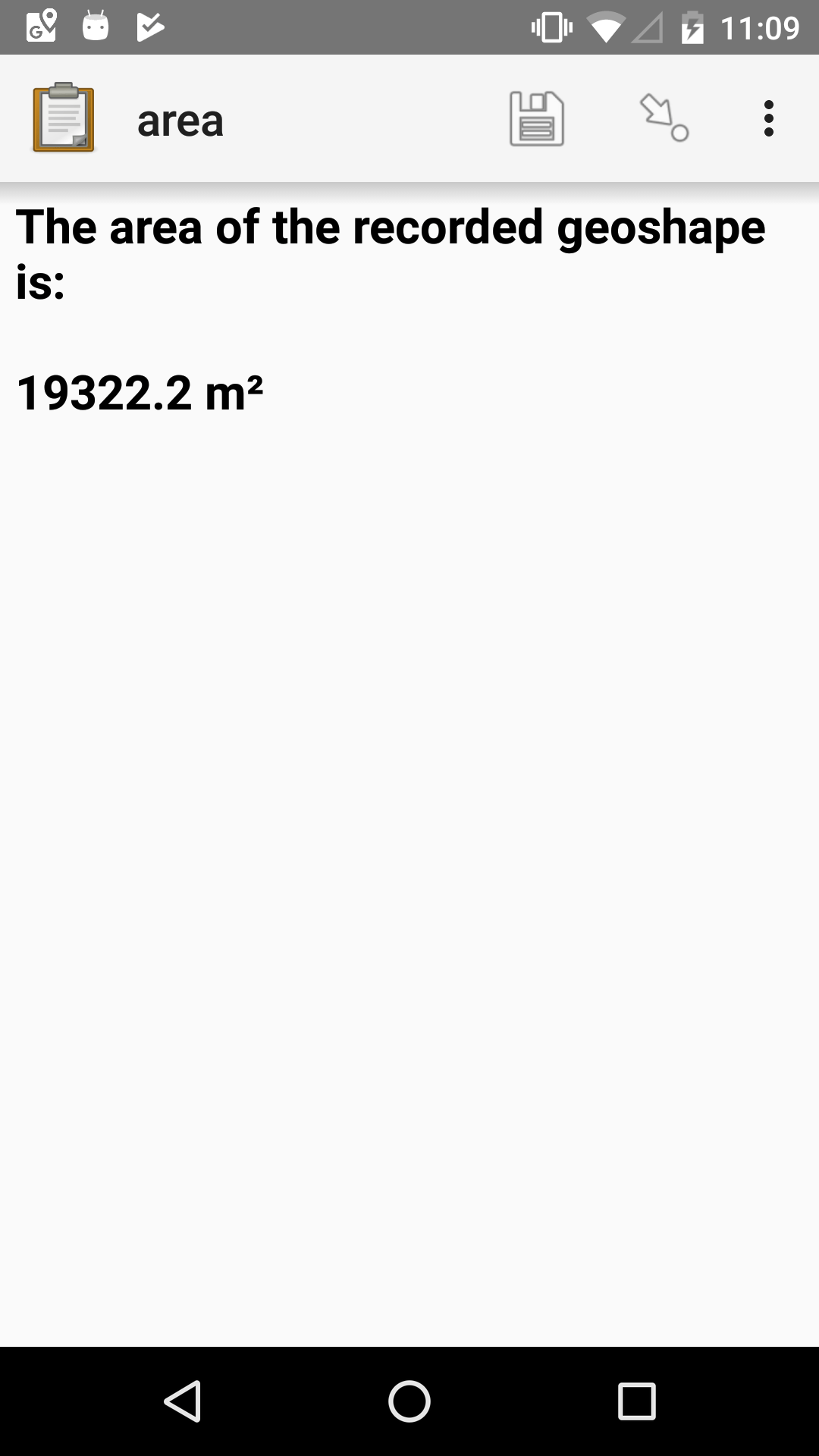
note |
shape_area_note |
The area of the recorded geoshape is:
${rounded_shape_area} m²
|
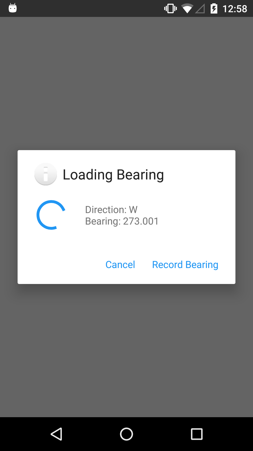
Bearing widget
- type
decimal- appearance
bearing
Captures a compass reading, which is stored as a decimal.
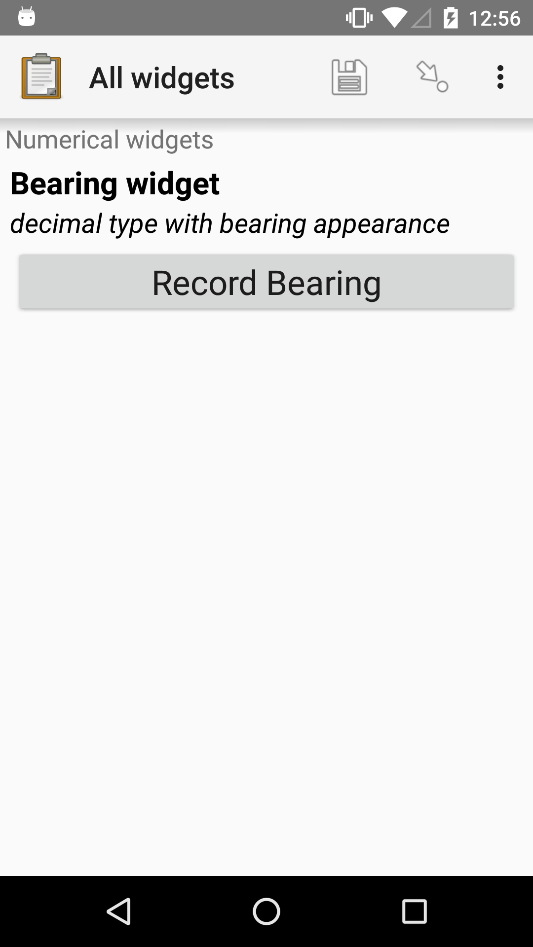
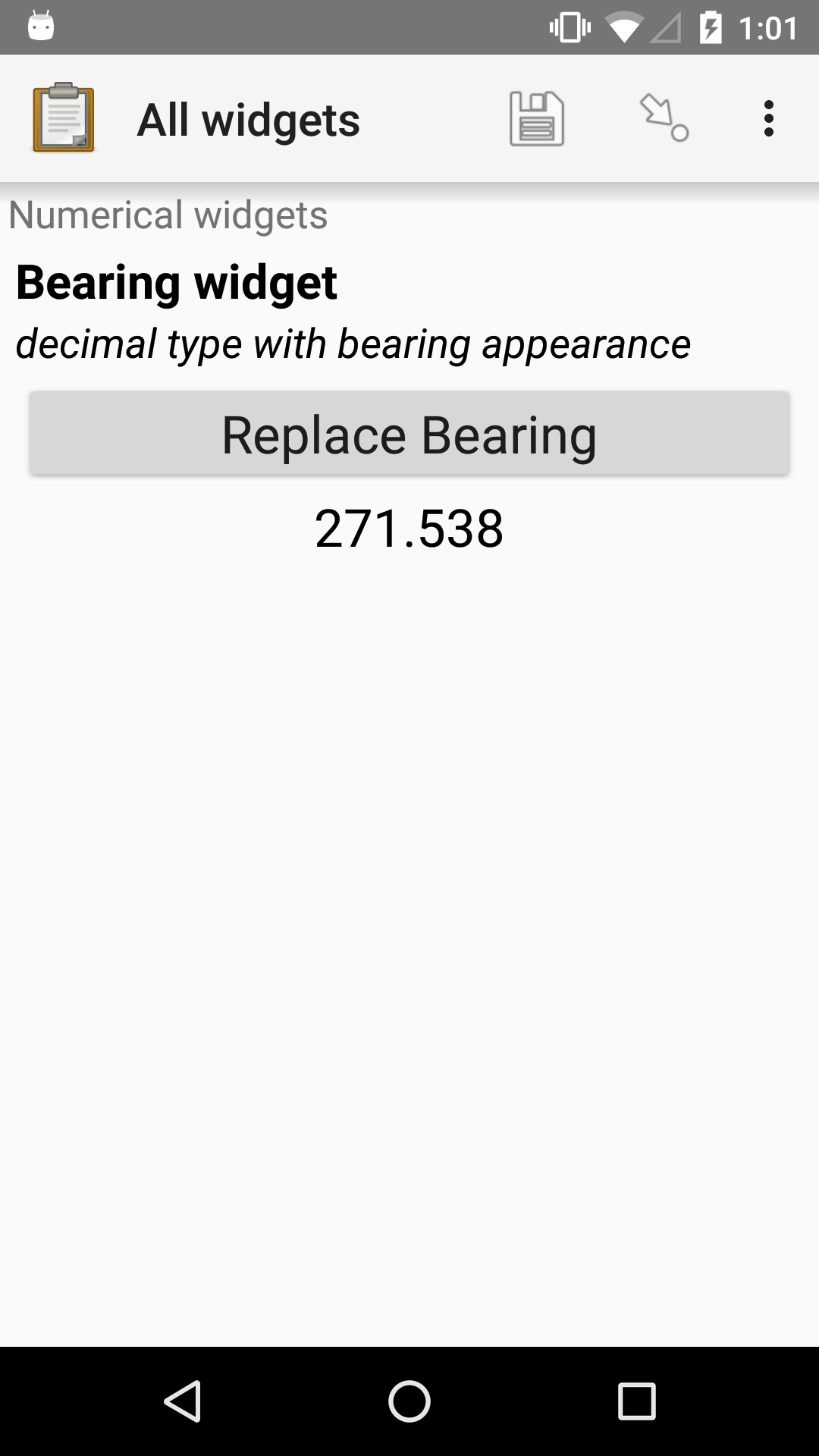
XLSForm
type |
name |
label |
appearance |
hint |
|---|---|---|---|---|
decimal |
bearing_widget |
Bearing widget |
bearing |
decimal type with bearing appearance |
Image widgets
Tip
Image files can be very large. We recommend always including a maximum image size in form design. Also, consider making test submissions to your server with the Internet conditions you expect when gathering data to make sure that you can send files of the size you expect.
Warning
Sensitive metadata, such as GPS location, is typically no longer included in images selected via Choose Image on Android 11 and later.
Default image widget
- type
image- appearance
none
Captures an image from the device. The user can choose to take a new picture with the device camera, or select an image from the device photo gallery.
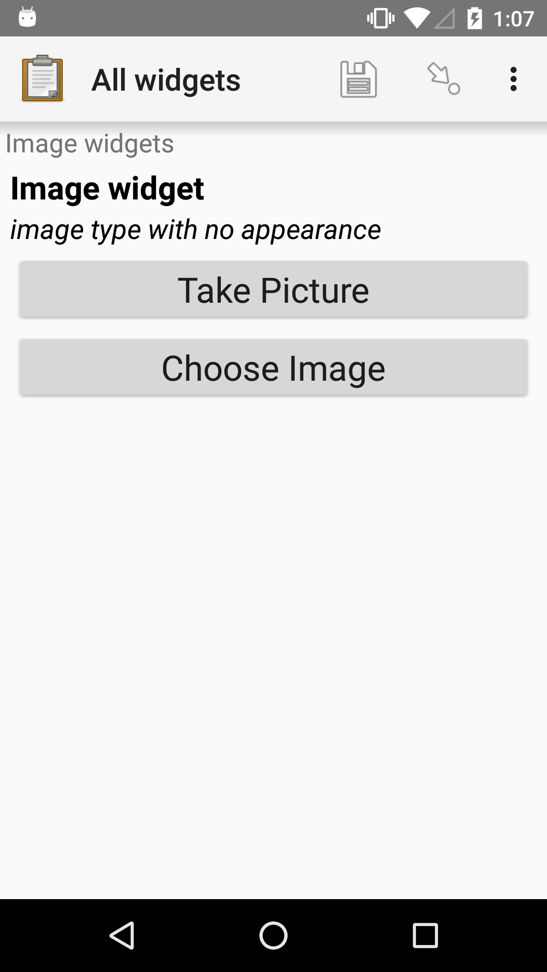
XLSForm
type |
name |
label |
hint |
|---|---|---|---|
image |
image_widget |
Image widget |
image type with no appearance |
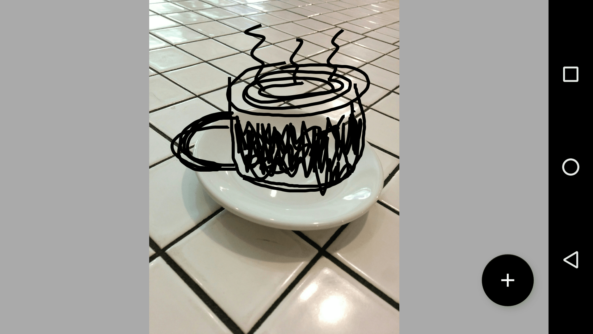
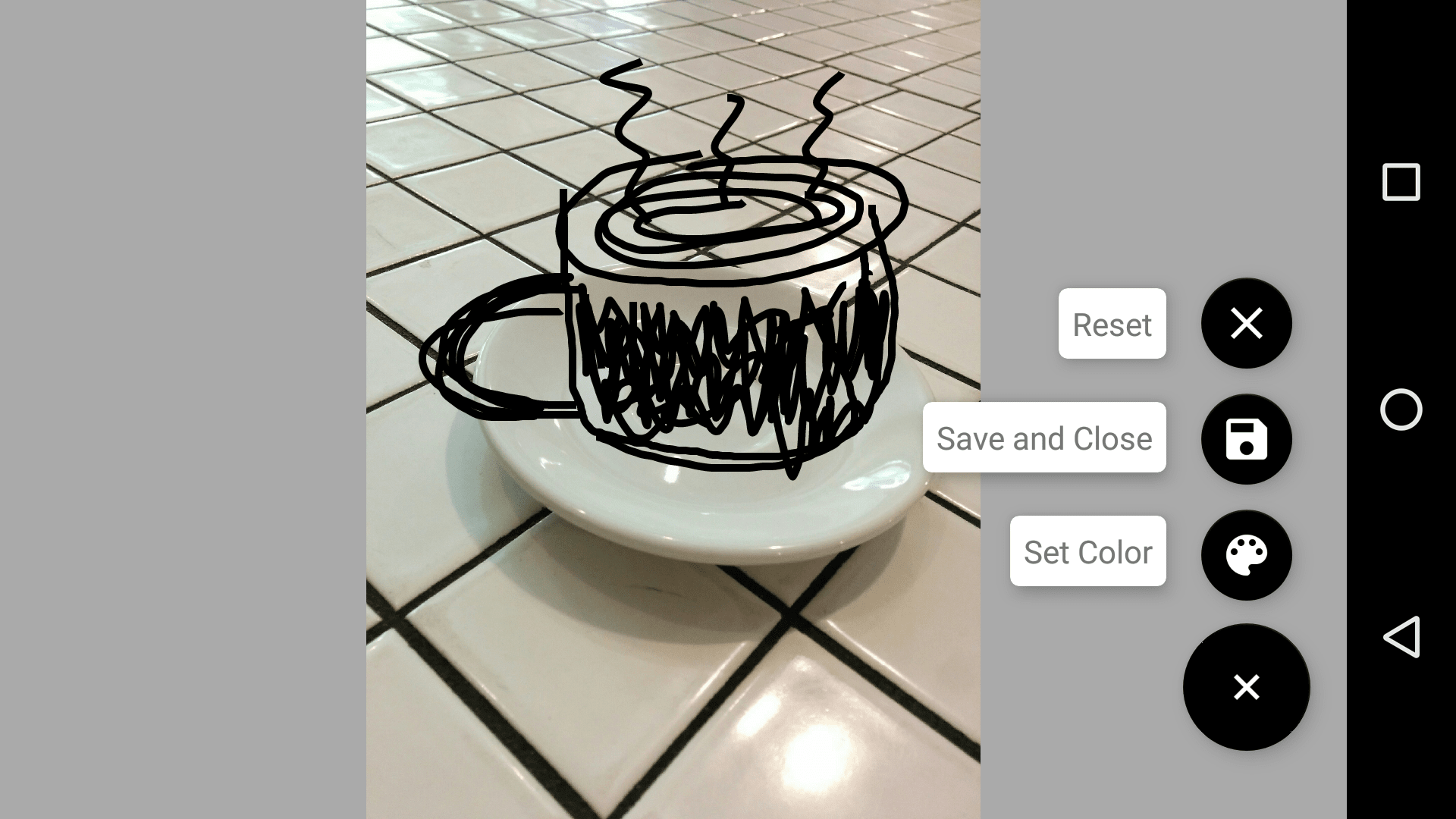
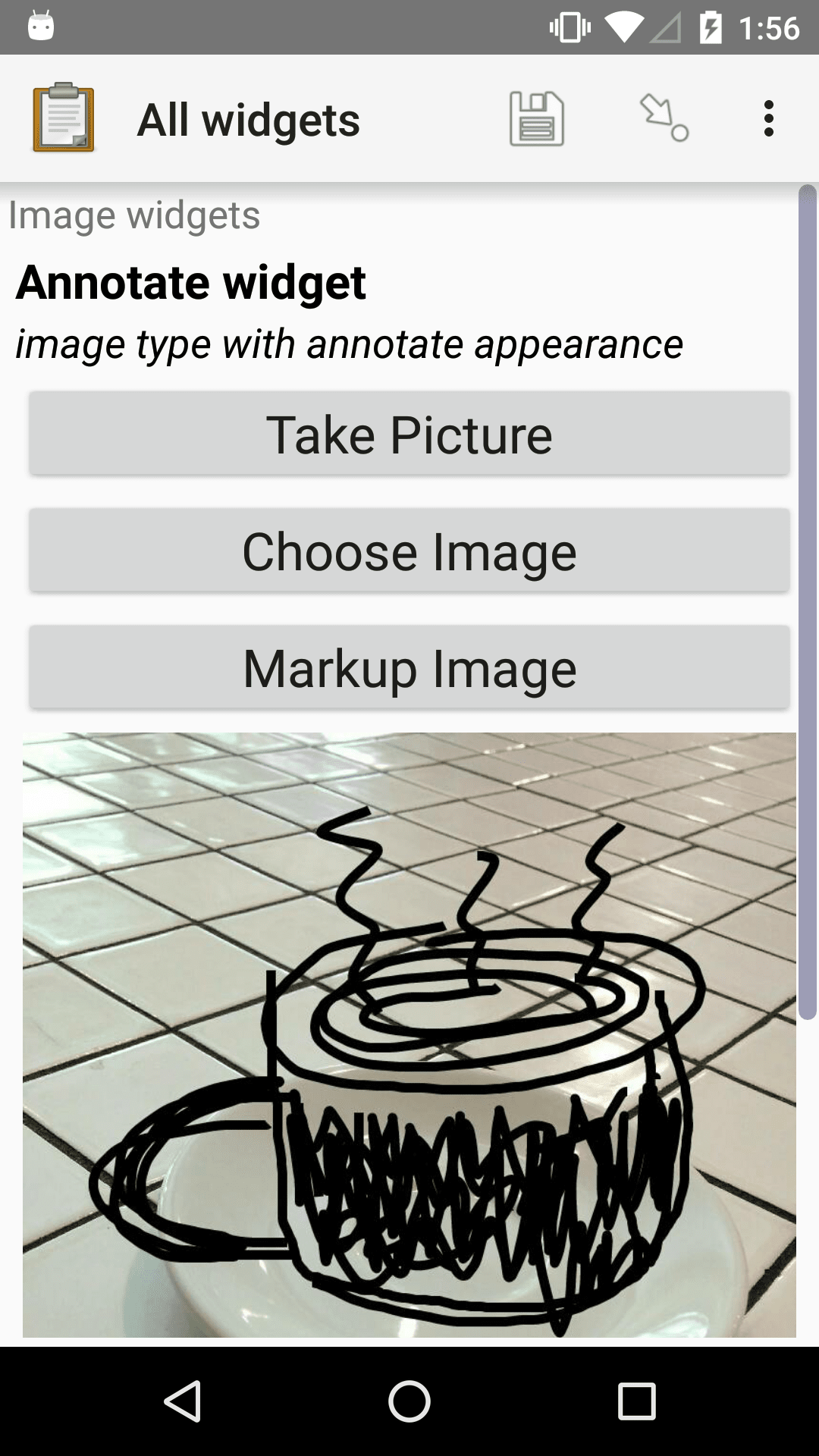
Image widget with annotation
- type
image- appearance
annotate
Adding the annotate appearance allows the user to draw on the image before submitting it.
Tip
If you have a standard image to annotate, you can add that image's filename in the default column. For example, put template.png in the default column and Central will prompt you to attach a png to the form. Anyone who fills out the form will see the same image.
To enforce that this default image gets annotated, you can use a constraint such as not(. = 'jr://images/template.png')). This works because Collect renames images after annotation.
Also see select from image.
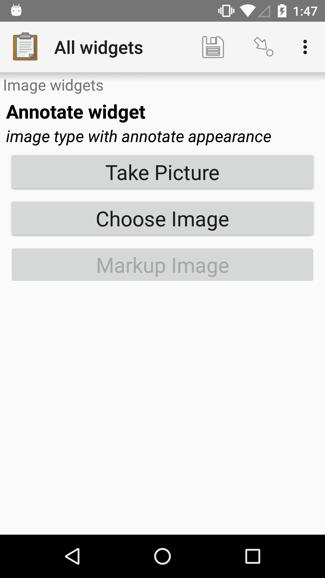

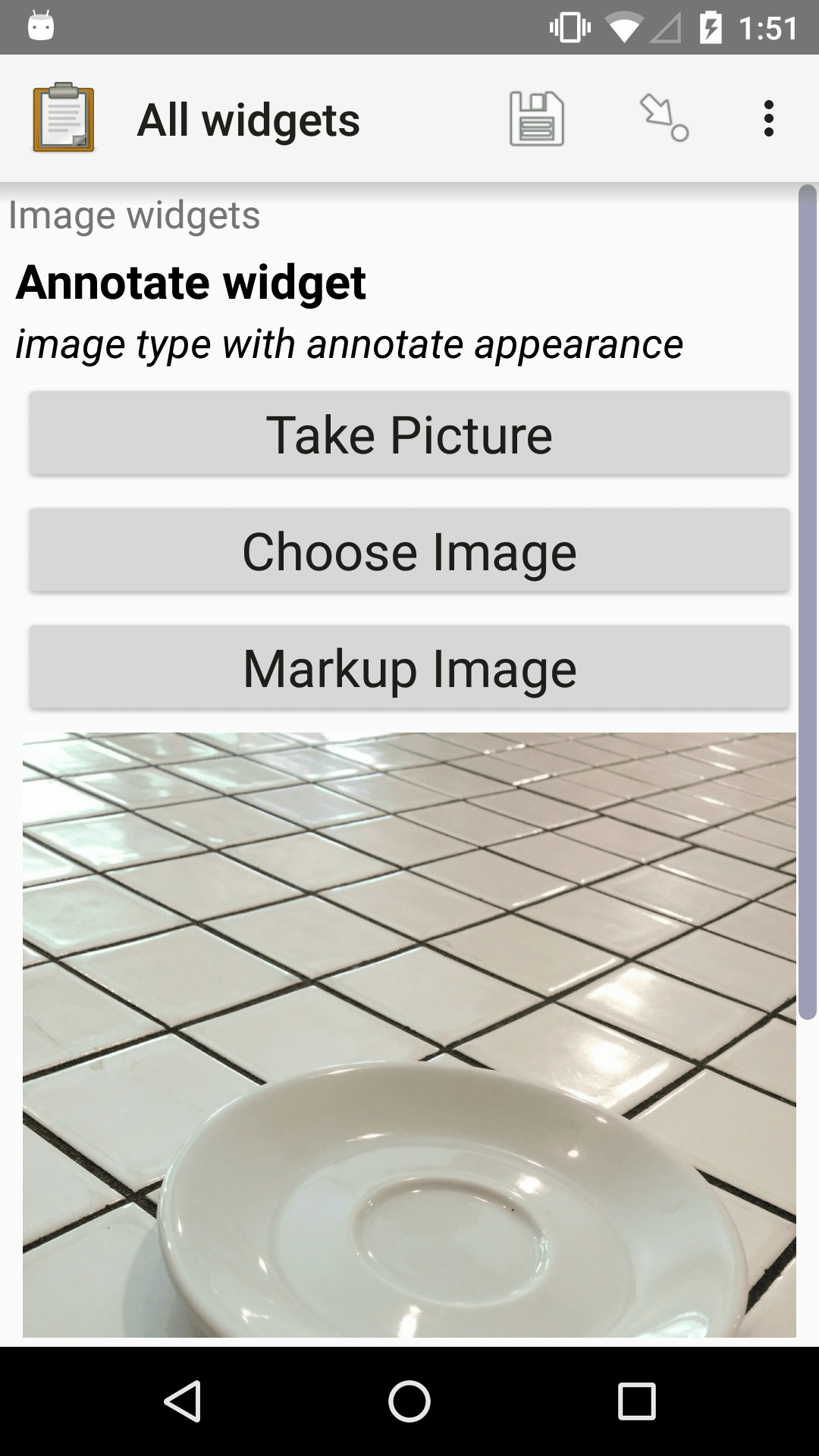
XLSForm
type |
name |
label |
appearance |
hint |
|---|---|---|---|---|
image |
annotate_image_widget |
Annotate widget |
annotate |
image type with annotate appearance |
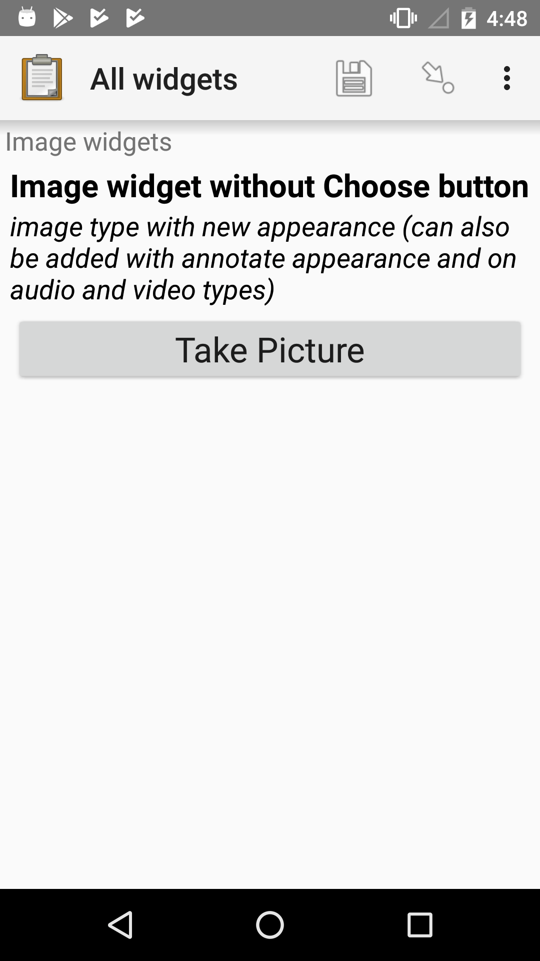
Image widget with required new image
- type
image- appearance
new
An image widget that does not include a Choose Image button. This requires the user to take a new picture.
XLSForm
type |
name |
label |
appearance |
hint |
|---|---|---|---|---|
image |
image_widget_no_choose |
Image widget without Choose button |
new |
image type with new appearance (can also be added with annotate appearance and on audio and video types) |
Image widget with custom camera app
Added in version 2024.1.0.
When attempting to capture a photo, ODK Collect by default opens the built-in camera app. However, if you wish to utilize a specific camera application, you can do so by including the app parameter and providing the package name of the desired camera app.
XLSForm
type |
name |
label |
hint |
parameters |
|---|---|---|---|---|
image |
image_widget |
Image widget |
image type with custom camera app |
app=net.sourceforge.opencamera |
To find a camera application's package name, search for it on the Play Store in a web browser. When you access its listing, the package name will be provided in the URL after id=.
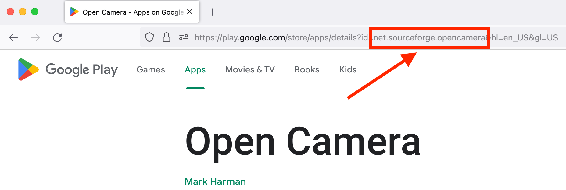
Some camera apps to consider:
Timestamp Camera can overlay timestamps, locations, and more
Open Camera provides many advanced settings
Note
The app with the provided package name must be installed on the device. If it's not available, there will be a toast shown, and it will not be possible to take a picture.
By default, it's possible to select a picture from the device. Use the
newappearance to prevent this.Collect will request a picture, but some camera apps may still allow users to take video. That will fail silently.
Self portrait (selfie) image widget
- type
image- appearance
new-front
Takes a picture using the front-facing ("selfie") camera. The Choose image button is not displayed.
Changed in version 1.15: Prior to v1.15, the appearance attribute for this was selfie.
The old appearance attribute will continue to work on existing forms, but new forms should use the new-front appearance.

XLSForm
type |
name |
label |
hint |
appearance |
|---|---|---|---|---|
image |
self-portrait |
Self portrait (selfie) widget |
image type with new-front appearance |
new-front |
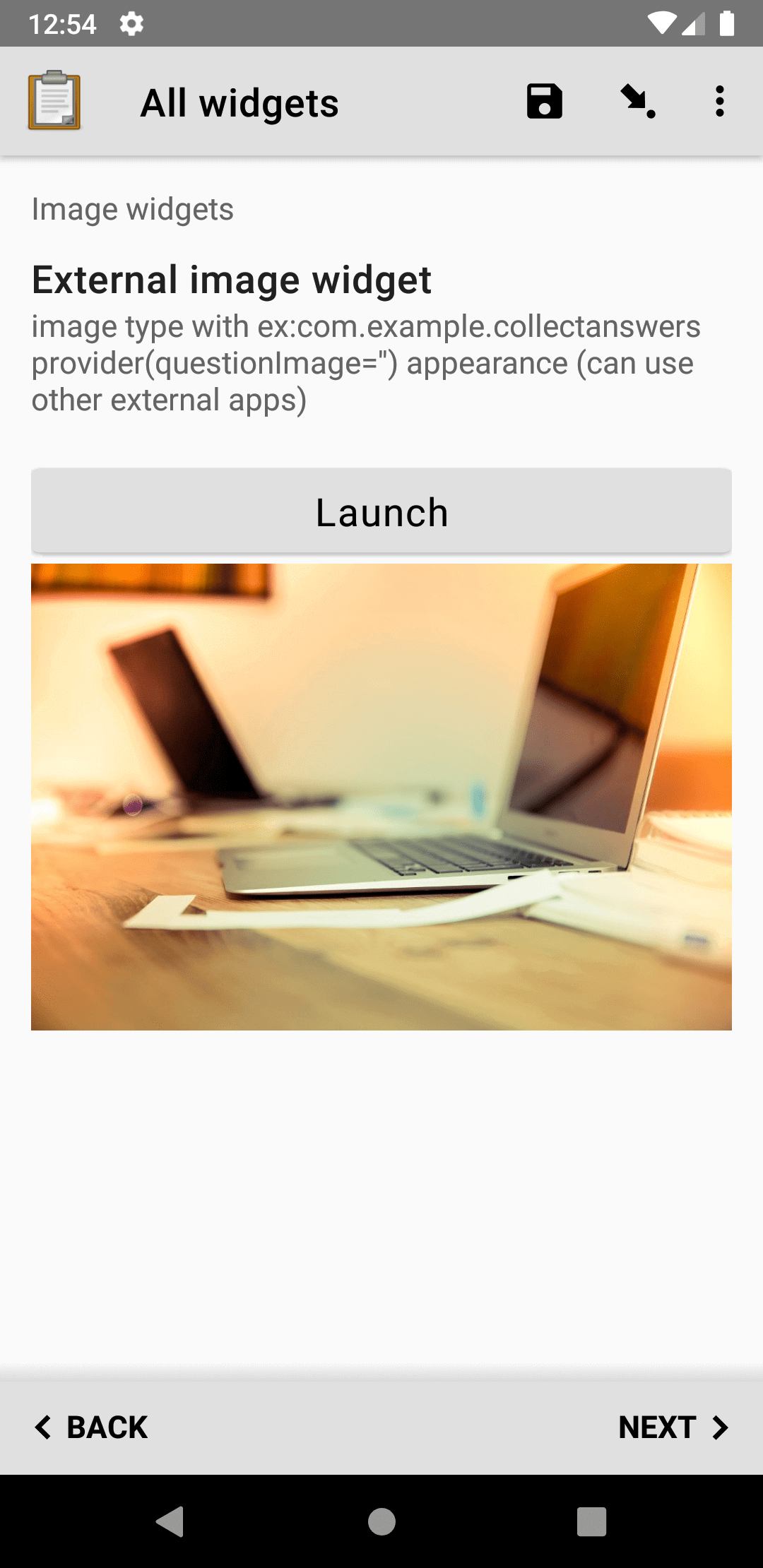
External app image widget
Added in version 1.30.
Launches an external app and receives an image back from the external app. If the specified external app is not available, it is not possible to use the widget.
The external app image widget is displayed when the appearance attribute begins with ex:. The rest of the appearance string specifies the application to launch.
See also
XLSForm
type |
name |
label |
appearance |
hint |
|---|---|---|---|---|
image |
ex_image_widget |
External image widget |
ex:com.example.collectanswersprovider(questionImage='') |
image type with ex:com.example.collectanswersprovider(questionImage='') appearance (can use other external apps) |
Draw widget
- type
image- appearance
draw
Provides the user a drawing pad and collects the drawn image.
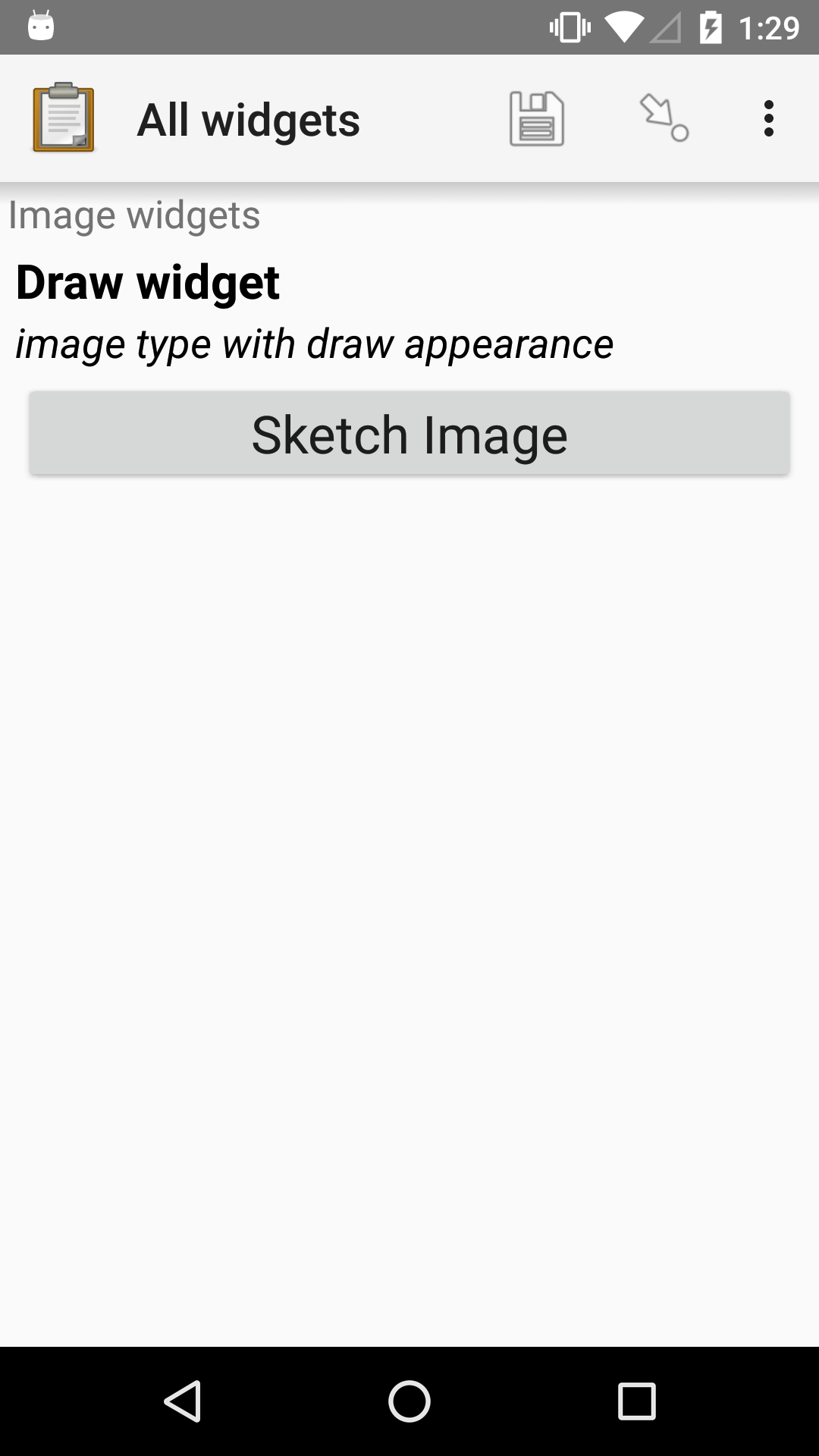
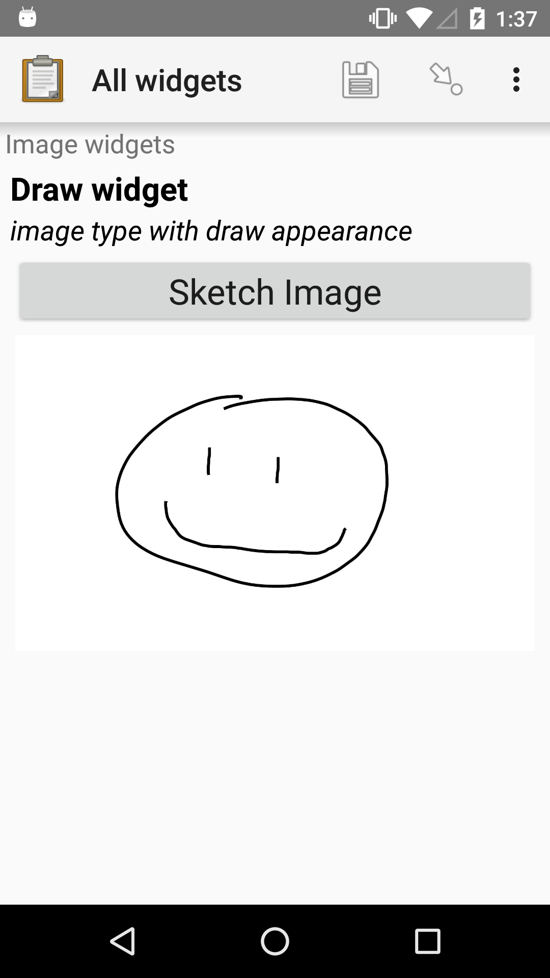
XLSForm
type |
name |
label |
appearance |
hint |
|---|---|---|---|---|
image |
draw_image_widget |
Draw widget |
draw |
image type with draw appearance |
Scaling down images
Images created with any of the image widgets described above can be automatically scaled down on save by using the max-pixels parameter. If the long edge of the image is larger than the maximum size specified, the image is resized proportionally so that the long edge matches the provided pixel value. This is useful to reduce the upload size when bandwidth is limited.
Warning
All scaled down jpg images are saved with 80% quality. That means in some rare cases when:
a jpg image is attached not captured
and the attached file has quality lower than 80%
and the difference between its original size and the value specified using
max-pixelsis not big enough
the size of the output image might be even bigger that the original one.
Available in Collect since v1.10.0 and in XLSForm since 7/2018.
XLSForm
In the parameters column, write max-pixels= followed by the desired maximum length of the long edge in pixels.
type |
name |
label |
parameters |
hint |
|---|---|---|---|---|
image |
my_scaled_image |
Scaled image |
max-pixels=1024 |
image scaled to a max long edge of 1024 pixels |
Audio widgets
Default audio widget
- type
audio- appearance
none
Records audio using the device's microphone or a connected external microphone. By default, an internal recorder is used.
Tip
We recommend you use the built-in audio recorder because you can customize audio quality and record while filling out other questions. Built-in recording is available in Collect v1.29 or later.
XLSForm
type |
name |
label |
|---|---|---|
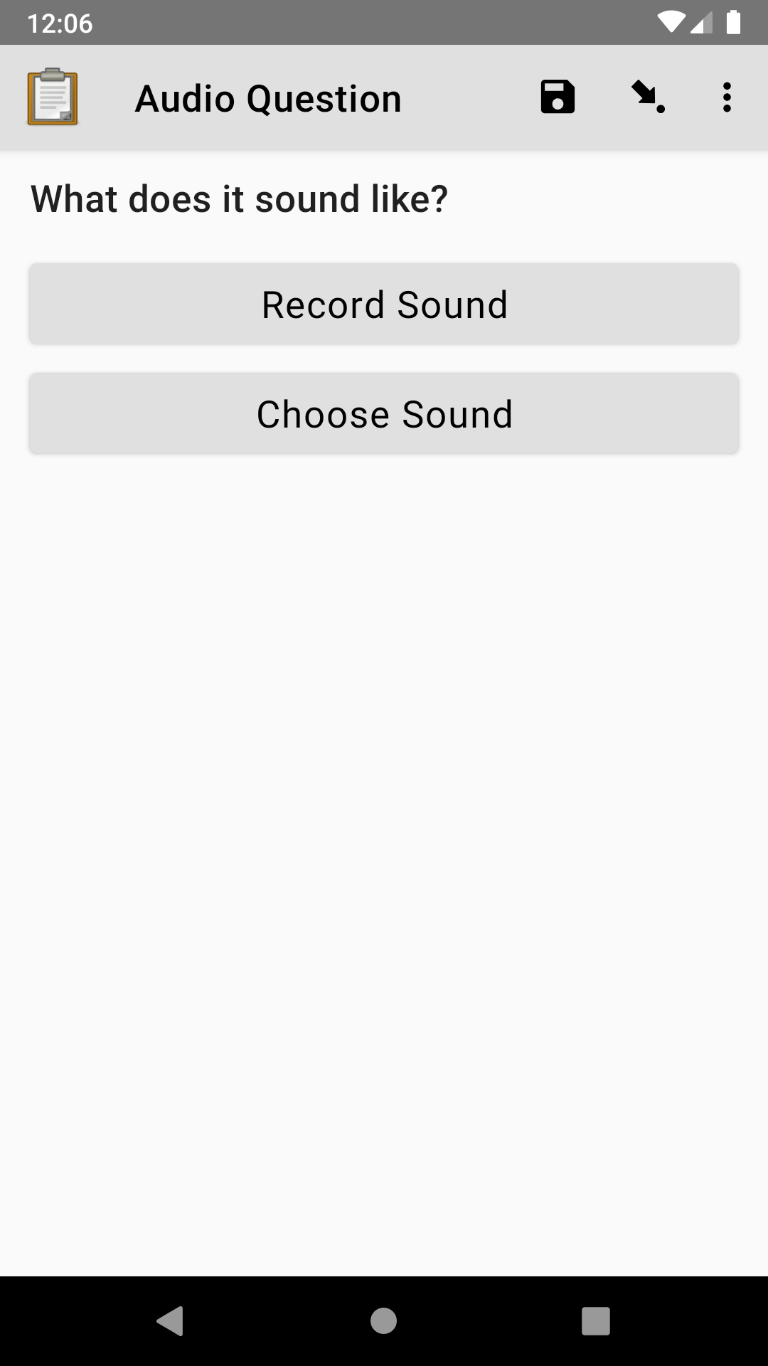
audio |
bird_recording |
What does it sound like? |
Tip
Audio files can be very large so if you record audio in your form, make sure that you consider your audio quality settings. Also, consider making test submissions to your server with the Internet conditions you expect when gathering data to make sure that you can send files of the size you expect.
Android devices can make many sounds during use and these will be included in recordings. We recommend turning off sounds from button presses, camera shutters and notifications before recording.
Using the built-in audio recorder
- type
audio- appearance
none
Added in version 1.29: ODK Collect v1.29.0
The built-in audio recorder makes it possible to capture audio without having to install an external app.
It also enables recording while filling out other questions and is designed to continue recording even if the user switches to another app or if the phone screen is locked.
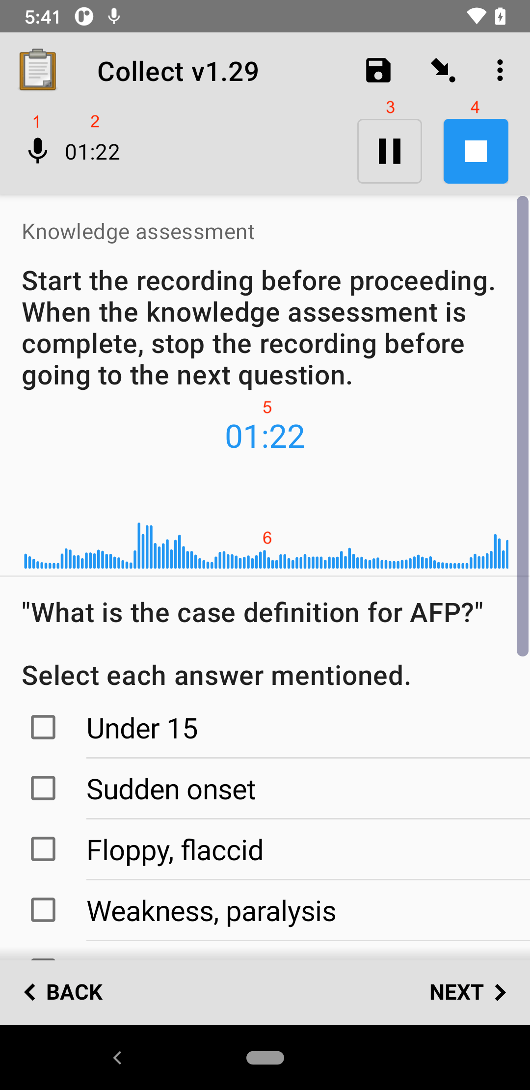
When built-in audio recording is enabled and recording is initiated, a recording control bar appears at at the top of the screen. At the top left of this bar is an icon to represent whether recording is currently ongoing or paused (1). To the right of this icon is the current length of the recording (2).
Warning
Pause is only available on Android 7.0 and above. On lower Android versions, the pause button is hidden.
At the right of the control bar are a pause button (3) and a stop button (4). When the pause button is tapped, recording is temporarily suspended and the button icon changes to a microphone. When the microphone is tapped, recording is resumed. Recording can be paused and resumed as many times as desired. When the stop button is tapped, the recording is ended and can no longer be modified.
Recording status is also displayed below the audio question text. There is a time representing the current length of the recording (5) and a diagram (6) representing the volume of the recording over time. The diagram provides confirmation that the microphone is working and can help a user ensure an even, sufficient volume.
Other questions can be included on the same screen as a built-in recording question. As shown in the screenshot above, this makes it possible to capture quantitative content while recording. To achieve this, put the questions in a field list.
During recording, the user is prevented from leaving the current question screen. However, it is safe to use other applications or to lock the device screen.
Once recording is stopped, the control bar disappears. The recording is made available for playback below the question text.
To replace the audio captured, first delete the current file and then record again.
In some rare cases such as the device running out of space, the recording may complete successfully but not be attached to the form. If this happens, a dialog will be displayed explaining that the file is available but needs to be accessed manually. You can find these files in the recordings folder of the Collect directory. This folder is never cleared so consider emptying it yourself once you have retrieved its files.
Customizing audio quality
Added in version 1.29:
ODK Collect v1.29.0, Central v1.1.0.
The quality of audio recordings can be customized using the quality parameter. If a quality is specified, the built-in recorder is always used, regardless of Collect settings. If no quality is specified and external app recording has been disabled, normal is used. The available quality values are:
Value |
Extension |
Encoding |
Bit rate |
Sample rate |
File size |
|---|---|---|---|---|---|
normal |
.m4a |
AAC |
64 kbps |
32 kHz |
~30 MB/hour |
low |
.m4a |
AAC |
24 kbps |
32 kHz |
~11 MB/hour |
voice-only |
.amr |
AMR |
12.2 kbps |
8 kHz |
~5 MB/hour |
Tip
We'd recommend only using voice-only for one-on-one interviews in a quiet place as otherwise there might be too much detail loss. low will sound compressed but speech is generally intelligible, even if multiple people are talking at once. normal is similar to typical podcast settings and will sound good on most devices.
It's a good idea to test the different qualities out with the device (and any other equipment) you'll be using in the field to see which one fits your use case and setup best.
XLSForm
In the parameters column, write quality= followed by the desired value.
type |
name |
label |
parameters |
|---|---|---|---|
audio |
voice_only_audio |
Voice audio |
quality=voice-only |
audio |
normal_audio |
Normal audio |
quality=normal |
Changing audio quality during form entry
If it's a possibility that an individual question could need different qualities depending on context you can use relevance to switch between them:
XLSForm
type |
name |
label |
parameters |
relevance |
|---|---|---|---|---|
select_one yes_no |
is_quiet |
Are you currently in a quiet location with only one person speaking at a time? |
||
audio |
recording_voice_only |
Please record |
quality=voice-only |
${is_quiet} = 'yes' |
audio |
recording_normal |
Please record |
quality=normal |
${is_quiet} = 'no' |
list_name |
name |
label |
|---|---|---|
yes_no |
yes |
Yes |
yes_no |
no |
No |
Recording with an external app
- type
audio- appearance
none- parameters
quality=external
Setting quality to external will cause Collect to use an external app to record audio rather than the built-in recorder. You can also configure Collect to always use an external app for recording and set no quality parameter.
Some Android devices provide a default application for audio recording. Others do not, and the user will need to install an audio recording app.
Any app that responds to
android.provider.MediaStore.Audio.Media.RECORD_SOUND_ACTION
should be compatible. We recommend Axet Audio Recorder.
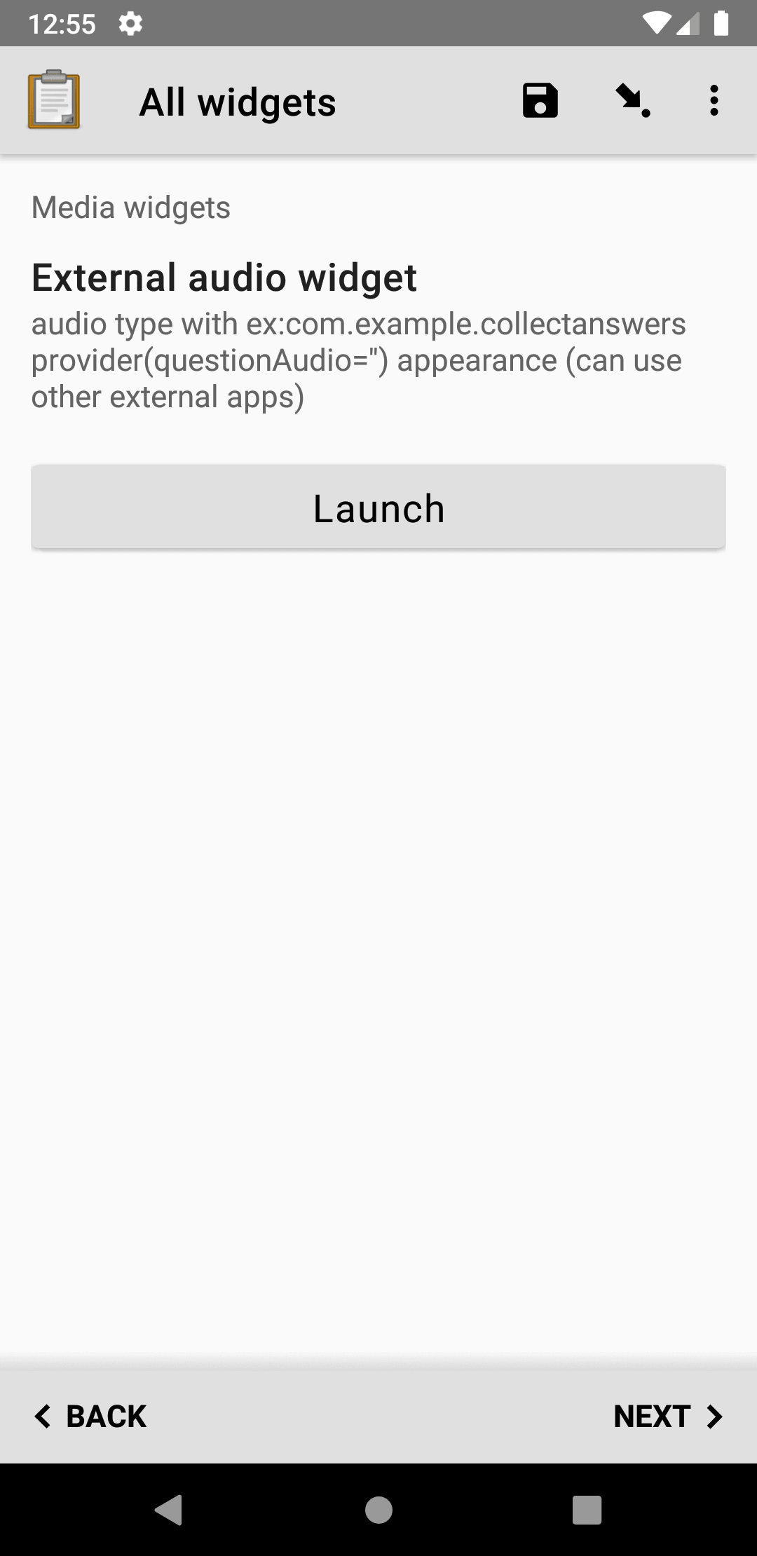
Getting audio from a custom external app
Added in version 1.30.
Launches an external app and receives an audio file back from the external app. If the specified external app is not available, it is not possible to use the widget.
The external app audio widget is displayed when the appearance attribute begins with ex:. The rest of the appearance string specifies the application to launch.
See also
XLSForm
type |
name |
label |
appearance |
hint |
|---|---|---|---|---|
audio |
ex_audio_widget |
External audio widget |
ex:com.example.collectanswersprovider(questionAudio='') |
audio type with ex:com.example.collectanswersprovider(questionAudio='') appearance (can use other external apps) |
Video widgets
Tip
Video files can be very large. We recommend configuring video options for every device you intend to use for data collection. Also make submissions to your server with the Internet conditions you expect when gathering data to make sure that you can send files of the size you expect. Note that Central has a 100 MB file upload size limit by default.
Default video widget
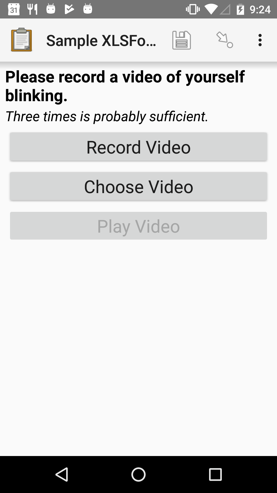
Records video, using the device camera.

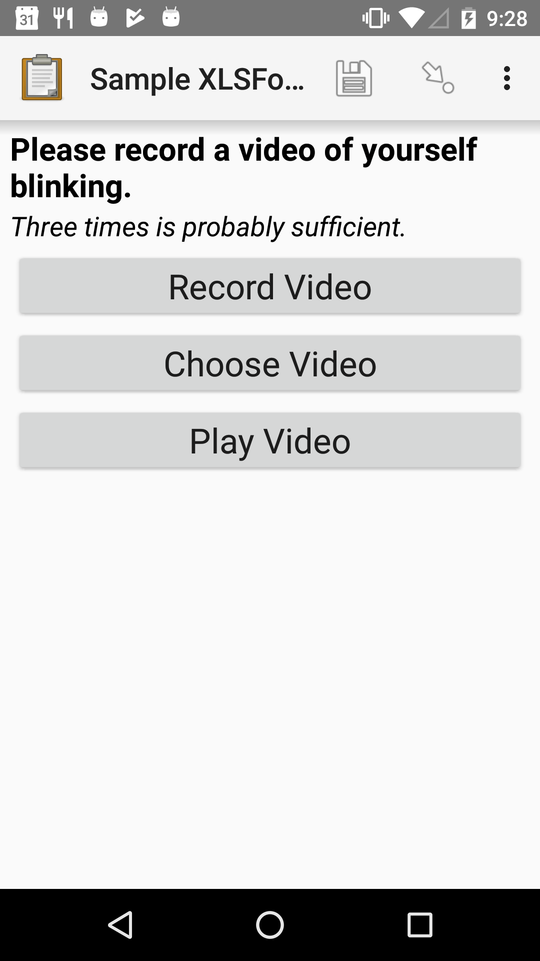
XLSForm
type |
name |
label |
hint |
|---|---|---|---|
video |
blinking |
Please record a video of yourself blinking. |
Three times is probably sufficient. |
External app video widget
Added in version 1.30.
Launches an external app and receives a video file back from the external app. If the specified external app is not available, it is not possible to use the widget.
The external app video widget is displayed when the appearance attribute begins with ex:. The rest of the appearance string specifies the application to launch.
See also
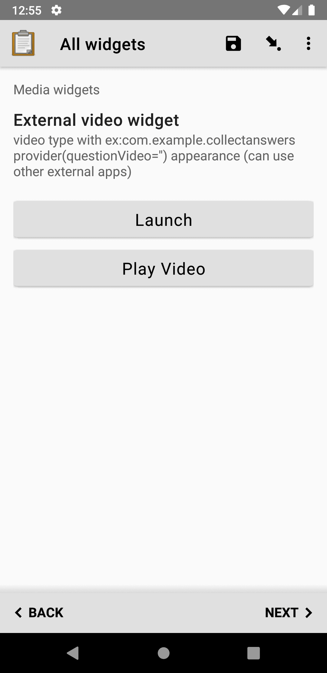
XLSForm
type |
name |
label |
appearance |
hint |
|---|---|---|---|---|
video |
ex_video_widget |
External video widget |
ex:com.example.collectanswersprovider(questionVideo='') |
video type with ex:com.example.collectanswersprovider(questionVideo='') appearance (can use other external apps) |
File upload widget
Default file upload widget
Added in version 1.15: ODK Collect v1.15.0
Uploads any file from the device to the form.
Warning
Users can upload any file type, which includes potentially malicious files. You should not include this widget unless you trust the people using the form.
Even then, you should take precautions before downloading or opening files.
Run an antimalware scan.
Verify the file is a type you expect (such as a
.pdfdocument), and not a potentially dangerous file (such as.exeor.ini).
Tip
To scan paper documents and attach them to your form, we recommend FairScan. It's a high-quality document scanner that automatically crops and straightens scans, then attaches them to your form as a PDF. Use a file question type with an appearance of ex:org.fairscan.app.action.SCAN_TO_PDF to enable it. See demo video.
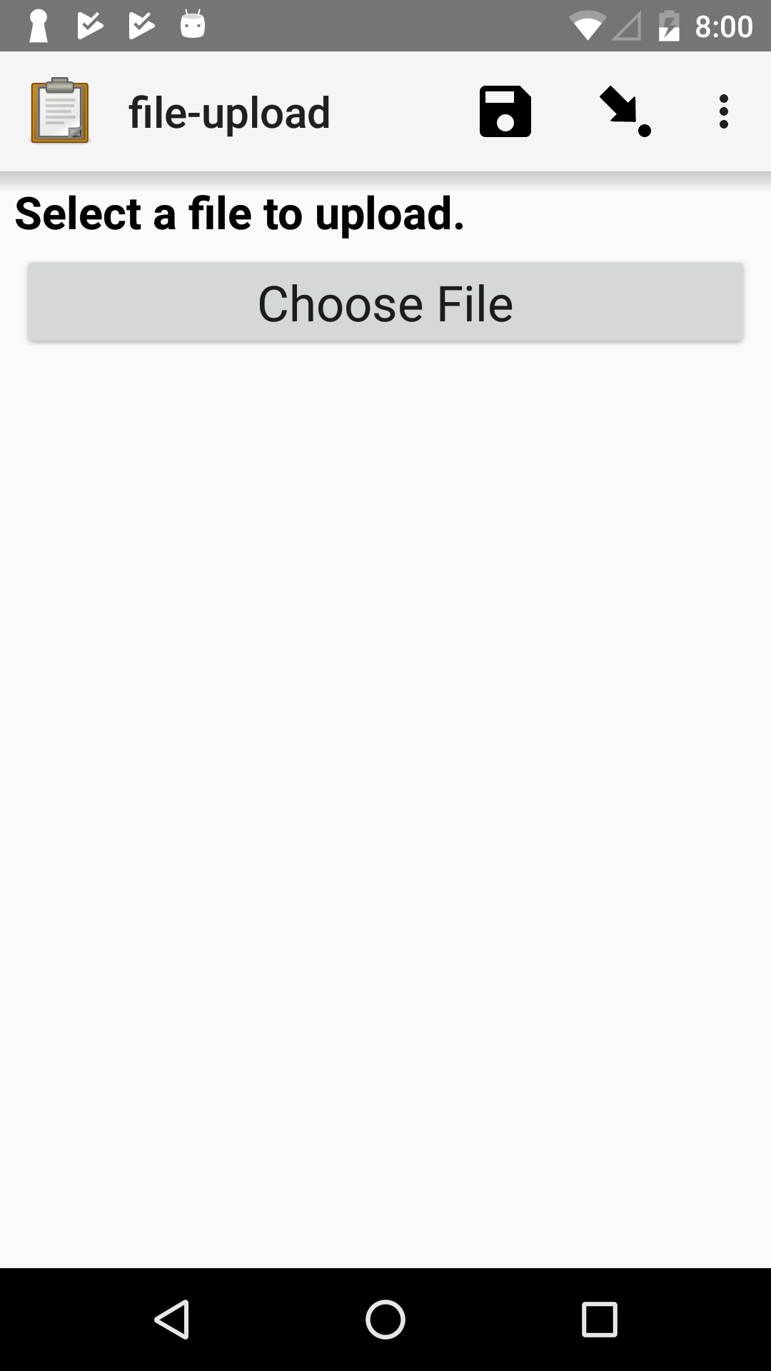
XLSForm
type |
name |
label |
|---|---|---|
file |
some-file |
Select a file to upload. |
External app file widget
Added in version 1.30.
Launches an external app and receives an arbitrary file back from the external app. If the specified external app is not available, it is not possible to use the widget.
The external app file widget is displayed when the appearance attribute begins with ex:. The rest of the appearance string specifies the application to launch.
See also
Warning
This widget accepts files of any type. Learn more about the risk above. You should only specify an external application that you trust.
XLSForm
type |
name |
label |
appearance |
hint |
|---|---|---|---|---|
file |
ex_file_widget |
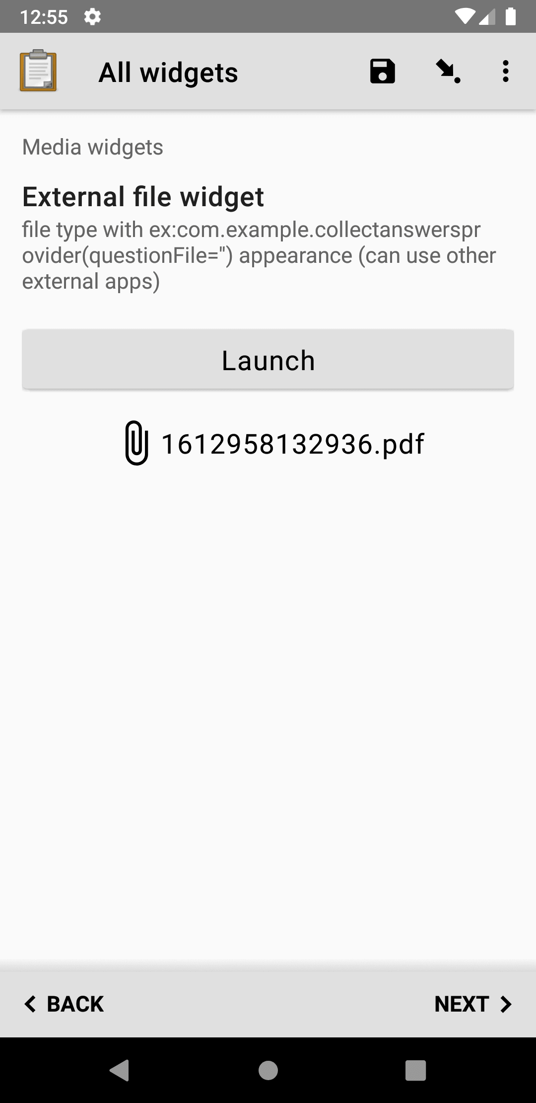
External file widget |
ex:com.example.collectanswersprovider(questionFile='') |
file type with ex:com.example.collectanswersprovider(questionFile='') appearance (can use other external apps) |
Barcode widget
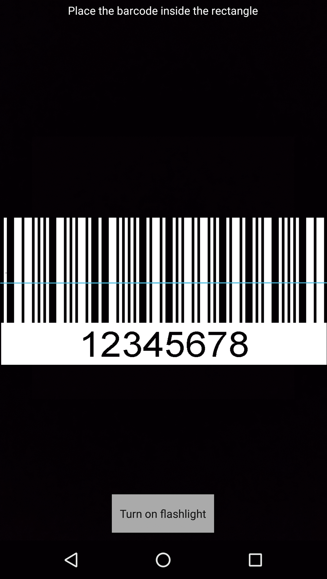
Scans, decodes, and captures the content of a barcode, using the device camera.
The following barcode formats are supported:
UPC-A
UPC-E
EAN-8
EAN-13
Code 39
Code 93
Code 128
Codabar
ITF
RSS-14
RSS-Expanded
QR Code
Data Matrix
Aztec
PDF 417
MaxiCode
For PDF 417 barcodes, the scanned contents are first decoded as UTF-8. If that fails, they are decoded using ISO-8859-1 instead.
Default barcode widget
The flash can be used as a light source when scanning barcodes in a poorly lit environment.
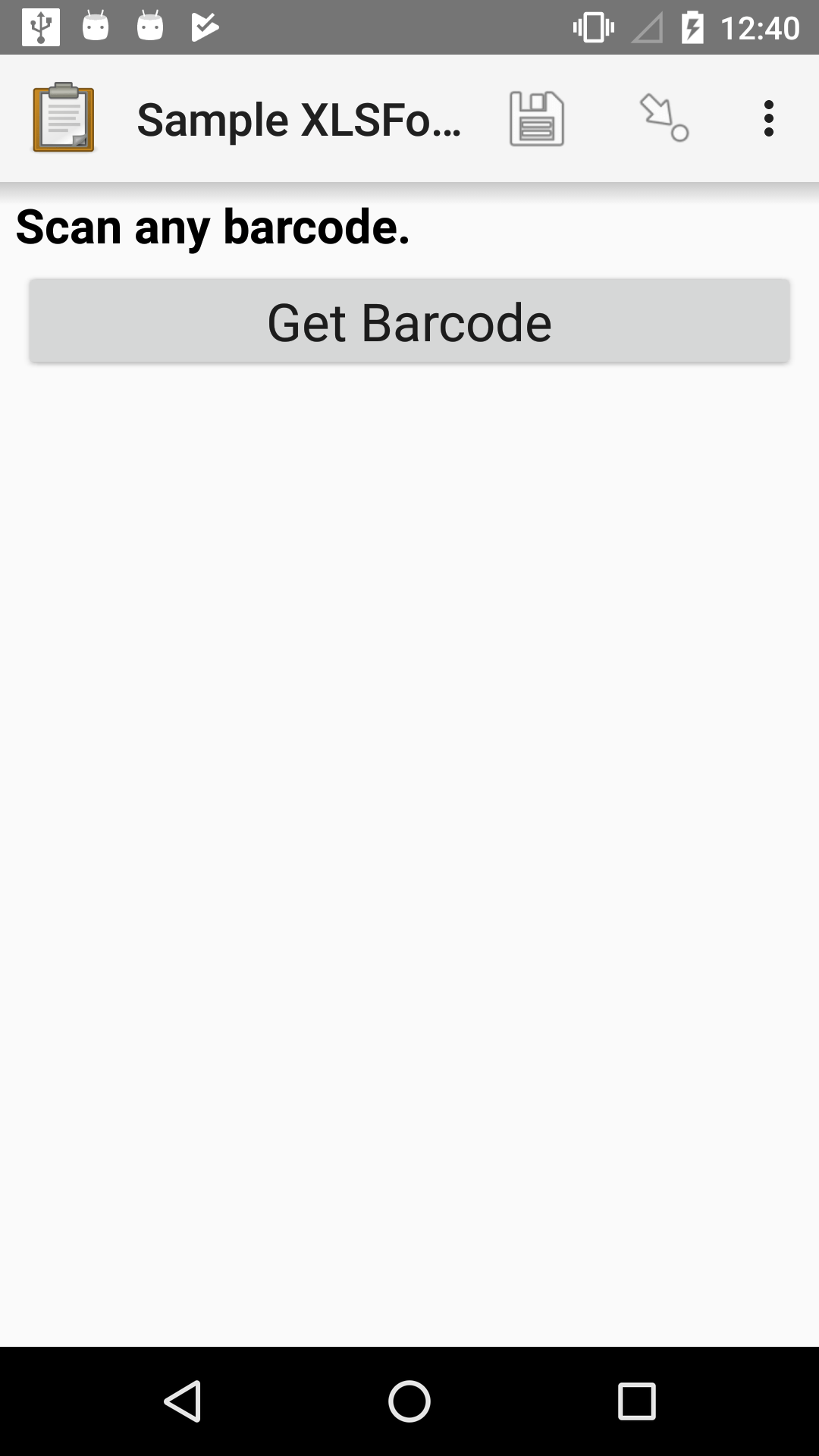
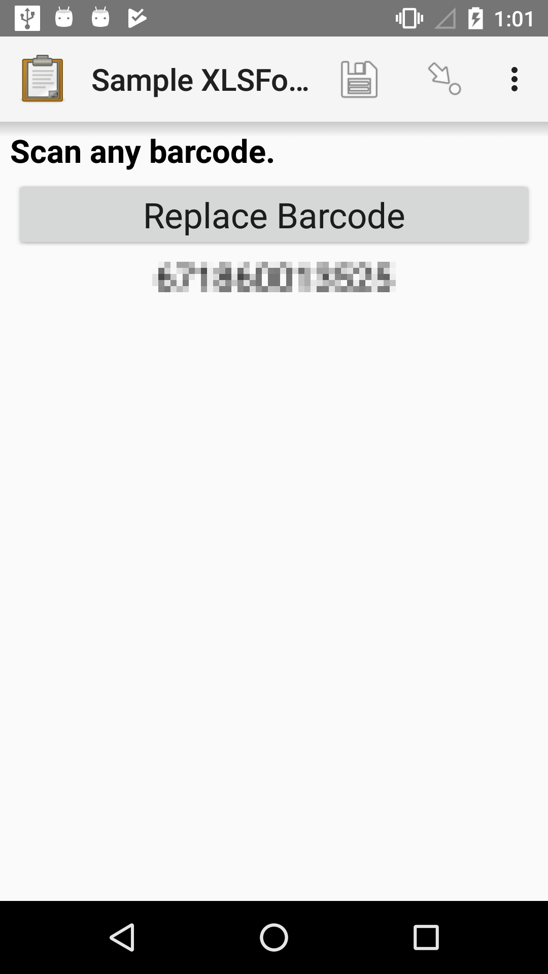
XLSForm
type |
name |
label |
|---|---|---|
barcode |
barcode_example |
Scan any barcode. |
Warning
It is recommended not to make barcode questions required because even when using high quality and waterproof codes things can go wrong and some of them might be unreadable for the camera. To handle such cases, it might be a good idea to add a Default text widget as a fallback option to let enumerators enter the code manually.
Self portrait (selfie) barcode widget
In some cases a front camera may work better. The flash can't be used in this case.
XLSForm
type |
name |
label |
appearance |
|---|---|---|---|
barcode |
barcode_example |
Scan any barcode. |
front |
Hiding the scanned value
By default, the scanned value is shown below the widget button. In some cases, the raw scanned value is not helpful to display. For example, it may be base64-encoded, be very long, or may represent a list of values. In that case, you can use the hidden-answer appearance. We generally recommend putting this question in a field-list to provide some useful feedback about the scanned value.
XLSForm
type |
name |
label |
appearance |
calculation |
|---|---|---|---|---|
begin_group |
gr |
field-list |
||
barcode |
barcode |
Please scan code |
hidden-answer |
|
calculate |
first_name |
selected-at(base64-decode(${barcode}), 0) |
||
calculate |
last_name |
selected-at(base64-decode(${barcode}), 1) |
||
note |
barcode_note |
First name: ${first_name} Last name: ${last_name} |
||
end_group |
gr |
You can try the sample form above with the following QR code:

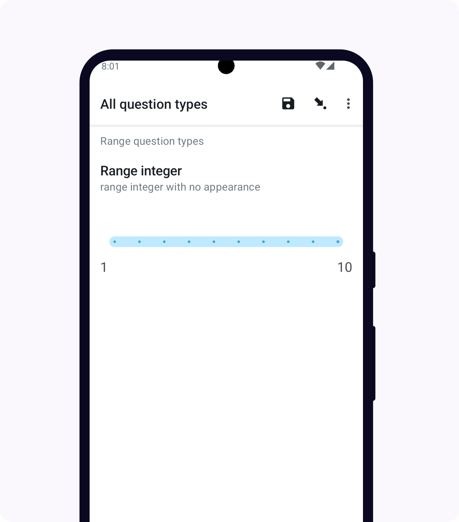
Range widgets
Range widgets allow the user to select numbers from within a range. The range can be represented visually as a number line, as a picker, or as a star rating.
The basic parameters of the range widget are defined by start, end, and step values defined in the parameters column of your XLSForm. The parameter values can be integers or decimals. The default values for start, end and step are 1, 10, and 1.
If all three parameter values are integers, the selected value is stored as an integer. If any of the parameter values are decimals, the input will be stored as a decimal.
See also
Number line range
Number line ranges are particularly helpful when you want to give survey respondents the opportunity to express an opinion or sentiment that exists on a continuum rather than as discrete values. Number lines have tick marks at every step by default and have labeled start and end values. The currently selected value is indicated by a line that can be dragged or the number line can be tapped directly to select a value. The currently-selected value is shown in the center of the number line.
The number line is displayed horizontally by default. It can also be displayed vertically and both orientations can be configured without visible ticks.
To help standardize how people interpret and use the scale, you can specify an interval at which to display visual ticks on the range and labels for those ticks. You can also set a placeholder value.
Horizontal range
- type
range- appearance
none
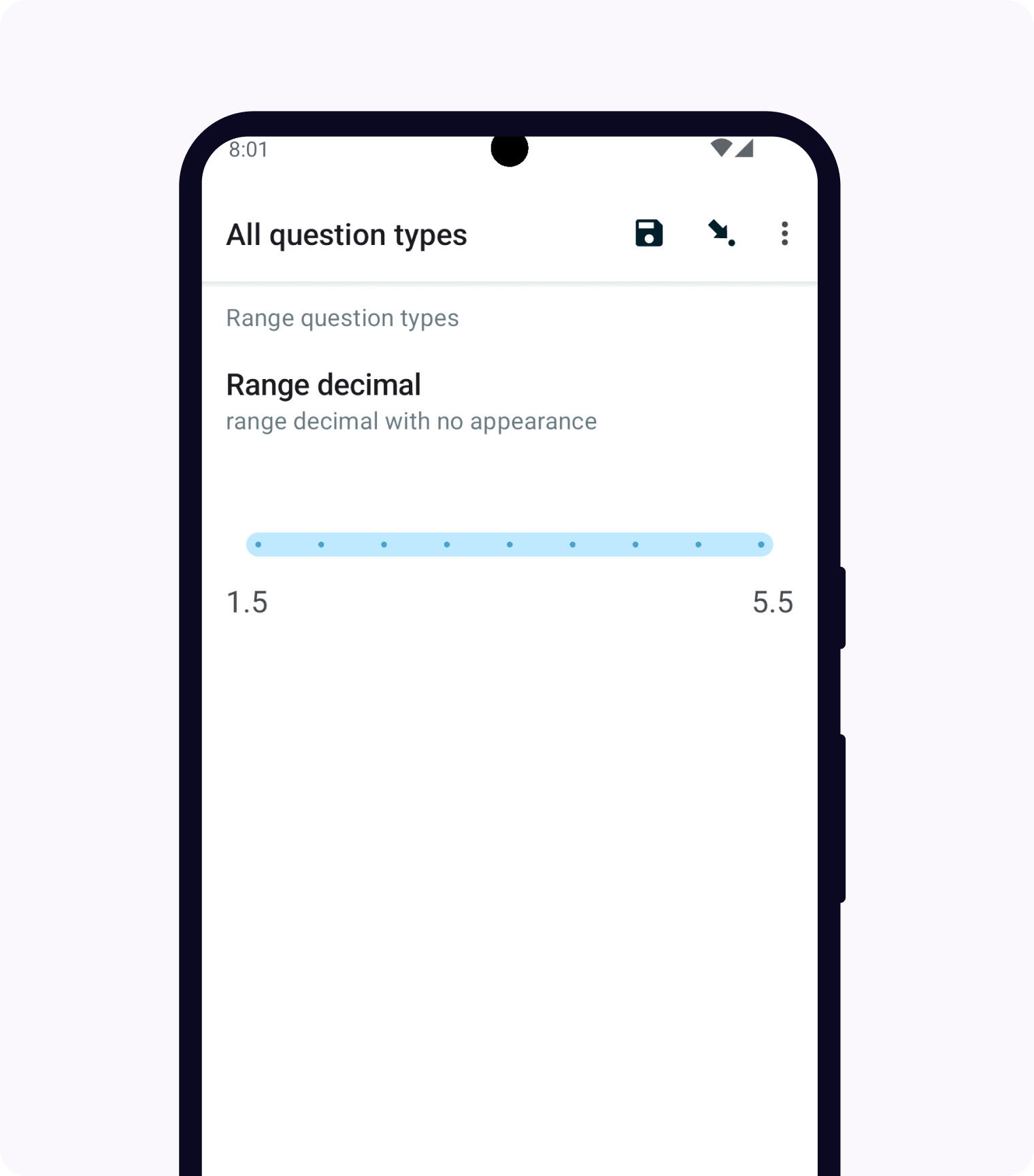
XLSForm
type |
name |
label |
appearance |
hint |
parameters |
|---|---|---|---|---|---|
range |
sentiment |
Decimal range |
Custom range |
start=1.5, end=5.5, step=0.5 |
Range tick interval and placeholder
A range question's step value determines the values that the user can select. For number line ranges, you can also optionally configure the step interval to determine the interval at which visible step markers are shown. This can be helpful if you want users to have visual markers to identify important points along the line such as the midpoint but also want to allow them to select points in between.
The step interval is configured by the tick_interval parameter in the parameters column. Evenly spaced intervals help standardize how people interpret and use the scale.
You can also configure a placeholder value for a number line range. This value determines where the selection line will be shown when no value is saved for the question. This can help avoid bias or help users select common values depending on the project context. No value is actually set for the question until the user interacts with range. If they tap on the placeholder, then that placeholder value is saved. The placeholder is configured by the placeholder parameter in the parameters column.
The screenshots below show the placeholder when no value is selected and then a selected value of 80.
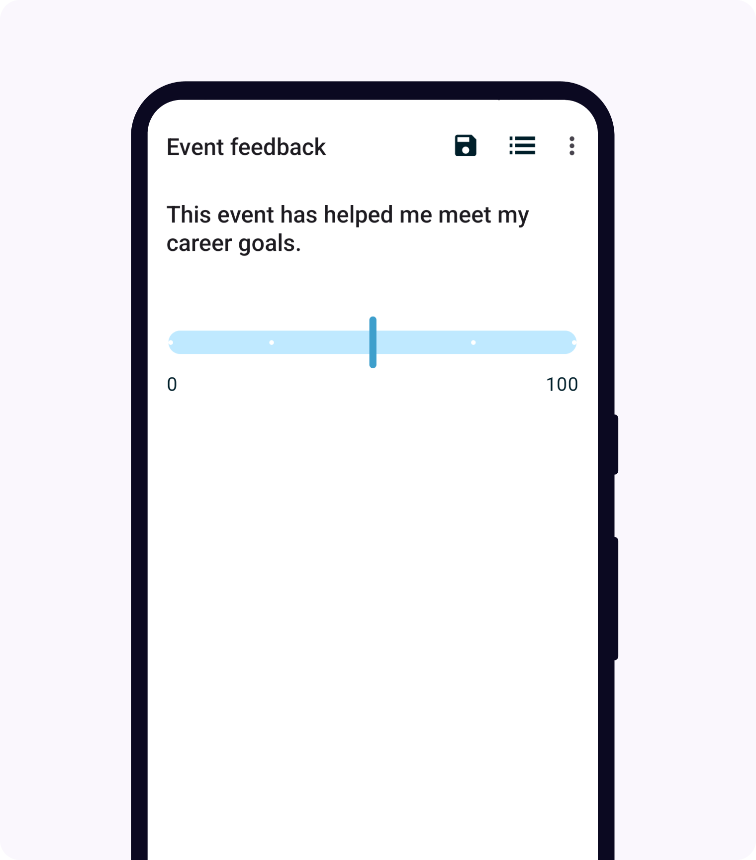
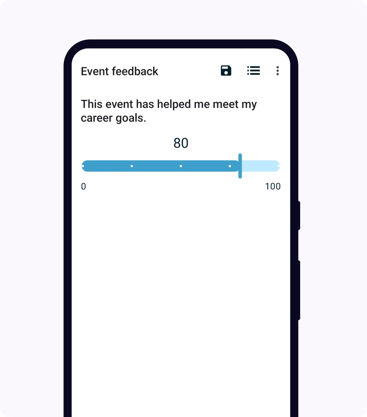
XLSForm
type |
name |
label |
parameters |
|---|---|---|---|
range |
agreement |
How strongly do you agree? |
start=0, end=100, tick_interval=25, placeholder=50 |
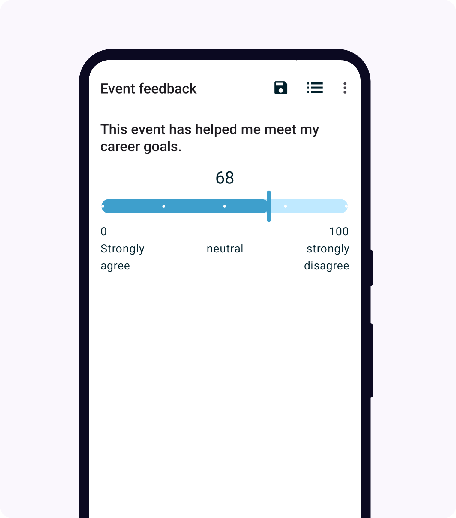
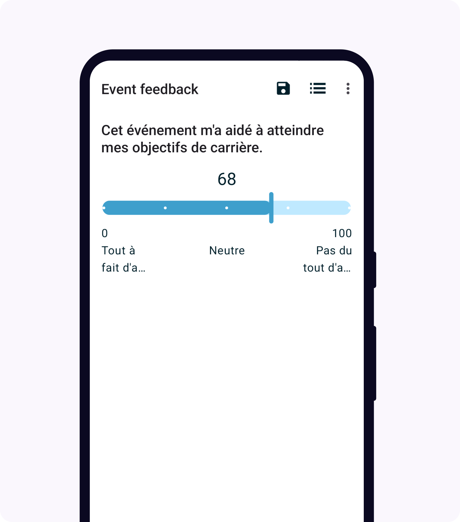
Range tick labels
You can optionally specify labels for the ticks on a number line.
When using phones to fill out forms, we recommend labeling at most the start, end, and midpoint. When using larger devices, you could add labels to any visible tick, determined by tick_interval if specified or step otherwise. If you add long labels or label many ticks, the labels may overlap so make sure to test on devices you intend to use.
Tick labels are defined in a list on the choices tab of your XLSForm. You can give this list any name you want, for example agreement_labels. The values in the name column for this list must be numbers that correspond to tick values in the range. The values in the label column can be any text you would like. You can translate those label values the same way you would translate select choice labels.
In the screenshots below, notice that the French labels are truncated on this device.
XLSForm
type |
name |
label |
parameters |
|---|---|---|---|
range |
agreement |
How strongly do you agree? |
start=0, end=100, tick_interval=25, placeholder=50, tick_labelset=agreement_labels |
list_name |
name |
label::English (en) |
label::français (fr) |
|---|---|---|---|
agreement_labels |
0 |
Strongly agree |
Tout à fait d'accord |
agreement_labels |
50 |
neutral |
Neutre |
agreement_labels |
100 |
strongly disagree |
Pas du tout d'accord |
Vertical range widget
- type
range- appearance
vertical
To display the range widget's number line vertically, use the vertical appearance. Both integers and decimals are supported.
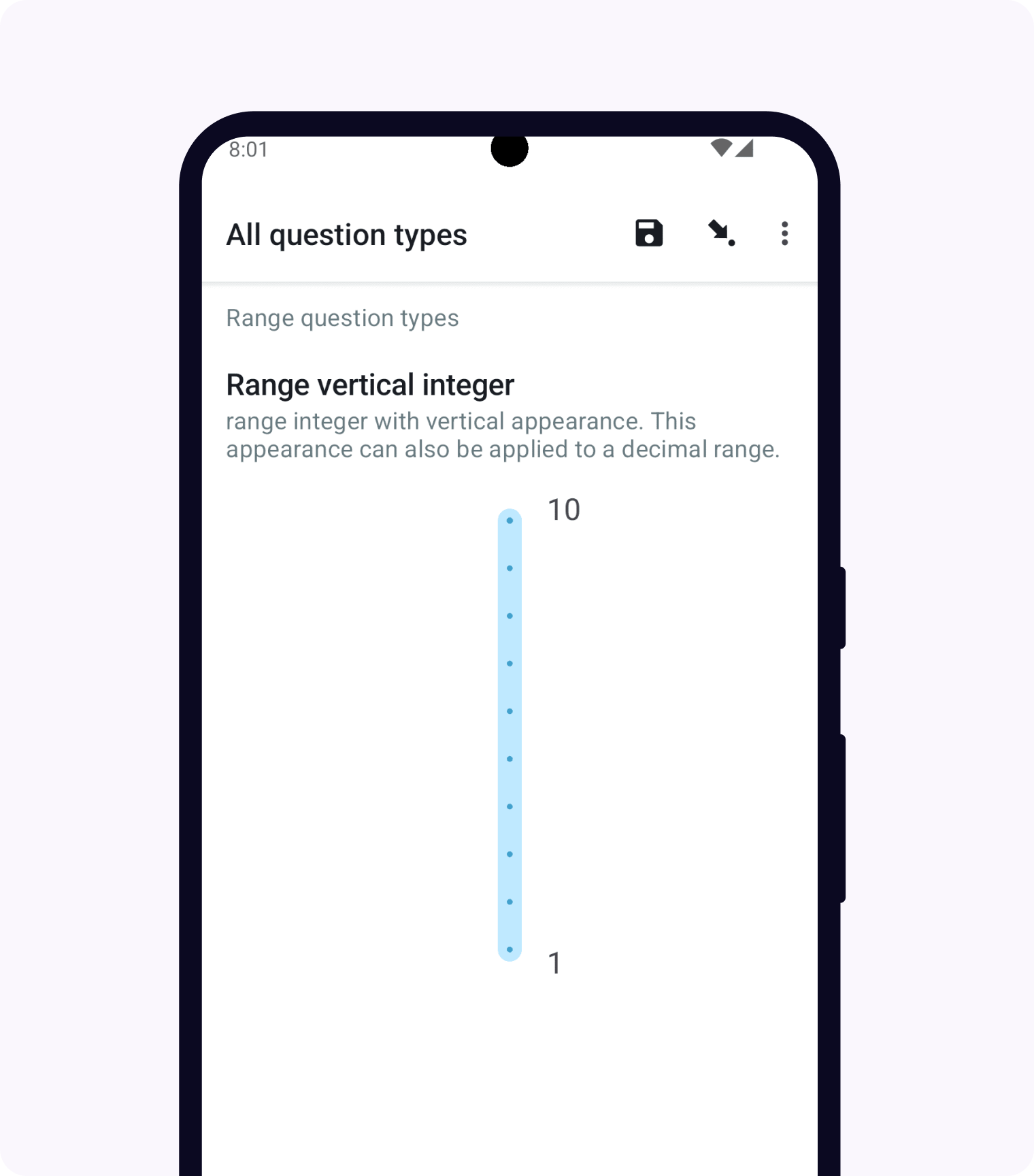
XLSForm
type |
name |
label |
appearance |
parameters |
|---|---|---|---|---|
range |
range_integer_widget_vertical |
Range vertical integer widget |
vertical |
start=1, end=10, step=1 |
Range widget with no ticks
- type
range- appearance
no-ticks
To display the range widget's number line without ticks, use the no-ticks appearance. Both integers and decimals are supported. You can also use this appearance with the Vertical range widget.
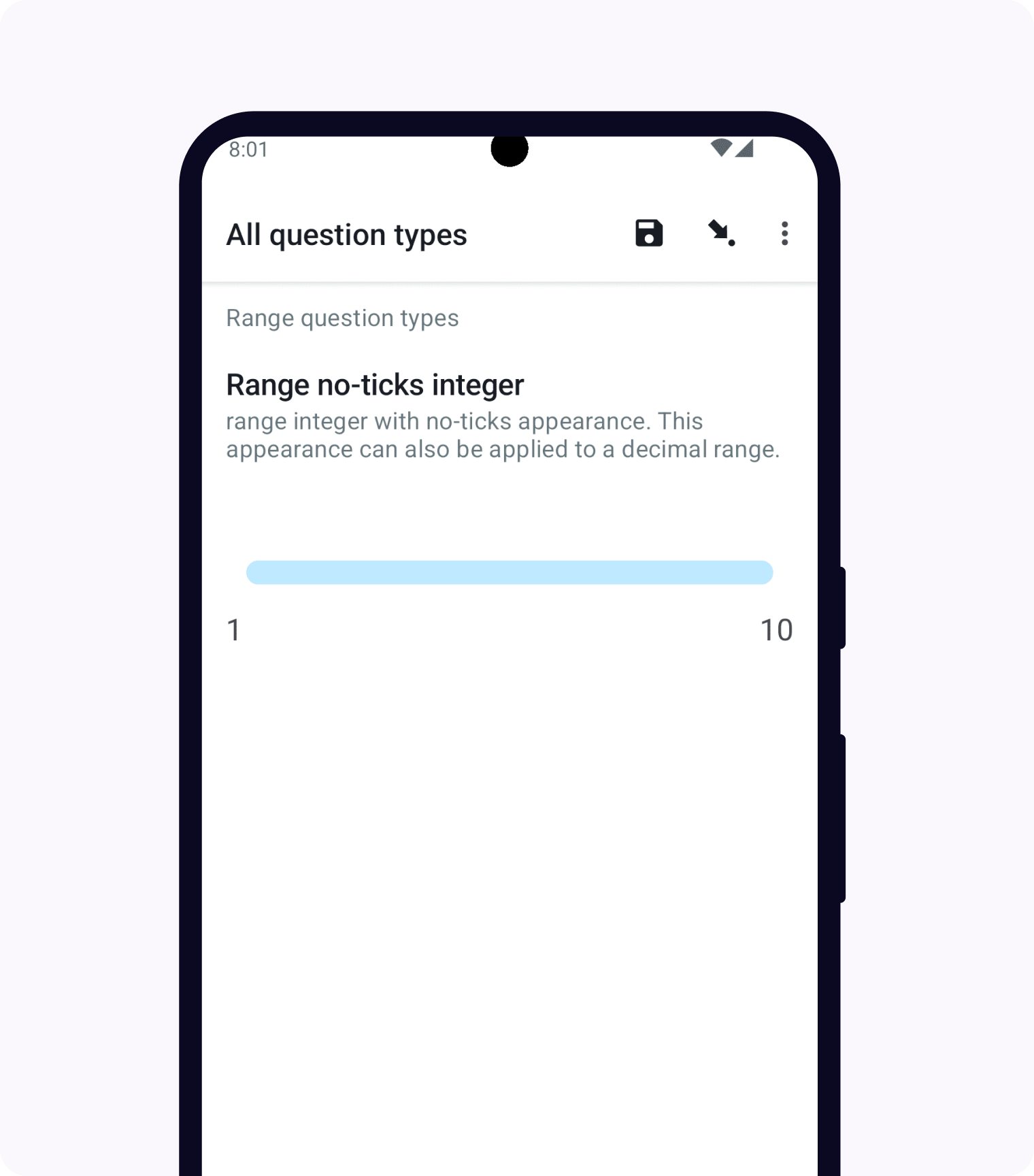
XLSForm
type |
name |
label |
appearance |
parameters |
|---|---|---|---|---|
range |
range_integer_widget_no_ticks |
Range integer widget with no ticks |
no-ticks |
start=1, end=10, step=1 |
Range widget with picker
- type
range- appearance
picker
When the picker appearance is added, the range widget is displayed with a spinner-style select menu in a dialog. The value between horizontal lines is the selected value. Users can scroll the spinner up and down or can tap on the value above to go up by one and on the value below to go down by one.
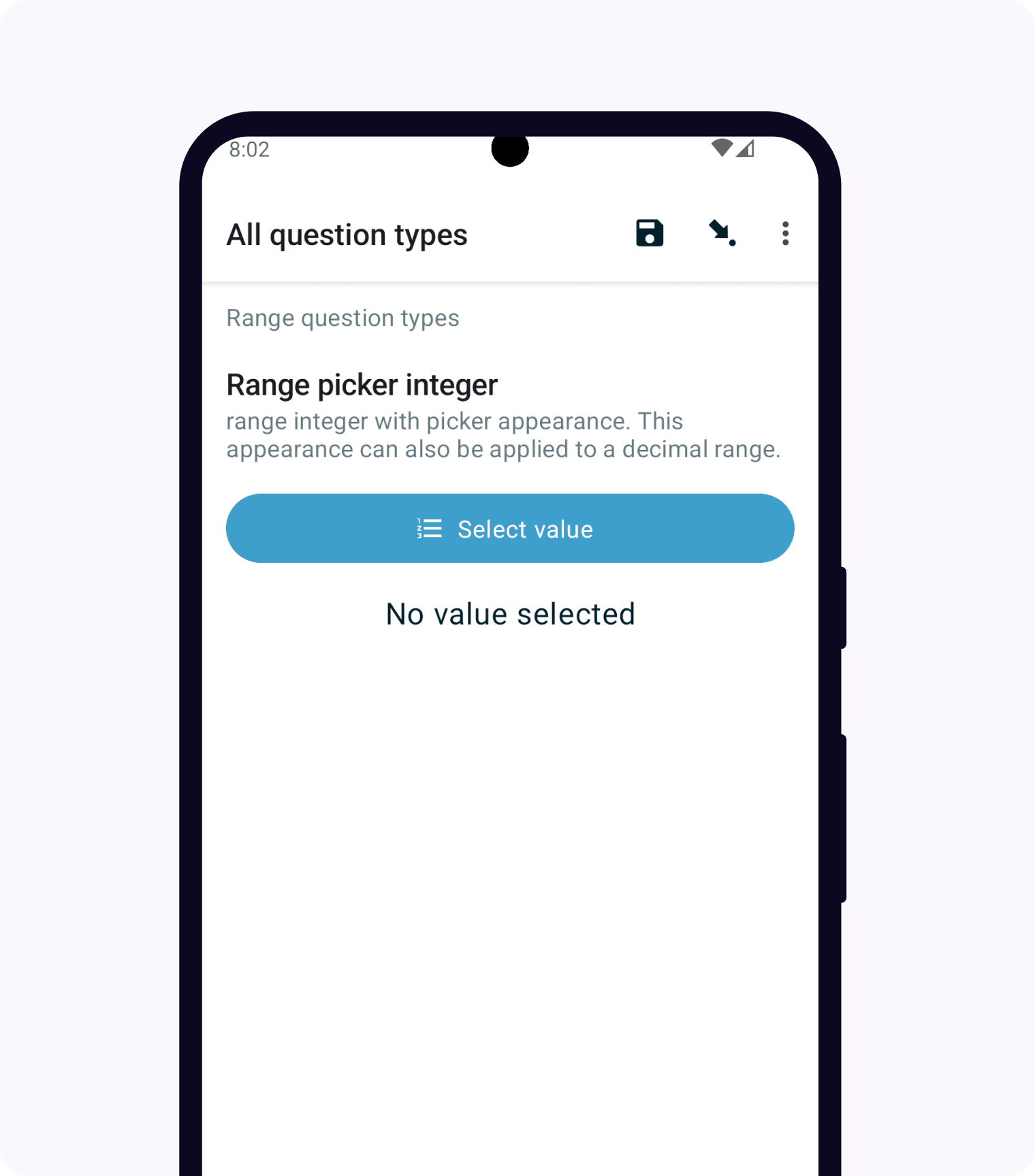
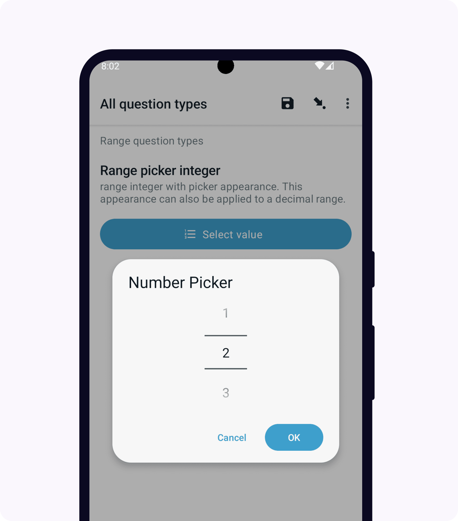
XLSForm
type |
name |
label |
appearance |
hint |
parameters |
|---|---|---|---|---|---|
range |
range_integer_widget_picker |
Range picker integer widget |
picker |
range integer widget with picker appearance |
start=1;end=10;step=1 |
Range widget with rating
- type
range- appearance
rating
When the rating appearance is added, the range widget is displayed with stars having equal spacing. Number of stars is calculated using the end parameter. When the user taps on an empty star, the stars up to and including that star will be filled. If the stars don't fit in the device width, they will wrap onto additional lines.
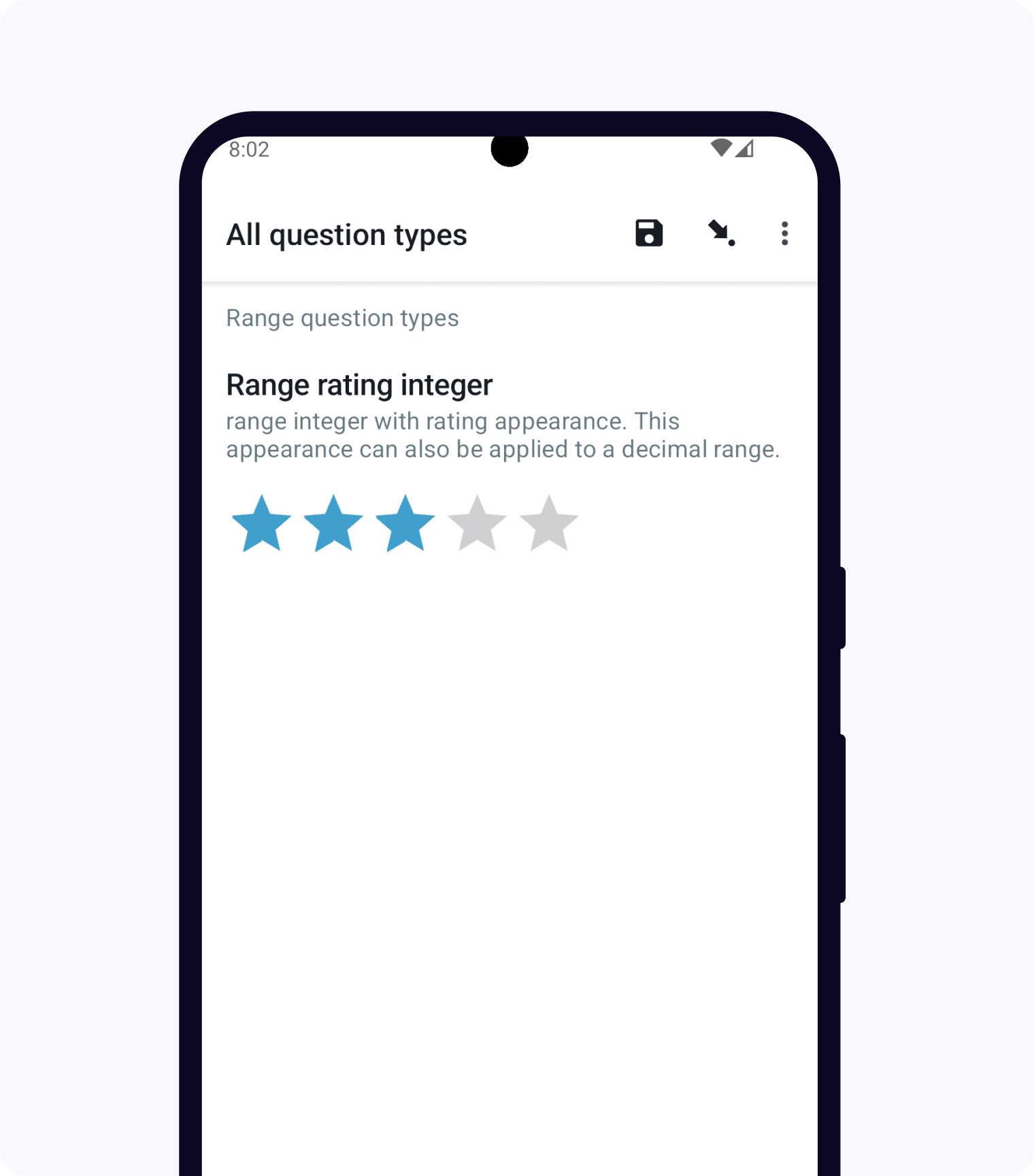
XLSForm
type |
name |
label |
appearance |
hint |
parameters |
|---|---|---|---|---|---|
range |
range_integer_widget_rating |
Range rating widget |
rating |
range integer widget with rating appearance |
end=5 |
Note widget
- type
note- appearance
none
A note to the user, accepting no input. This example includes hint text.
XLSForm
type |
name |
label |
hint |
|---|---|---|---|
note |
note_1 |
This is an example note. |
The text displays, but there is no input. |
URL widget
- type
text- appearance
url
Provides a link which the user can open from the survey. Takes no input.
The URL to open is specified with default.
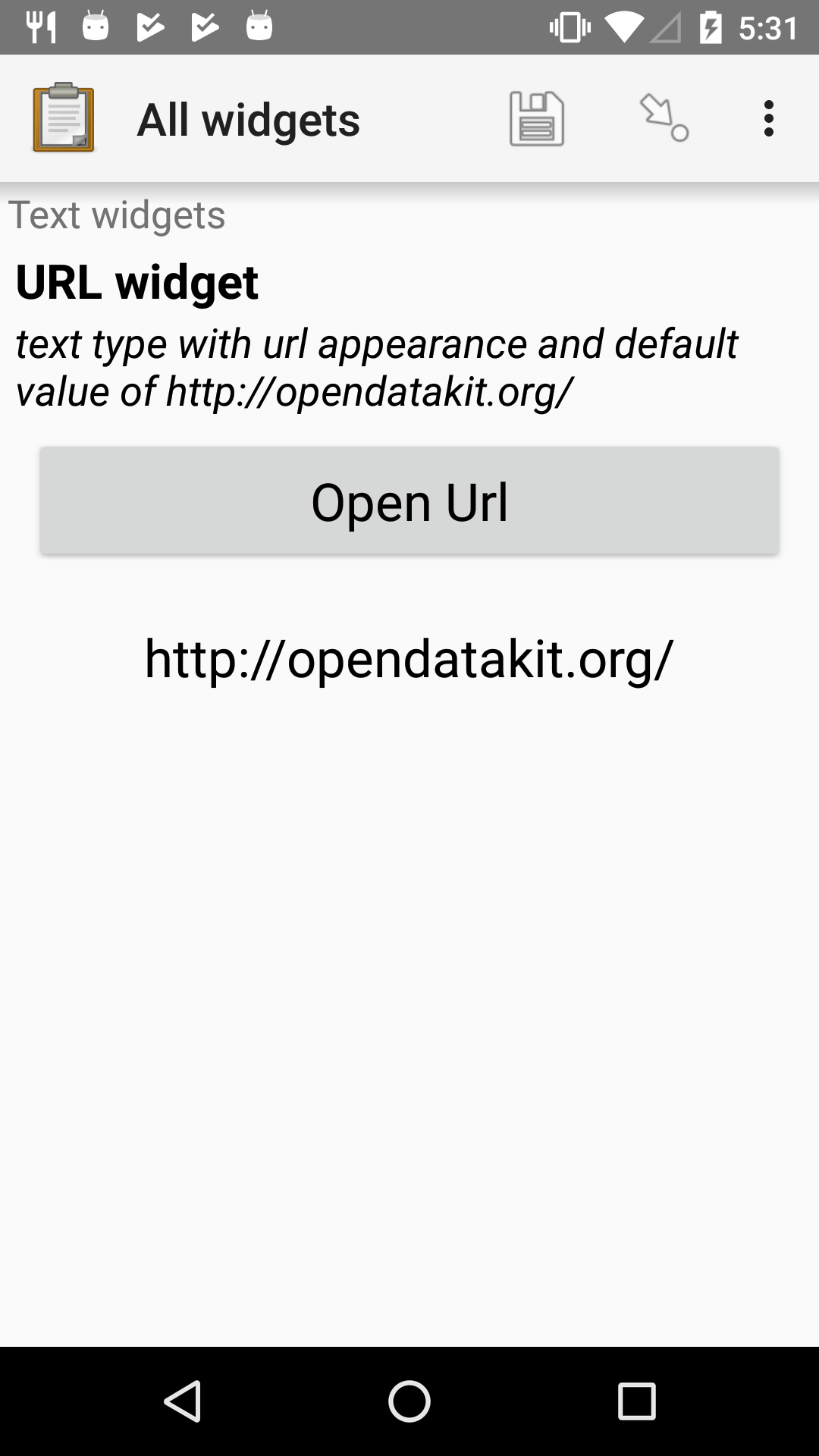
XLSForm
type |
name |
label |
appearance |
hint |
default |
|---|---|---|---|---|---|
text |
url_widget |
URL widget |
url |
text type with url appearance and default value of https://getodk.org/ |
Printer widget
Note
Collect previously supported printing to specific Zebra label printer modules with an external app. That external app is no longer available and starting in Collect v2024.1, this more general print functionality replaces it.
- type
text- appearance
printer
When a text field has the printer appearance, its text value is interpreted as HTML by ODK Collect. When the user taps the Print button, Collect shows a print preview of that rendered HTML. From the preview screen, users can save as PDF or send to a connected printer.
XLSForm
type |
name |
label |
appearance |
calculation |
|---|---|---|---|---|
text |
id_card |
Tap the button to print the card |
printer |
concat(${first_name}, ' ', ${last_name}) |
The most common way to set the value to print is by specifying a calculate expression, generally with the concat() function so that values from the form can be included.
We recommend writing your HTML with fixed sample values first, trying it in a web browser, and then converting it to a concat function to insert form values. You don't need to include body tags and other aspects typically required in an web page, you can instead specify only the elements that you need.
This question type understands a custom qrcode element. Any text values placed within opening and closing qrcode tags will be encoded as a QR code and shown as an image You can apply the same attributes and styling to this element as you would to an img element.
The calculation used to generate the card in the screenshot above is:
concat("
  <qrcode width='150' height='150'>", ${first_name}, " ", ${last_name}, " ", ${age}, " ", ${email}, " ", ${phone_number}, "</qrcode></br>
  <img width='150' src='", ${photo}, "'>
  <table>
    <tr>
      <td>First name</td>
      <td>", ${first_name}, "</td>
    </tr>
    <tr>
      <td>Last name</td>
      <td>", ${last_name}, "</td>
    </tr>
    <tr>
      <td>Age</td>
      <td>", ${age}, "</td>
    </tr>
    <tr>
      <td>Email</td>
      <td>", ${email}, "</td>
    </tr>
    <tr>
      <td>Phone number</td>
      <td>", ${phone_number}, "</td>
    </tr>
  </table>
")
Trigger/acknowledge widget
- type
trigger,acknowledge- appearance
none
The trigger widget, also known as the acknowledge widget, presents a single checkbox.
A completed trigger response is stored as the string OK.
The example shown here includes the required attribute.
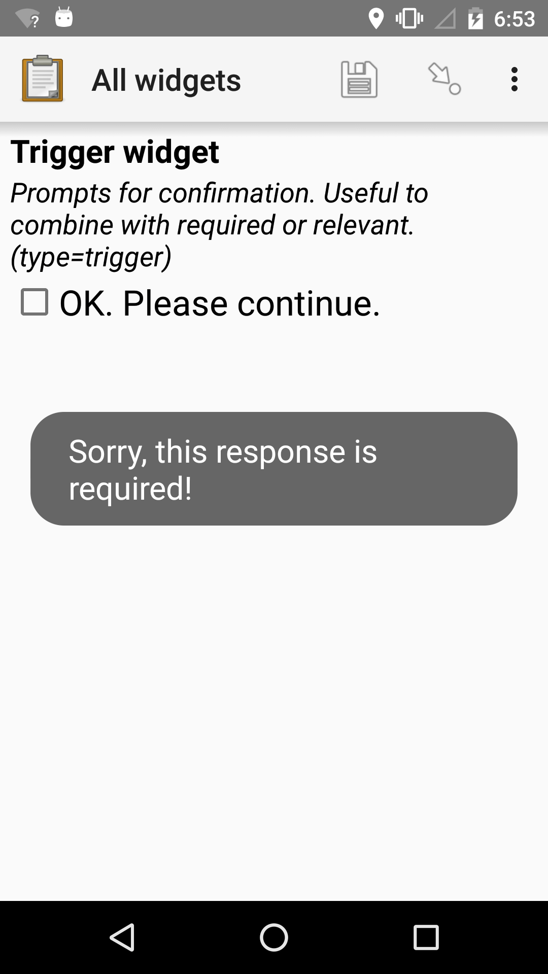
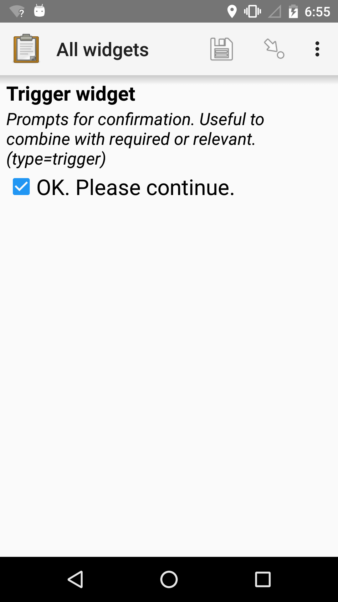
XLSForm
type |
name |
label |
hint |
required |
|---|---|---|---|---|
trigger |
my_trigger |
Trigger widget |
Prompts for confirmation. Useful to combine with required or relevant. (type=trigger) |
true() |
Signature widget
- type
image- appearance
signature
Collects a signature from the user.
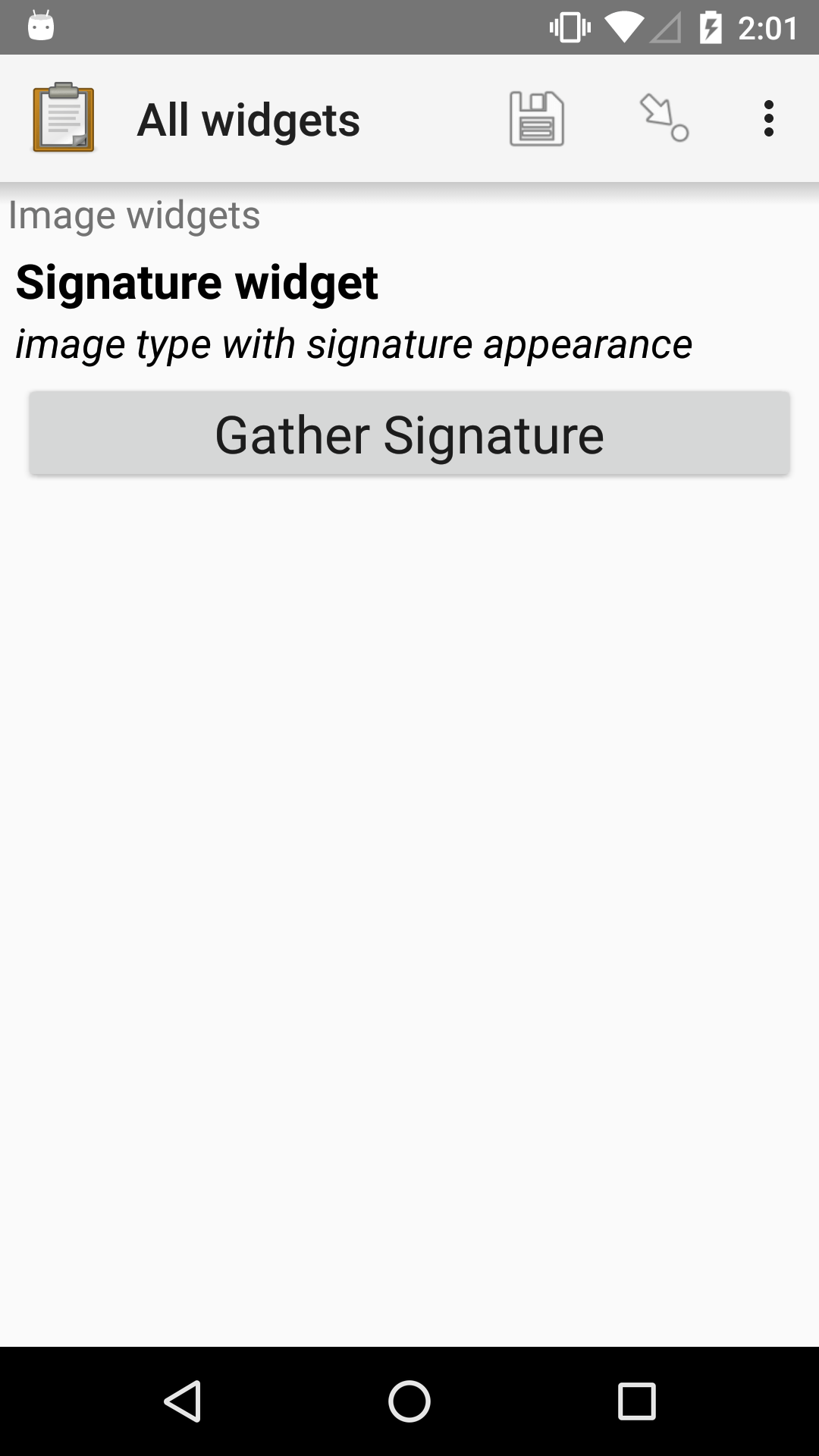
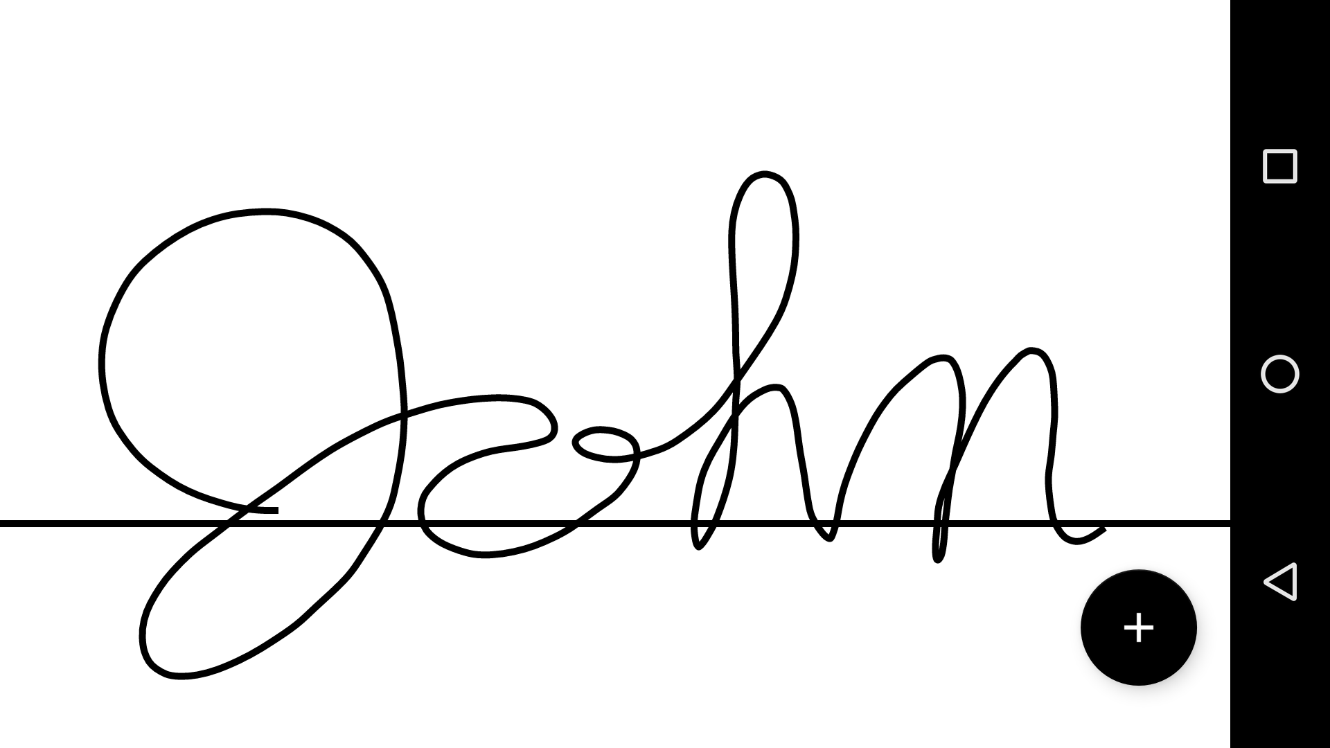
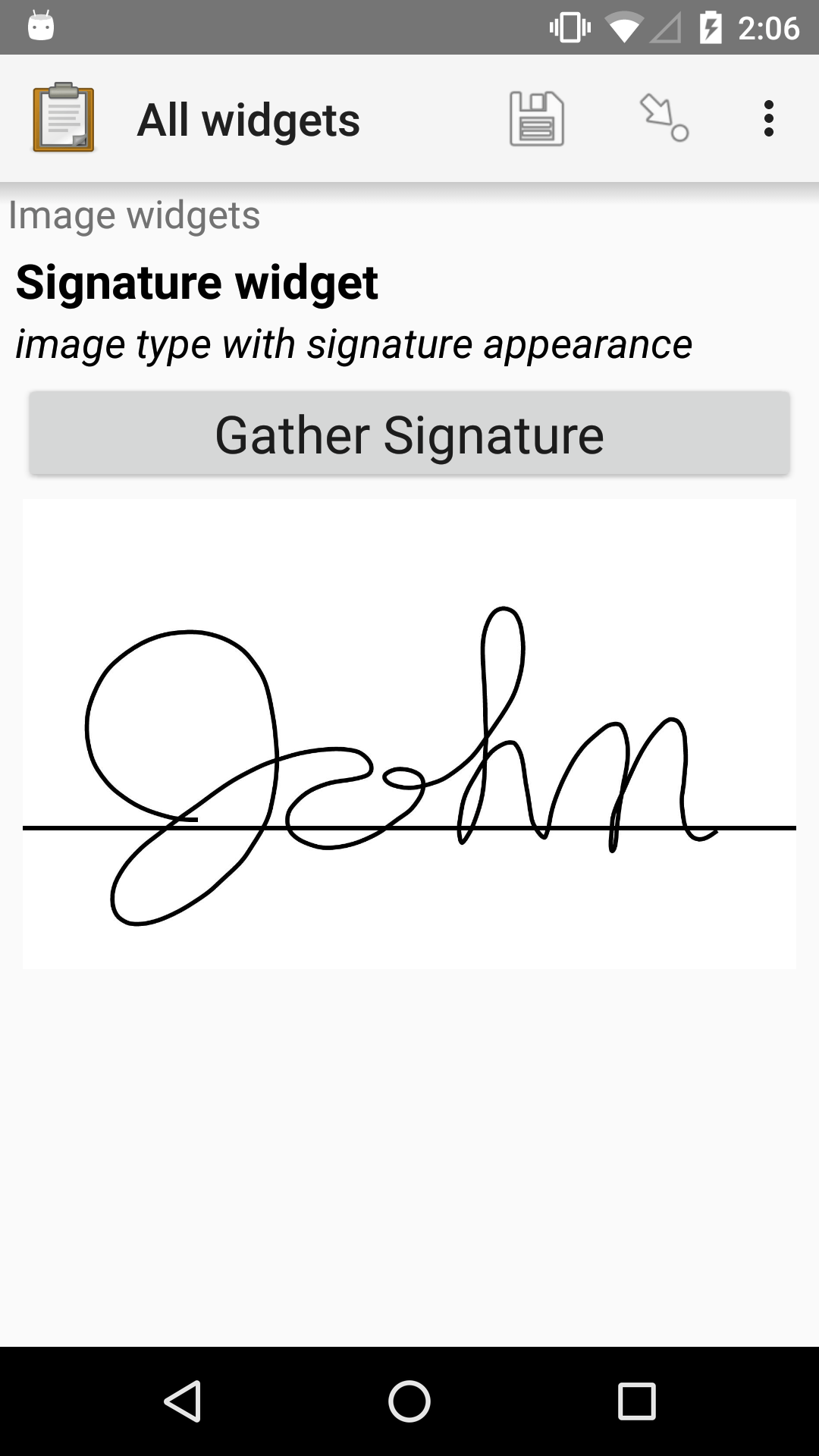
XLSForm
type |
name |
label |
appearance |
hint |
|---|---|---|---|---|
image |
signature_widget |
Signature widget |
signature |
image type with signature appearance |
Grouping multiple widgets on the same screen
- type
begin_group- appearance
field-list
The field-list appearance attribute, applied to a group of widgets, displays them all on a single screen.
Warning
Relevance, constraint and calculation evaluation within the same screen is supported in Collect v1.22 and later.
Warning
Displaying Repeating questions on the same screen (inside a field-list group) is not supported.
See also
Grid of selects on the same screen
If you have multiple select questions with the same choices, it can be helpful to group them on one screen.
To do this, put your select questions in a field-list group and use the following appearance attributes:
labelOnly the option labels are displayed, without checkboxes. This is used for the top row with the 'Yes' and 'No' options in the example above.
list-nolabelOnly checkboxes or radio buttons are displayed, without their labels. This is used for the question rows in the example above.
listThe labels are displayed along with checkboxes for multi-select questions and radio buttons for single-select questions. You could use this instead of having a
labelrow to keep the option labels closer to the checkboxes or radio buttons.
XLSForm
type |
name |
label |
appearance |
|---|---|---|---|
begin_group |
underlying_conditions |
Underlying conditions |
field-list |
select_one yes_no |
condition_labels |
Conditions |
label |
select_one yes_no |
Comcond_preg |
Pregnancy |
list-nolabel |
select_one yes_no |
Comcond_partum |
Post-partum (< 6 weeks) |
list-nolabel |
end_group |
underlying_conditions |
list_name |
name |
label |
|---|---|---|
yes_no |
yes |
Yes |
yes_no |
no |
No |